HOME | DD
 ramdom — thr33

Published: 2002-05-23 07:37:46 +0000 UTC; Views: 2393; Favourites: 10; Downloads: 1011
Redirect to original
Description
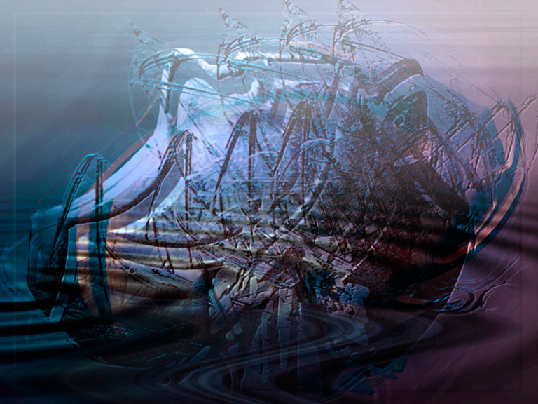
~ three three three x 2. scaryenuff. no bluff, guff or ruff stuff - try angles. gawrsh.3.
Related content


Comments: 24

almost asif its 3d - like real life or something .. its amazing
👍: 0 ⏩: 0


this is something else. what did the number 3 do to deserve a monument like this? reigning over a geyser of color and beauty in an barren landscape.
hmm. the three is a mystery, but thats why i like it. like joining a secret cult... maybe youll be initiated into the mysteries later, maybe not, but its worth it just to be part of the scene...
👍: 0 ⏩: 0

this is a great 2d-3d-trendy! great colors and a very good composition....
👍: 0 ⏩: 0

i really like it and it takes me back to sesame street, maybe you can make a 21 wallpaper just for me haha
👍: 0 ⏩: 0


fuck! i wish i could excel to this level!!!
you so amaze me.
👍: 0 ⏩: 0

Positive aspects: (I'm an optimist mommy!)
very stylish, though it doesn't seem to fall in line with your other works I've seen? The solid white bits match the blue (sky) very well. I like, will download.
Negative Aspects: (I hate everything review)
Some elements (particularly centering around the '3') seem to suffer from dithering or otherwise lossy picture quality? The only other explaination I can think of is that the blending wasn't done well and the images clash at certain points, creating an effect that gives a "lossy" impression. Certain design elements seem to have little connection with the obscure message at hand.
-----
Eh? Synthamesc.
👍: 0 ⏩: 0

the door creeps open, his head peers in and quietly he re-enters, walking softly across the floor and hangs his latest truimph of modern design on the wall. beautiful.
👍: 0 ⏩: 0

finally! yes!! a work of art that doesn't simply jump aboard the trend wagon. i'm so happy to see that you've taken the reins and made this part of your own, unique expression.
-----
:: paroxysm ::
[link] .: My Card
[link] .: 3WC - The Creatives Are Restless
[link] .: KwanStudios
[link] .: deviantMAG
👍: 0 ⏩: 0

wow...this is really cool...i love the abstract feel...very original style paper
-----
-olo-
WARNING: do not click here --> [link]
👍: 0 ⏩: 0

nice work. i love freemasonic numbers.
-----
.:
👍: 0 ⏩: 0


absolutely stunning.
great work indeed.
-----
go dorks.
👍: 0 ⏩: 0

wow this is great..
I don't even figure how you did that...
great work!
👍: 0 ⏩: 0

This looks a little different to the usual styles. Great work on the design.
I've got a new submission as well, how about having a look. [link]
Have a look at my website at [link]
👍: 0 ⏩: 0

hey ! that's good. the screenshot doesn't make it justice at all. The background is very detailled and i like the exploding thing at the centre...
why the 3 has to be that huge ?
-----
L-courni [link] :flagEU:
👍: 0 ⏩: 0

really cool & original, i like it
-----
:: deus designs :: [link] :: [link] ::
👍: 0 ⏩: 0
