HOME | DD
 RobertSleeper — Unbridled Potential...

Published: 2012-10-12 03:21:52 +0000 UTC; Views: 14708; Favourites: 264; Downloads: 0
Redirect to original
Description
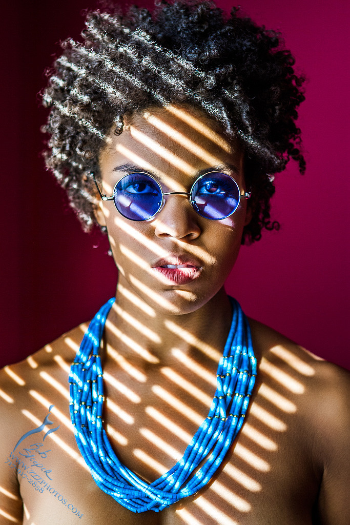
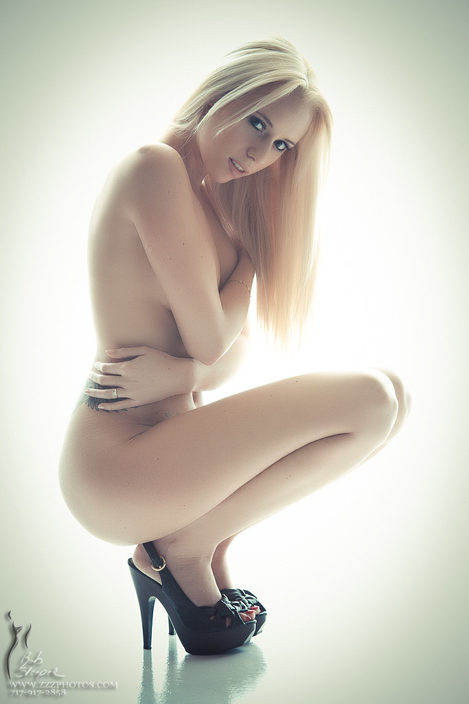
Model - GigiRelated content


Comments: 10

👍: 0 ⏩: 0


Originality
I really would like to learn about lighting you used here...
The model is perfect, the pose is very good despite its frequent use. The real McCoy here is the harmony between the model's beauty and the lights. It not only emphasize her body shapes and lines, but shows the beautiful tone of her skin, the youthfulness and marks of a firm and interesting personality on her face.
Perspective would bring emphasis to her left leg, but the light on her shoulder and face compensates it. (It is a bit strange as her left big toe gets hidden and "missing".) Her left hand is the most beautiful detail on the image. Not only she has very nice hand, but the gesture as she gives a rest draws light on it that gives it even more ease and fineness.
For this posture and lighting, her look and expression makes me feel that visibility of her left breast is disturbing and out-of-mood. It catches too much light and breaks the harmony of the lines of arms, legs and waist. The whole pose shows primarily a beautiful human being and it is secondary that this person is a woman, and even third that she is appealing. For this reason it would be even better if her breast would hide behind her elbow.
I was paying a thought or two whether it would be better if we could see her right elbow, too. For this stance that one would be a usual setup. But it's frequency makes that pose obsolete, and this version is a lot better, after all.
About the composition, it suggests that this image is for a book or news cover, or an advertisement. There is too much air above her, and this makes your logo not only acceptable but necessary. Using the bottom third calls for some text, logo, or other graphics up there.
I like the reflecting floor, too, as a counterpoint for the "excess" whiteness above. At the first sight I thought I would give it a more definite fade-out, but that would not control tha above space enough, therefore this solution is better.
As for overall impact: it is beautiful image, and she is beautiful model. The composition is fine and the lights are extraordinary well set. The pose is not original, but has that little plus in it what makes better-than-average. Two things disturb a bit, what made me keep back a half star: the unnecessary lights on her left breast and too much and whitening light on her hair. But these are minor things comparing the overall quality of the picture.
Thank you (and Gigi) for sharing this image!
👍: 0 ⏩: 0

 (Smile)")


celle-ci aussi est superbe la position le tout rend superbe bon travail vous avez un stock interessant
👍: 0 ⏩: 0


your use of light makes for more, and more interesting,contrasts than a lighter-complected model would have. very nice.
👍: 0 ⏩: 0


