HOME | DD
 rustymarc — A - I'm so sneaky

Published: 2004-07-16 02:20:20 +0000 UTC; Views: 932; Favourites: 13; Downloads: 223
Redirect to original
Description
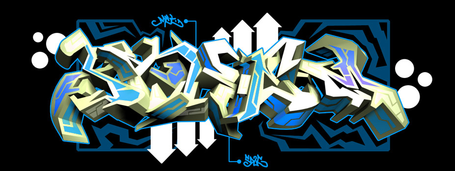
Yeah. This was my contribution to the ~ all-city secret mens business collaboration.Looking back, it's not as good as it could be, but i'm still pretty proud of it. Enjoy, peeps.
Comments/Crits greatly appreciated
Related content


Comments: 11


 (Smile)")


This is VERY nicely done. The patterns in the blue make this piece.
~Orion
👍: 0 ⏩: 0

I will be stealing your fill ideas fyi. You got that down man. Very nice stuff.
👍: 0 ⏩: 0

sheit i forgot to watch ya. nice...bits especially at the top left of the A. the hole in the a could be a little bigger, maybe curvin up into a rectangle, but otherwise this is deope! perfect lines 2. my new pic is pretty grafftastic u mite like it. keep it uppppp

👍: 0 ⏩: 0
blanket [2004-07-19 08:25:17 +0000 UTC]
pink!!!!!!!!!
haha, kidding
looks really nice, and yeah... just cool.
👍: 0 ⏩: 0


that looks real cool. the inner stroke adds a nice touch. you'd figure it would be a little crowded, but its pretty easy on the eyes. it goes good with the others on the actual piece, too....keep it up
👍: 0 ⏩: 0