HOME | DD
 shadowpencil — Always Read the Fine Print

Published: 2007-07-19 04:28:41 +0000 UTC; Views: 87406; Favourites: 1198; Downloads: 2254
Redirect to original
Description
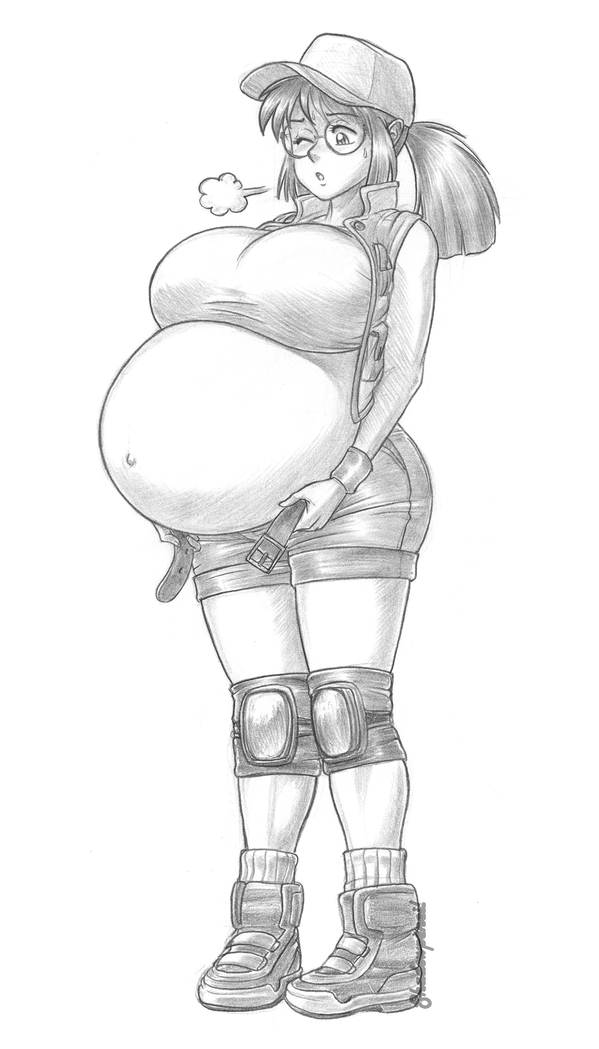
So here it is at last, my part of the art trade, I hope you enjoy it ! It was inspired by a tiny portion of the ICMM story.Please do tell me about any mistakes, it is a very large image (over 2 MB! Beware if you want to download it!) and it's hard to spot all of the tiny mistakes on it. There were also others that I just couldn't correct despite being identified, but I'll let the you tell me how it looks.
"International Competition Miss Mars", Katy Liberty, Jin Mei Zhong and Emi Saito are owned by SaburoX.
Blue Mary is (C) by SNKPlaymore. Chun-Li and Ibuki are (C) by CAPCOM.
Image by shadowpencil (me).
Related content


Comments: 76

This is absolutely perfect! And I thought the sketch was good enough as it was to begin with. For an added bonus, you gave us dialogue, which is a definite plus in my books 'cause I love comics.
Except for Chun Li, I don't know the other characters their representing that well, though I am familiar with them. Still, out of the three, I think Katy resembles her game counterpart the most. Kinda wonder why her face has that blue color; I've seen it used before, but you wouldn't call it a blush, would you?
👍: 0 ⏩: 1

Thanks for your comments.
I made Katy's "blush" blue to reflect "ill feeling, or mortification" [link] Jin's had to be red because she is angy, and Emi, being so shy, had to be red as well to reflect the intensity of her embarassment (not as much for what she wears as for what she could had been forced to wear).
👍: 0 ⏩: 0

No. I did it practically all in Paint Shop Pro 9. I did use a lot of vector lines, though.
👍: 0 ⏩: 0

I think the one critique that I can give you is that the one dressed as Chun-Li (Jin, I think?)'s right breast doesn't seem as circular as her left one. But that's a minor one, really. Like others have said, the linework is very detailed and the coloring really looks clean and smooth. The background is also nicely done. Great work.
")
👍: 0 ⏩: 1
Thanks.
It is indeed Jin. Perhaps you're right about that detail. I unfortunately, couldn't do much editing after the handrawn part was over. I hoped the perspective could explain that detail.
👍: 0 ⏩: 0

It's really very nicely done. Katy and Emi are so cute, and Jin just looks plainly fed up. I can't find much to critique...but then again, such is the curse of one who writes. I will agree with Darien, though, on Jin's quote, which initially confused me.
But of course, as an SNK fan, I loved Emi's quote...and it makes me wonder how well the "Other kunoichi's" outfit would hold up to her tummy.  (Smile)")
👍: 0 ⏩: 1
Thanks a lot.
I think there's more than one kunoichi that Emi would fear to be dressed as, but the one from SNK is the obvious choice as her most feared
👍: 0 ⏩: 1
*tires to think* ...oh...yeah...Namco has one that she would HATE...*thinks of Emi in that outfit*
👍: 0 ⏩: 1

I love the Girl on the Right!
My three favorite remaining Miss Mars Contestants in the same pic! Way to go!
👍: 0 ⏩: 0

...Jin in tight pants. 'blushes'
Damn that's good!
Keep it up! Your work rocks!
👍: 0 ⏩: 0


hehe, very good job! n.n this is a VERY amazing piece of artwork. Great job with...well..everything! xD
👍: 0 ⏩: 0


*drools*
Utterly awesome job, Shadow. The jokes are good, the colouring and linework even better, and well, you can probably guess what I think of the subject matter ^_^;
I'd really love to give you a full round of constructive criticism on this, but I'm really badly under the weather right now and I don't think I'd do you justice, so consider this an I-O-U.
Although I will say this; both Emi and Ibuki have black hair, so it's kinda odd that Emi has brown (highlights?) hair here. Also it took me a minute to realise that Jin's comment was responding to the title; at first I thought she was talking to Katy, and saying she wore her own belt or something, which didn't make a whole lot of sense.
But minor nitpicks that don't do anything to harm a great picture.
👍: 0 ⏩: 1
Thanks a lot for your comments.
Regarding Emi's hair: though I took most of the colors from the pre-competittion portraits, that particular detail of Emi's hair was based on Saburo's "Girl's Night Out"; I must admit that the colors in that picture are a bit different from the original portraits.
I must admit that the speech ballons might be misplaced. I rushed a bit in making them as the program I use slows down on certain ocassions and I feared I could not save the image.
👍: 0 ⏩: 1
And now for the overdue critique...
First about colours; I can see what you mean, her hair does look a little more brown in that picture, but I'm fairly sure it's because there's a kind of reddish light shining on all the girls (you'll notice that Victoria, Jin, and Elena's black clothes are also tinted). This is kind of Saburo's domain, though, so I can't be certain.
The expressions are all great, I like how Katy's blush is more blue, it helps to emote her discomfort over embarrassment. I'm almost surprised you kept the light source consistent across all three girls. While that's pretty darn neat, I am inclined to ask why, if they're standing on the middle of a stage, the biggest source of light is off to their left, and not above Jin, or just spotlights. I think it wouldn't hurt to give the light source presence (i.e. umm... draw light... shining... in the air...?) in a picture like this. But I'm no artist so I could be way off here.
I've said it before, but it bears repeating; I'm always impressed by your ability to draw digits (fingers, toes). While I'd say there are occasional misses, times like this they all just look spot on.
The background is a little drab, but that's easily forgiven.
Man, other than that I can't think of anything to critique. It's just plain awesome.
👍: 0 ⏩: 1
Thanks a lot for taking time to complete your critique!
Now that you mention it, I didn't think of that (the reddish light) when I saw the "Girl's Night Out" picture. I did notice the difference in colors but couldn't think of a cause related to the ambient of the picture. Maybe I should have asked. Also, I recently watched this deviation (and others) in another computer thats has a better monitor (mine fails horribly at brightness and such) and I see that I could have chosen better colors if I had not this technical problem.
Regarding the light source, I think you're right in asking why, and I admit I got that one in a rather unconventional way (or plainly screwed it up, whatever you like the most ")
Unfotunately, I have not been to many cosplay events myself (I'm not very fond of them), so I couldn't think of anything more to add to the stage. Perhaps some confetti would have helped?
Thanks for noticing the little details. Fingers and toes are sometimes a bit hard to make, so I'm glad that you pay attention to them
👍: 0 ⏩: 0

I think all your hard work definitely paid off, as this is a really great picture. The coloring is clean and really vibrant, the linework sharp and detailed.
Also, the background and character lines also add a lot more humor to the picture than there was in the lineart (which was also great in its own regard) so I think the concept comes through more here and adds another dimension to an already wonderful piece.
Good work!
👍: 0 ⏩: 1
Thanks a lot. I'm glad you liked it!
👍: 0 ⏩: 0


I love the girl in the middle the most.
👍: 0 ⏩: 1

<= Prev |