HOME | DD
 Shinybinary — Attractive offers

Published: 2007-08-11 13:00:39 +0000 UTC; Views: 22861; Favourites: 403; Downloads: 3476
Redirect to original
Description
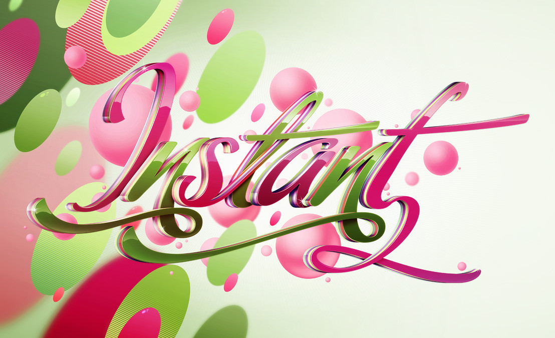
Some typographic work for an advert for BA. The colours were tweaked and changed by the client quite a few times until I can't even remember how they were originally. Original size is 8500 x 5500.Related content


Comments: 95


There is no need in my comment i think... you have plenty of 'em. And BTW i think you are not reading
👍: 0 ⏩: 0

How i wish i could do this stuff Dx It really looks nice! I love colors!
👍: 0 ⏩: 0


Oooh hohoho, soo sexy. Really demands a closer look, the detail is amazing, and your colours great.
👍: 0 ⏩: 0

I can't believe!
It's sooooo cool. I like your typo.

👍: 0 ⏩: 0

Oh that's sweet. I love the swirls. Nice colours too.  (Smile)")
👍: 0 ⏩: 0

great feeling for typography and the letters looks great. also the colours and effects in the background a good choice.
👍: 0 ⏩: 0


WOWOOW !!!!!
HOW DO U DO THESE CIRCURLES?!
it's amazing
👍: 0 ⏩: 0

do something with my name DESIREE, your sooooo goood!
👍: 0 ⏩: 0


how do u do it man i really love this man i wish i could do that sort of stuff +fav
👍: 0 ⏩: 0


Thats tight. Although the kern and leading around the "ttr" in attractive bothers me.
👍: 0 ⏩: 0


that's absolutely my colors and my thang!! I love it!!
👍: 0 ⏩: 0

sexy ")
👍: 0 ⏩: 0


ooo i really like this. spirally things remind me of si scott. x
👍: 0 ⏩: 0

really nicejob, the lettering has a nice touch, and I definitely like your style
👍: 0 ⏩: 0

i really like how you composed the swirls. nice colours, a refreshing artwork from you
👍: 0 ⏩: 0

thats really nice, swirls are generally over used and boring, but deffo comes into its own on this. loving it
👍: 0 ⏩: 0


And another amazing work! Love the colors of this one!
👍: 0 ⏩: 0

not too keen on the text, but the swirls and colors are sexy bro.
cheers.
👍: 0 ⏩: 0

 (Wink)")


stunning!!the white font looks really clean and elegant

👍: 0 ⏩: 0

<= Prev |