HOME | DD
 Shinybinary —
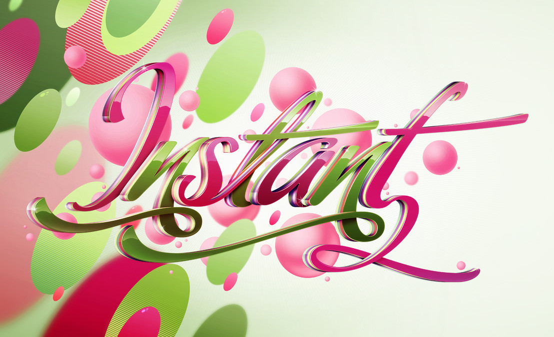
Instant
Shinybinary —
Instant
Published: 2009-03-13 14:52:30 +0000 UTC; Views: 45135; Favourites: 909; Downloads: 1883
Redirect to original
Description
Client work, all about the type really, the background had to be quite simple and easily removable (ie not interact with the text). All Photoshop this time.Sober colour version too: [link]
Related content


Comments: 181


")

 (Smile)")


Excellent. Very crisp and hip, like it grabbed my attention instantly on the Daily Deviations bar.
👍: 0 ⏩: 0

I can't get over the level of detail in the type. It really is an amazing image.
👍: 0 ⏩: 0


Wonderful!
congratulations,your DD is really deserved!
👍: 0 ⏩: 0


That, my friend, is some slick work.
Gotta say though I prefer the sober version, possibly because the blurred background adds depth.
Either way, I hold these skills to be self evident.
👍: 0 ⏩: 0
 (Wink)")

A most beautiful design with some great colors and for some reason it seems like candy to me! Great sharp design that catches the eye from a distance! Excellent work and congratulations on the DD!
👍: 0 ⏩: 0


Damn how could I miss this Nik! Didnt checked out my deviantwatch in a while!
But this looks really amazing man, great use of light, shine..
Really worth watching this! Im sure starbucks is happy with this! well done mate
👍: 0 ⏩: 0


I love how many people ask is it done in 3D program when you said in description lol. I can see how you did this, but I would love to just watch you once do an entire piece step by step, keep it up
👍: 0 ⏩: 0


sweet!i love the colours and lighting etc, looks so shiny! : )
👍: 0 ⏩: 0


OMG² is like it were made of crystal!
I love this effect, but I don't know do it lol
👍: 0 ⏩: 0


Love it, very nice manipulation of that font. Sometimes the uppercase "I" is difficult to read when I use it but here it really is clear. Very nice use of complementary colors.
👍: 0 ⏩: 0

That is great work, how did you do it all in photoshop?
👍: 0 ⏩: 0

i hate that word "sober" the executives used aaaaall the time! lol
Great work! yup
👍: 0 ⏩: 0


| Next =>