HOME | DD
 shr00m — electronicz v1
Published: 2001-07-19 05:52:49 +0000 UTC; Views: 901; Favourites: 0; Downloads: 264
Redirect to original
Description
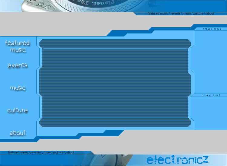
I made this for a friend. All done in photoshop. I don't really like the left sidebar for the links. Looks to plain but I could't think of anyway to make it look better. So here it is. Please comment/grade.Related content


Comments: 4

I like the color scheme, and the design is pretty tight as well, another different layout. On the right you have the "headers" of chatbox and playlist, I'd add something similar to the left like navigation or menu, it'll balance it out more. Also, make the font of the menu more legible, it's hard to read. Good work.
metadream.com - Sal Loria
deviantMAG.com - Senior Editor - Software Reviews
deviantART.com - Addict
👍: 0 ⏩: 0

i like the design, though the typography could use some works, and the grey doesn't quite match, other than that it owns
------------------
I once heard the shortest horror story:
The last person on earth sat in a room,
Something knocked on the door
👍: 0 ⏩: 0

When text goes on top of those scan lines it will look really fucked up. maybe border the content area in scan lines and put a defined border around the content area too.
👍: 0 ⏩: 0

nicely done man, i like it.. although i think you could probably do better with the fonts on the left and right side of it.. but overall its pretty nice. also might wanna do somethign with those big blank gray areas on the top and bottom.
-roq
👍: 0 ⏩: 0