HOME | DD
 SkiesOfAzel —
Atolm
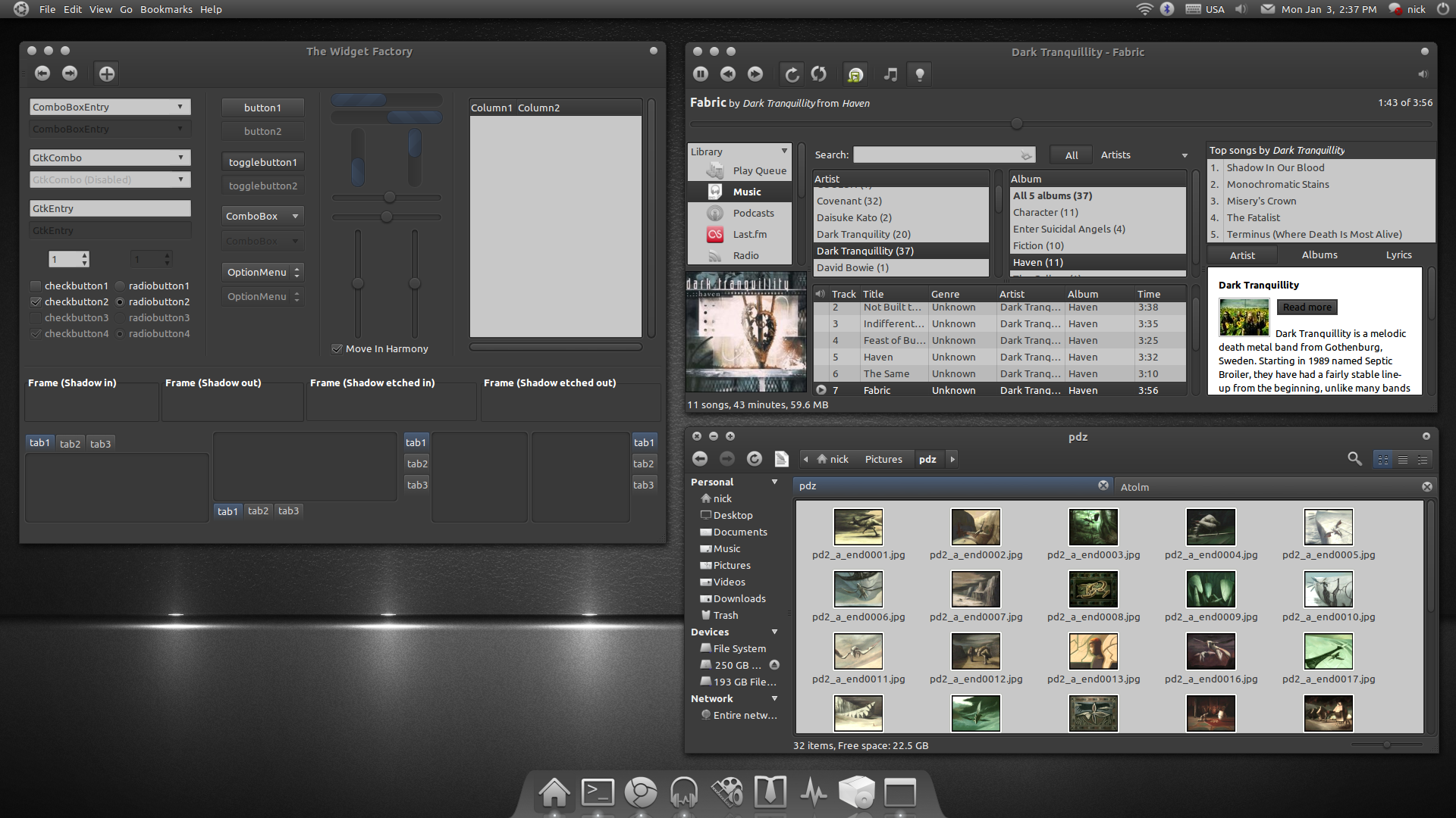
Published: 2010-12-29 18:29:42 +0000 UTC; Views: 168136; Favourites: 310; Downloads: 54541
Redirect to original
Description
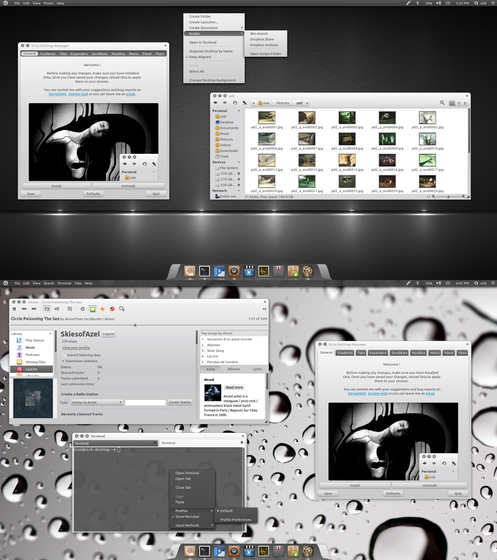
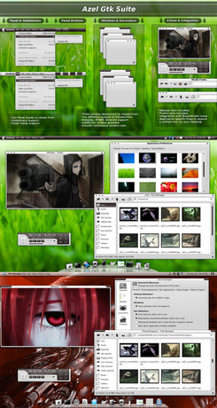
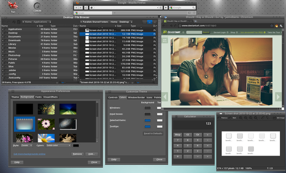
Version 0.7.5 :This theme is a collaboration between me and MonkeyMagico whose mock up was the initial inspiration behind Atolm.
You will need the murrine, pixbuf and equinox gtk engines to use this theme. The AwOken icon theme is also highly recommended as is Nautilus Elementary.
Installation :
PPA :
Make sure you have uninstalled any older versions of the theme before installing via ppa. For good measure type on a terminal :
rm -R ~/.themes/Atolm
to install the Equinox gtk engine (provided by Tiheum ) :
sudo add-apt-repository ppa:tiheum/equinox
sudo apt-get update
sudo apt-get install gtk2-engines-equinox
to install Atolm :
sudo add-apt-repository ppa:nikount/orta-desktop
sudo apt-get update
sudo apt-get install atolm-theme
to install the Atolm xfwm4 decorators :
sudo apt-get install atolm-xfwm4-decorators
to install the Atolm emerald decorator :
sudo apt-get install atolm-emerald-decorators
Manual Installation :
just extract the contents of the zip file somewhere and drag and drop the Atolm.tar.gz and Atolm-Squared.tar.gz to the Appearance Preferences window (again, make sure you have uninstalled any previous version first). You can also install the emerald theme via the Emerald Theme Manager.
Customization :
If you prefer the old tabs, edit the gtkrc file (found inside ~/.themes/Atolm/gtk-2.0/ or /usr/share/themes/Atolm/gtk-2.0/ if you have installed via ppa) and replace the line :
include "Styles/tabs1.rc"
with this:
include "Styles/tabs.rc"
If you don't use Nautilus Elementary, edit the gtkrc and make this line:
include "Apps/nautilus-elementary.rc"
look like this:
#include "Apps/nautilus-elementary.rc"
OpenOffice and most other Gtk apps now have a different base and text color than the rest of the theme. This is unavoidable if you want to have a usable OpenOffice. If you want to have a unified look, you can make all Gtk apps follow the same settings by setting the Input Boxes background color to 5C5C5C and the Input Boxes text color to ECECEC.
License :
GPL3
Thanks :
I would like to thank my partner in crime, MonkeyMagico , JurialMunkey for his valuable feedback and advice, Sword1ne for his amazing wallpaper and all of you that keep supporting my work


Changelog :
- Squared Metacity decorator added.
- Xfwm4 normal and squared decorators added.
- Emerald decorator added.
- Text color of the contact name on the pidgin messaging window fixed.
- Text color of the JDownloader exit dialog and progressbars fixed.
- Text visibility of titles and quotes with lLiferea fixed.
- Firefox entry dark text on dark color bug on some sites fixed.
Related content
Comments: 183

Always a awesome work Skies, you and monkey are the pride of the linux theming, what we would do without you?
👍: 0 ⏩: 1

Superb ! Looking forward for new releases 
👍: 0 ⏩: 1

Awesome work as usual !!! I know you will not settle for nothing less than perfection and you will keep moving towards fixing the latency issues, though i dont really find anything annoying about the performance
Thanks once again and waiting to see more updates on this.
👍: 0 ⏩: 1

Thanks, i will optimize it and bug fix it of course, but it will remain a simpler theme than Orta.
👍: 0 ⏩: 0

Nice work.
Can't say I'm a big fan of the scrollbars or tabs though; the tabs in particular look clunky IMO. The colours remind me a lot of elegant gnome, and can't say that I have ever particularly liked that dark blue colour, but that's a personal choice. The shadows/dark border on the GtkScrolledWindow/List/Treeview look a little off. The thick dark lines on Scrollbars/Tabs/Scrolledwindow is quite off-putting IMHO. I don't mean to sound overly critical or negative, more just trying to provide some feedback. Overall it is really very nice work and consistent. From a usability stand-point, the theme works well.
Also, I think I can help you with the speed issues. The biggest performance hit is from using a shadowed text style on checks/radios/buttons. Murrine really struggles with shadowed text on all the various button types. Change your button.rc to textstyle=0 and you will notice a massive improvement in performance. My GtkPerf speeds went from around the 12 mark to around the 7 or 8 mark by changing that option. Still not the fastest horse in the stable, but improves performance enough to send it to the track
👍: 0 ⏩: 1

Thanks, critical feedback may not sound as pleasant, but is always more useful than the usual comments, especially when it comes from someone as experienced as yourself 
I am not that happy with the tabs myself, i couldn't replicate the tabs of the mock up so i went for button style tabs. My free time for this project was less than a week so i had little time to experiment with different things. I also toyed with light colored scrollbars but i didn't include them in the end because i wanted to stay as close to the mock up as possible. I may add them as an alternative in the future though.
The colors are kind of conservative, but they work for most users and that was the intention here. Initially i contemplated creating a dark theme with a deep dark blue (close to black) bg color and light blue-green (neon like) highlights, but after the Orta experiment i chose to do something more down to earth instead (hence the engine options as well).
The shadows as most everything that has to do with design is a subjective matter and i kind of like the result. As for the thick dark lines, they are there for extra contrast, not beautification 
Btw, thanks for the tip about the text, you are a lifesaver 
How are things going with your WIP? Is it close to release? I am really looking forward to it 
👍: 0 ⏩: 1

Yeah the tabs were the one thing that I thought you could do better on. The rest was mostly personal choice.
Re: Shadows/Dark lines - the indented shadow on the notebooks looks fantastic, but the one on the GtkScrolledWindow treeview doesn't seem to match and has a dark border, that is what I was getting at (Appearance preferences > Customise > Controls tab is a good place to see what I mean). Its not a huge issue... I just thought it would be nicer if it matched. But I think I'm starting to see why you had to do it that way in order to make the selected items sit flush with the border.
I also see your point regarding better contrast for the scrollbars. I just thought the ones in the mockup looked really fantastic.
Oh, I wouldn't say Murrine is slow either, just has so many options that sometimes you have to be careful because certain things don't work properly with certain widgets
WIP is going well. I think there are some things that are just impossible for me to fix, and I also might have to resort to more pixmaps than I originally planned. But overall, its coming along nicely and plan to release it shortly after the new year. The main thing stopping me from releasing it is finding the time to sit down and create a metacity theme (its only emerald at the moment), I just find metacity a pain to work with but its kind of a necessity to releasing it.
👍: 0 ⏩: 1

Actually the Notebook and scrolled window shadows are almost completely the same. The have the same lightborder, the same dark border, the same opacity and the same lighting. There are 2 differences though : The Notebook shadow is 6 pixel wide instead of 3 (because frankly 6 pixel wide scrolled window shadows would be excessive) and most importantly, the shadow is followed up by the base color instead of the window color in the case of the scrolled window, creating the optical illusion it's darker that it actually is. The thing is that the pixmap engine uses the bg color instead of the base color for the background of the transparent shadow, so it doesn't blend smoothly with the inside of the widget. With Orta i just included a white background inside the shadow pixmap, but that created uniformity problems in many cases i had to patch individually.
I had to modify the scrollbars of the mock-up for 2 reasons. The first was the size of them. The vertical gradient looked nice when the bars were oversized, but didn't look that great when the scrollbars had a reasonable width. The second reason was the lighting which was completely off. The rest of the theme has a light source on top, the scrollbars had a light source on the right. I am still not satisfied with the contrast though, so i will try to include some light colored ones in the future, but the text color bugs are a priority right now. I have 5 more days of free time to fix whatever i can, and then i will be otherwise occupied for approximately 2 months, so i have to prioritize.
As for murrine, i am a novice at best with it, so i will take your word for it. You probably know it better than most other Gtk themers out there.
👍: 0 ⏩: 0

And since we are into bowing, domo arigato gozaimasu
👍: 0 ⏩: 1

I was just thinking of suggesting to you, a dark version of the orta ... try it now.
I'm your big fan. thanks for your work
👍: 0 ⏩: 1

[link]
[link]
[link]
some problems with the text on some occasions, however, makes really well. I like it.
👍: 0 ⏩: 1

Evolution just doesn't know when to quit 
👍: 0 ⏩: 1
<= Prev |
