HOME | DD
 smar — Bright-Ice
Published: 2001-12-29 02:16:32 +0000 UTC; Views: 1002; Favourites: 4; Downloads: 390
Redirect to original
Description
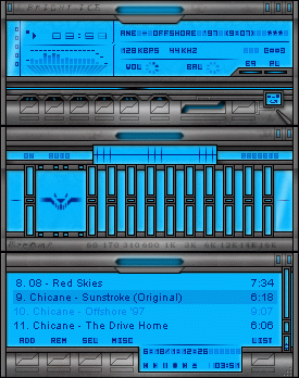
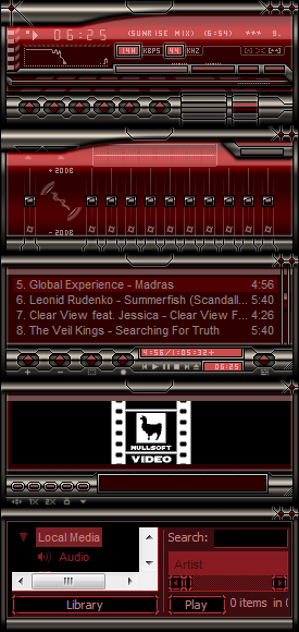
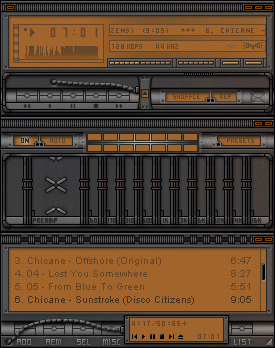
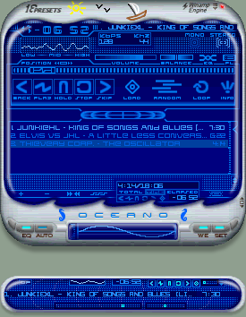
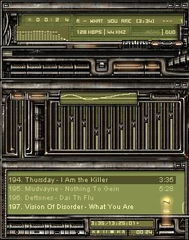
Whoa!Now this one took some time to finish.
I started working on a different skin,
but I didn't like it much.
So I tried something else and this is what
it become.
This isn't a typical "metal" skin.
It's the display that is what makes this skin.
My thoughts where to make something different
than the usual metal skin.
The bright blue display is very common as a
backlight for watches and other displays.
Even though, it is rarely used on WinAmp skins,
so I thought I'd give it a wirl .
Maybe I'll make more different display colors,
but I wanna see how this one is going.
Related content


Comments: 21

They're is nothing wrong with the blue. Bright can be attractive when it has to. Again the play buttons are very unique. It doesnt really look metal to me. Its an amazing skin.
👍: 0 ⏩: 0

Lovely skin! Great buttons!
-----
Get The Best Winamp Skins on DA, all in a convienient DevPack! https://www.deviantart.com/packs/view.php ?id=723
👍: 0 ⏩: 0

i absolutely love the blue
Join The Revolution Today
👍: 0 ⏩: 0


Nice one, cool buttons. The displays might be just a bit to bright for my taste but it fits the skin.
-Smaken är som baken, den är delad-
👍: 0 ⏩: 0

ohh! this is a rely god skin! great work!
nice too se that you are alive smar.
:>
> mikkeh.com
👍: 0 ⏩: 0

c00l skin once again smar!
woha i luve the way you made the volume and balance!
👍: 0 ⏩: 0

cool. Like the buttons. It's not too light, btw - very good colour selection. Speak to ya later.
~BlackIce
CrazySunArt: http://crazysunart.narod.ru
Dominion: http://www.dominion.net.uk
👍: 0 ⏩: 0

Nice skin, love what you did with buttons and volume/balance. It's too bright for my taste but it doens't make it any worse.
👍: 0 ⏩: 0

*masa klicks on the download button*
--Im fast as a rat in the ocean
👍: 0 ⏩: 0


Whoa...that's one hell of a skin! Good job smar!
Damn......I REALLY like this one! The only flaw I can point out is the blue is a bit too strong/bright. Not sure if you'd mind lightening it up or maybe making it a bit more transparent??
Groovy-ass skin dude! Awaiting more!
--faiboy--
👍: 0 ⏩: 0

nice. very cleen. blue's a bit bright but whatever.
alter-ego
no offense, but you suck.
👍: 0 ⏩: 0

Nice job smar! It all works really well as a unit. If I may, I'd like to gripe about a thing or two...
I'd like to see a little more brightness when the buttons a pressed. Can't help but feel a nice glow behind the opening mechanism would look a bit cooler. The number font looks a little quirky. A little more refinement in regards to the 'backlights' on the titlebars.
Regardless of my fickle whining, its a great skin with some well implemented ideas (volly, balance). And the EQ is really nice with it's pseudo-3d appearance.
:: the future has already begun ::
👍: 0 ⏩: 0

This is nice work Smar. I like it alot. The blue is great. I love how the buttons open up. Very cool.
- enjoy our quality responsibly -
(amorenite95 is coming soon)
👍: 0 ⏩: 0

i like it....ill use
(¯`·.,¸¸,.·´¯`·.·•angelsfaith
👍: 0 ⏩: 0

oh wow!! I love this! The buttons here are awesome as are the volume and balance sliders. The backlit blue is fine with me. The only thing i don't like is the title bar text. Either switch the font or leave it out altogether, IMHO.
It's also great to see some effort put into the the winshade modes aswell
Great skin
👍: 0 ⏩: 0

yay i like that turn down on the blue though
the cokester
👍: 0 ⏩: 0

i love this skin...im working on my litestep theme, and i really like this color blue...i have my monitor set really dark, so its not too bright for me...just right. i think ill switch my blue color to something closer to that.
=
we are decreed,
Reserved, and destined to eternal woe;
Whatever doing, what can we suffer more,
What can we suffer worse?
Paradise Lost
II, 160-163
👍: 0 ⏩: 0

ah very nice skin I like it alot.. and it´s cool to use too.. only thing is the bright blue display color.. it´s to bright for me.. would prefer an darker color there, so I hope makes one ..
ah.. great work
__£-Ø-í-Ð-ë-Ñ ___
Ako ay iyong sofa
CrazysunART - http://crazysunart.narod.ru/
_______________________
👍: 0 ⏩: 0