HOME | DD
 softer — -i-vinsmodernity
Published: 2002-02-05 04:24:12 +0000 UTC; Views: 2008; Favourites: 2; Downloads: 628
Redirect to original
Description
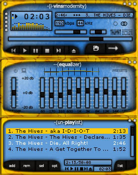
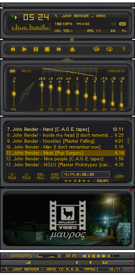
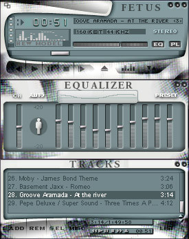
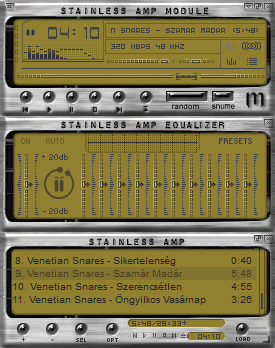
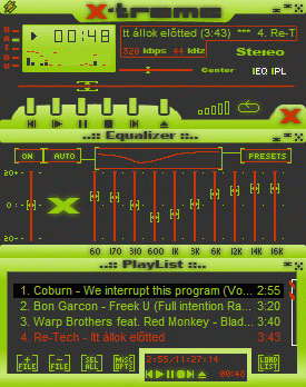
My second winamp skinning attempt. Much brighter this time.Related content


Comments: 18


Ooh, i lobr this. The bold contrasts are great.
-----
This comment is provided AS IS without warranty of any kind, either express or implied. The entire risk arising out of use of the comment lies entirely with you.
👍: 0 ⏩: 0

I like this skin, it's a little rough and that adds the final touch of perfection to it. Good Job.
-----
.:Love doesnt make the world go round but it does make the ride worthwhile:.
👍: 0 ⏩: 0

a grey border would kick ass . . .
-----
Join The Revolution Today
👍: 0 ⏩: 0

the design is very good, esp for a 2nd skin, but personally i dont like that yellow border (i seem to be in the minority on this). apart from that, this is a cool skin, keep it up!
👍: 0 ⏩: 0

I really like the colour scheme, but i have to agree with zkreso, it's a little to blurry.
👍: 0 ⏩: 0

The shapes are nice and it's a nice concept but some of it is kind of blurry
-----
-----------------------
Zlatko Kreso
Breed Skin Division Head - http://www.breedart.org
Project Pallus founder - https://projectpallus.deviantart.com
DeviantArt member - https://zkreso.deviantart.com
Plastik v4 webmaster - http://plastik.pillboxed.com
And occasional skinner
👍: 0 ⏩: 0


I would never use this skin because of the extreme contrast, but that same contrast makes it really well done. Nice job.
-------
* splat@dmusic.com
👍: 0 ⏩: 0

I really love that golden color.. A little too blurry, though.
____
in my nothing, you meant everything, everything to me.
👍: 0 ⏩: 0

nice nice nice...
love the colors
easy in the eyes and easy to see
good job man...
can't wait to see more..
The Darkest Realms Exist Within The Brightest Minds.
👍: 0 ⏩: 0

Cool colors, one thing i would like is a bit more contrast in the title lettering to make it a bit sharper.
👍: 0 ⏩: 0


woa..this is pretty sweet..especially for your 2nd skin...I expect to see more skins from you
the yellow and blue actually kinda go together nicely, imo
👍: 0 ⏩: 0

If the yellow was the same color blue, then I would download. Never the less, still a good skin.
👍: 0 ⏩: 0
