HOME | DD
 spx — notitle

Published: 2002-09-13 17:47:24 +0000 UTC; Views: 1190; Favourites: 15; Downloads: 129
Redirect to original
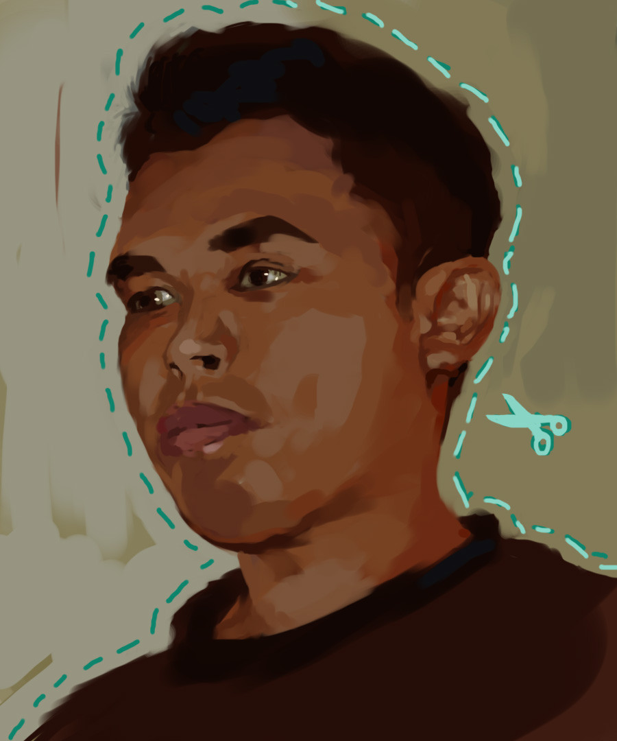
Description
no good with titles, sorry!ps7 and graphire
Related content


Comments: 17


i love it when you put a little clear detail in your work , it shows your great skill and im just a sucker for facial details..
👍: 0 ⏩: 0

Very nice colouring on the face. I love the intense light hitting the front of her head. I like that grainy brush you've been using too.. gives and interesting texture, almost like chalk pastels.
👍: 0 ⏩: 0

once again, luv the facial expression, especially the nose
👍: 0 ⏩: 0


There's a lot of movement in this. Kinda like it's starting to warp back in time... maybe. It's abstract in some respects, with realisim thrown in there to give you hints that it's actuall human. Or is it? Bewildering. But there is a good amount of detail in the face. I suppose the contrast in detail and non-detail pulls you towards the face itself, which I assume is the main focus. As far as a title... well, how about "confused woman" or "crazy blah?" I don't know. I'm not good with titles either.
👍: 0 ⏩: 0

princess mercenary is good, ack, no good with titles too!
this one's nice, i like the naughty expression on her face. ofcourse brushwork is sweet as always
👍: 0 ⏩: 0

Very interesting piece man. Very abstract. I really like how it seems like you've taken basic shapes and made into so much more. It also has an appearance of everything flying in from a certain angle to join together to make one whole piece. Excellent work.
👍: 0 ⏩: 0

oh. nice, but the black field in the corner feels a little weird.
👍: 0 ⏩: 0


man, hope U don't be upseted by my last comment.
this one is beatiful. Try to keep amazing us.
Good job!
👍: 0 ⏩: 0


Woooo that's sharper than usual but it's good !
Confusing but really nice, it's one more awesome pic u submit
👍: 0 ⏩: 0

Great pic, I really like the "bluriness" and the choice of colours.
👍: 0 ⏩: 0
