HOME | DD
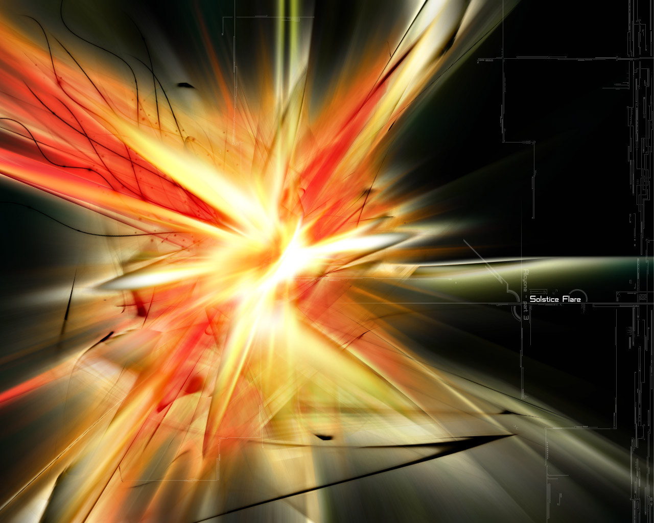
 tranced — Solstice-Confusion

Published: 2002-12-12 04:31:59 +0000 UTC; Views: 1119; Favourites: 7; Downloads: 73
Redirect to original
Description
was trying to get a background for something else and just ended up playing with the colors, really liked what i did and decided to turn it into a wall.hope you like ^^
comments welcome.
version2: [link]
Related content


Comments: 10

Hey this is good, ive been following your work and this is nice, please check out my work, im tryin to get noticed here.. so please leave a comment as well on my newest work
👍: 0 ⏩: 0

Oh no, not again >
There's just too many pieces of work that I like... another one to add to my collection - I have so many arts by many people, but only one can be my background...
👍: 0 ⏩: 0

the contrast against the black and the colors blending in work really well here.
👍: 0 ⏩: 0

good one once more.. love the colours, The treds thats comes down/up (looks like an impact), is rly nice..
Another good pice by you
👍: 0 ⏩: 0


sweet, i like the shapes and lighting, looks like somethin i'd throw together..less busy tho, a very good thing
👍: 0 ⏩: 0

Oo.. I love this! The colors work beautifully together. The typo and 2d work on the right side are awesome as well. Great job! definite
👍: 0 ⏩: 0

Nice. I liked the other version on this quite I bit, but now I'm not sure which I like more...
Keep it up, this is good stuff.
👍: 0 ⏩: 0