HOME | DD
 trashmonkey — MIRO VS
Published: 2006-10-24 17:58:52 +0000 UTC; Views: 93468; Favourites: 246; Downloads: 16369
Redirect to original
Description
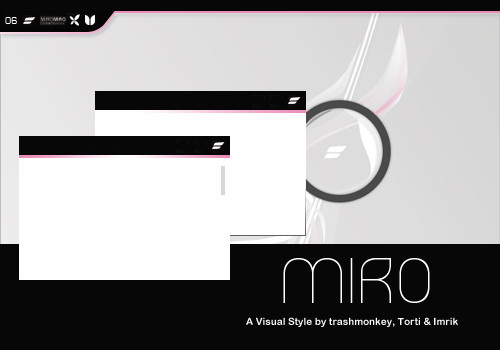
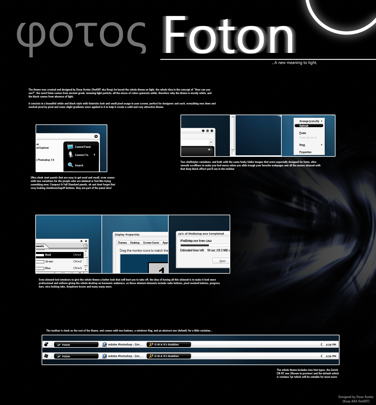
MIRO Visual Style
collab between ~trashmonkey , ~t0rti & ~imrik , based on ~imrik 's MIRO Wallpaper: [link]
PREVIEW: [link]
It comes in 2 versions (borderless & with borders)
MIRO Miranda by Torti: [link]
MIRO Winamp by trashmonkey: coming soon!
MIRO Iconpackage by Imrik: coming soon!
MIRO GuiKit by technici: 60% done
Please don't ask for permissions on any skins or mods!
[link] 4Impressions
[link] UnitedCustomizers
Related content


Comments: 92

And i don't like you
- No
- Why must the startbutton readable?
and the shellstyle is on Autumn-Vacation!
")
👍: 0 ⏩: 1

ahhh
critical comments are not welcome...
no change the content margins? why not, it is a bug!! but i know , you love bugs!
and why must the startbutton readable?
is this an joke? you have put the text on it, or not?
a vs without the shellstyle is only the half part...
greetings tivar
👍: 0 ⏩: 2

rofl...gibts für diese "Shellstyles" nen gutes How-To?
Nee ernsthaft Olaf...deine Comments sind echt geil...
")
👍: 0 ⏩: 1
@technici
... na logisch gibt es es ein gutes how to.
und wenn du mich so höflich fragst gebe ich dir auch gerne eine antwort. traurig ist nur, man hätte das schon eher haben können oder nicht?
ich trage euch nichts nach...
👍: 0 ⏩: 1
Die Frage nach dem How-To war nen interner Joke...nix gegen dich... Was dein Angebot angeht...vielen Dank, aber mit Shellstyles hab ich unter OS X glücklicherweise nix mehr am Hut.
Alles weitere -> trash's comment (ich denke das trifft es ganz gut)
👍: 0 ⏩: 0
...you must so hate me.
but the hype is on your side, what you want more?
haha, you can make shit, but all of users love it. this is great, the glow of gold, haha.
and yes, the truth can bring you pain.
greetings in very friendship tivar
👍: 0 ⏩: 1

Mit diesem Kommentar hast du echt den Vögel abgeschossen! Was soll das? Ich hab mir deine Styles eben mal angesehen! Mein Ding sind sie nicht, weil sie mir zu mmh.. allgemein sind, das soll aber nicht heissen das sie nicht gut gemacht sind! Meiner Meinung nach ist deine Eifersucht völlig unangebracht! Die einen mögen eben XP-Klicky-Bund-Schicky-Micky & die anderen stehen voll auf Sauber und bloss nicht zu viel! Hier gibt es viele die sich auf dieses coole, schlichte Design gefreut haben! Also versau es ihnen bitte nicht!
👍: 0 ⏩: 0

")


i love it, but i do think it needs some trims around the edges
👍: 0 ⏩: 0

I still don't understand why people do this preview-after-and-often-on-the-same-page-as-the-actual-thing thing. Honestly, someone explain this to me. I could understand if you put the preview in some other category, or maybe used it in a screenshot and then linked back to here. But the "preview" is the NEXT NEWEST DAMN FILE!!
👍: 0 ⏩: 1
Wow, thanks for being an unhelpful dick!
👍: 0 ⏩: 1

His question is legitimate. Why do you post a screenshot in the visual styles section? Next to the entry of the visual style itself? Seems like subtle spamming to me...
👍: 0 ⏩: 1
And this is still unanswered. Thanks, UC!
👍: 0 ⏩: 1
True, but he's a member of UC, and other UC people seem to be answering in his stead at times. My original complaint still stands.
👍: 0 ⏩: 0

I found a little glitch, for windows the bottom border and corners are in black rather then white.
👍: 0 ⏩: 1

maybe you activate the substyle
👍: 0 ⏩: 0

i really like the way this was done. the gradients around the buttons are unique and refreshing.

👍: 0 ⏩: 0


Looks really pretty in the screenshot, but when I install it I can't see the titles of windows. There's sexy minimalism and then there's minimalism to the point of impracticality...not being able to see the titles is pretty silly.
👍: 0 ⏩: 1
start stylebuilder and change the captionbar-textcolor to 255 255 255 (#FFF)
👍: 0 ⏩: 0
Very nicely put together as i said over at customize. Great to see Imrik's working with you, cant wait for the winamp and icons!
👍: 0 ⏩: 0

Great skin, but it's pink........
Could you make some other colour versions?
")
👍: 0 ⏩: 0

na da schmeiß ich doch glatt mein WinXp dafür an^^
sieht klasse aus!
👍: 0 ⏩: 0
Sieht klasse aus!
(ist aber leider nicht wirklich benutzbar)
👍: 0 ⏩: 1
inwiefern "nicht wirklich benutzbar" oO
👍: 0 ⏩: 1
Zu wenig Kontrast der einzelnen Elemente, zu kleine Schriftart
👍: 0 ⏩: 1
Einen größeren Kontrast wie Schwarz und Weiß gibt es meines erachtens nicht
Naja und die Schriftart ist mittlerweile ein Standardfont wie du ihn auch beispielsweise bei Windows Vista erleben wirst
👍: 0 ⏩: 1
Hey, nimm's nicht persönlich. Ich hatte ja geschrieben, dass MIRO klasse ausssieht. Aber für einen längeren Einsatz ist er für *mich* nicht geeignet, da er mir bald anfängt, auf die Nerven zu gehen. Ich bin aber sowieso eher ein Freund von Windows klassisch oder ähnlichem. Das ist einfach *meine* persönliche Einschätzung, dass MIRO zwar cool aussieht, aber *für mich* zum dauerhaften Arbeiten nicht geeignet ist.
👍: 0 ⏩: 1
Ich nehms nicht persönlich, wollte nur mal meine Meinung kundtun, geschmäcker sind nunmal verschieden  (Wink)")
👍: 0 ⏩: 0


DAAANKE! Damit hätte ich heute aber nicht gerechnet! Sieht wirklich schick aus!
THX!

👍: 0 ⏩: 0

Wie gern würd ich den nu ausprobieren  (Smile)")
👍: 0 ⏩: 0

<= Prev |