HOME | DD
 tuxie —
nocture
tuxie —
nocture
Published: 2004-02-25 21:55:59 +0000 UTC; Views: 14655; Favourites: 120; Downloads: 11698
Redirect to original
Description
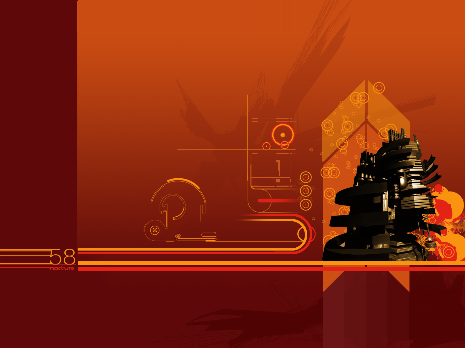
hum,just submitting the wallpaper on my current desktop
 (Smile)")
btw, got inspired by a low-res image from f-disk, which would be perfect on my bg
")
have fun, i'll submit some more art these days
Related content


Comments: 101


The render is great, and you also did a great job on the 2d
👍: 0 ⏩: 0

This looks awesome. Great colors and composition!
👍: 0 ⏩: 0

nice work...........one day i will be at this level !
👍: 0 ⏩: 0

Great 2d work. The 3D render isn't my thing, but it is enough of my thing to be my new :fav: and background.
👍: 0 ⏩: 0


Thats sopoo kewl ^_^ I hope to be as good as you someday!
👍: 0 ⏩: 0

Nice image. The rich, warm colours look pretty good on this image. The only thing I have to question about it is the shapes and their layout. It looks like they are a bit unnecessary in some places, and to be frank, in some places they just dont fit in at all. It also looks as though you've tried to incorporate 'techy 2D' work into the composition, which IMHO is an element that has no place in the image you've created here.
Overall, the render and it's placement, the actual colours and location of most of the elements are good.
And also, once again, kudos on the use of rich reds and oranges, looks great
👍: 0 ⏩: 0


awesome stuff, great composition.. nice colors/2d. congrats on DD!
👍: 0 ⏩: 0


im faving this for pete...
apparently he wants some infinity psds or err something :s
👍: 0 ⏩: 0


this goes perfectly with my orange theme i am sporting right now!
👍: 0 ⏩: 0


yum yum! check out those colours 8 -) gj my man, gj
👍: 0 ⏩: 0

Nice work mate ")
👍: 0 ⏩: 0


This is excellent...i simply love that color scheme..great job!
-Anthriel
👍: 0 ⏩: 0

Its been a while since my desktop has seen red! Great work, love that big machine. Nice compostition overall, and the 2d stuff is cool.
👍: 0 ⏩: 0


Great job ... this is deviantartmanship!
👍: 0 ⏩: 0


Tight, I love the colors you used and the simple flow and graphics of it. Wonderful work.
And congrats on getting the DDF too!
~


👍: 0 ⏩: 0


sweet flow in this one mate
👍: 0 ⏩: 0


like it a lot...the colores a great also like the rende ru use!
👍: 0 ⏩: 0


i like it a lot
however, the structure would look nicer in my opinion if you filtered it somehow a bit to match the colours of the BG better
otherwise, its great
👍: 0 ⏩: 0

Sweet, I love it! the only thing bugging me is that flat color area on the left, although it would be practical to put icons there on Windows Me. and older.
PS. Congrats on the Daly Deviation!
 (Wink)")
👍: 0 ⏩: 0

I hardly ever look at this type of art, gives me the eye sore, I'm lost, but this one I like!
👍: 0 ⏩: 0

very interesting, gotta love thoose background vectors behind render
👍: 0 ⏩: 0

i think the render needs some work.
concept is cool though
👍: 0 ⏩: 0


hey nice work
not 100% sure about the render but still fits quite well, and the peice is broken up well.
mad 2d
👍: 0 ⏩: 0

really nice vectors and colors
render works well
very stylish

👍: 0 ⏩: 0

nice work mate...makes a nice dt, i like the colours and composition..btw - hows our clb?
👍: 0 ⏩: 0

Looks pretty good. I like the design of the lines in the middle-left of the image, they make a futuristic helmet kind of shape. The cut and paste of the concentric circles is kind of boring, they could use some opacity variation. The metal structure has some nice geometry and is pretty neat to look at.
👍: 0 ⏩: 0


Sweet colors and great layout on the 2d..
sweet job man, you know I like the render too
👍: 0 ⏩: 0


<= Prev |