HOME | DD
 val — SCAVENGER TYPE
Published: 2003-05-15 00:51:01 +0000 UTC; Views: 646; Favourites: 4; Downloads: 60
Redirect to original
Description
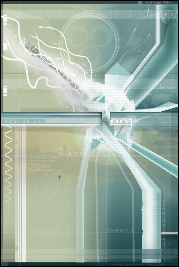
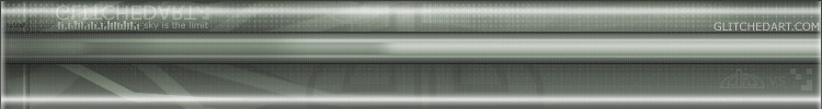
+SCAVENGER TYPE+------------------------
You seek information. You seek knowedge, but the fact is.
There is no answer.
There is no end to something.
There is no start.
No such thing as an element.
No such thing as a beggining..
------------------------
So that's my little theory behind this image. Over 200 layers, in period of about 2 weeks with 20 hours of solid work. It's been fun, and doing this sort of reminded me of how much I love art. I will be making a new layout for my site and all soon.
i'de like to thank people such as monaux, dj-designs, niteangel, ekud, and a few others for inspiring me. you might not know it, but all your hard work gave me ideas for this piece.
please visit
[link] and
[link]
and check out my gallery
ANY comments appreciated. I hope you enjoy it as much as i did making it.
Related content


Comments: 12

i like this maing, your style is very original. nice and professional looking. great colors combos as well keep it up
👍: 0 ⏩: 0

Allow me to add to my comment, it may have came off rude and I'd prefer to be constructive...
What I meant by stopping halfway through it is looks like you perhaps tried too hard, the circular logo in the top middle of the piece seems misplaced or even unnecessary, my eyes keep drawing towards it even though I know it's not the focal point of the image.
To enhance and add depth to the focal point try a subtle gradient in value of the colors towards where you want to draw the eyes. What appears to be an inner shadow along the right side of the left horizontal bar is distracting to the overall image, I definately enjoy the right horizontal bar, it seems more complimentary. The single black + in the mid left seems kinda random.
I do like mix of organic curves flowing into an inorganic structure and exiting out the other side as a changed more mechanical design.
Your font selection is decent, but try to find more fitting fonts, try to make them reflect the piece, more relaxed elegent fonts to the upper left and lifeless square fonts on the lower right. Placement of type and symbols is also important, there are a few instances where overlapping occurs, it should fit neatly into the background or lighter lines.
I hope you find this comment much more useful than my previous...
👍: 0 ⏩: 0

good job... i'm fond of the colors, too. i've no purpose for it, though. make a wall.
👍: 0 ⏩: 0

sweet, nice mix of colours, 2d and 3d, i like it, great work
👍: 0 ⏩: 0

looks pretty cool, trendy yes, but a very cool type of trendy. the 2d looks awesome man, great job and great choice of colors, very cool indeed.
👍: 0 ⏩: 0

Very trendy indeed, I like the wavey lines near the top left hand side, looks good!
👍: 0 ⏩: 0

Over 200 layers? very impressive. Nice piece too. I like the whole layout/design of it and you picked an excellent blend of colors.
👍: 0 ⏩: 0


Glad to see you finally finished it, it looks great All of the elements you used makes this extremely interesting. I really love the colors you used, they work nicely together. The 2d is great as well. nice job dude.
👍: 0 ⏩: 0

A very trendy sort of a piece. One little annoyance for me is the fact that the horizontal center line intersects with the focal point of the image in a weird manner, creating a sort of bump effect over the middle of the explosion.
Ease up on the philosophy there tiger
👍: 0 ⏩: 0
