HOME | DD
 webdiod — Digital Redemption
Published: 2002-05-23 22:25:46 +0000 UTC; Views: 4526; Favourites: 19; Downloads: 546
Redirect to original
Description
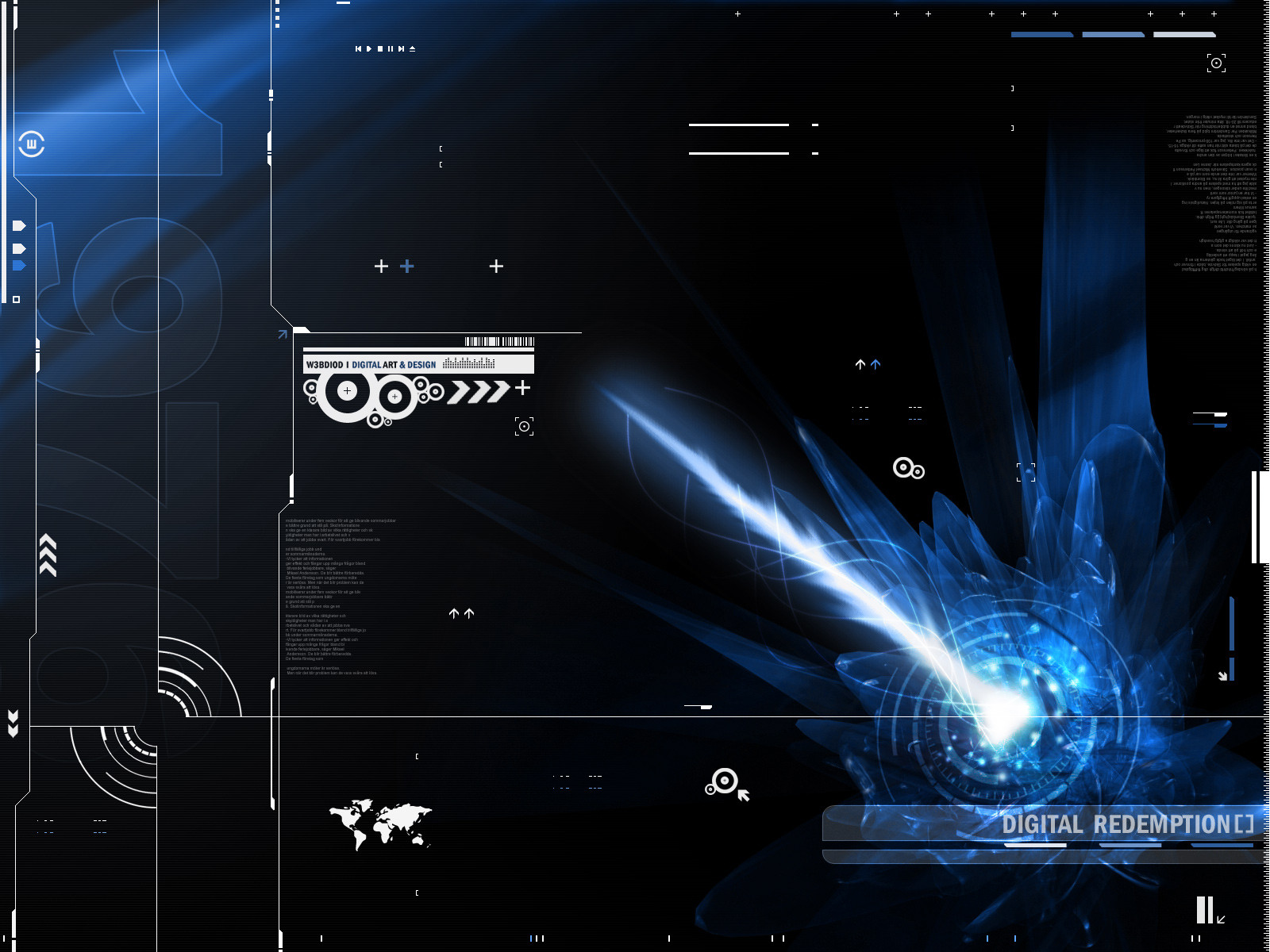
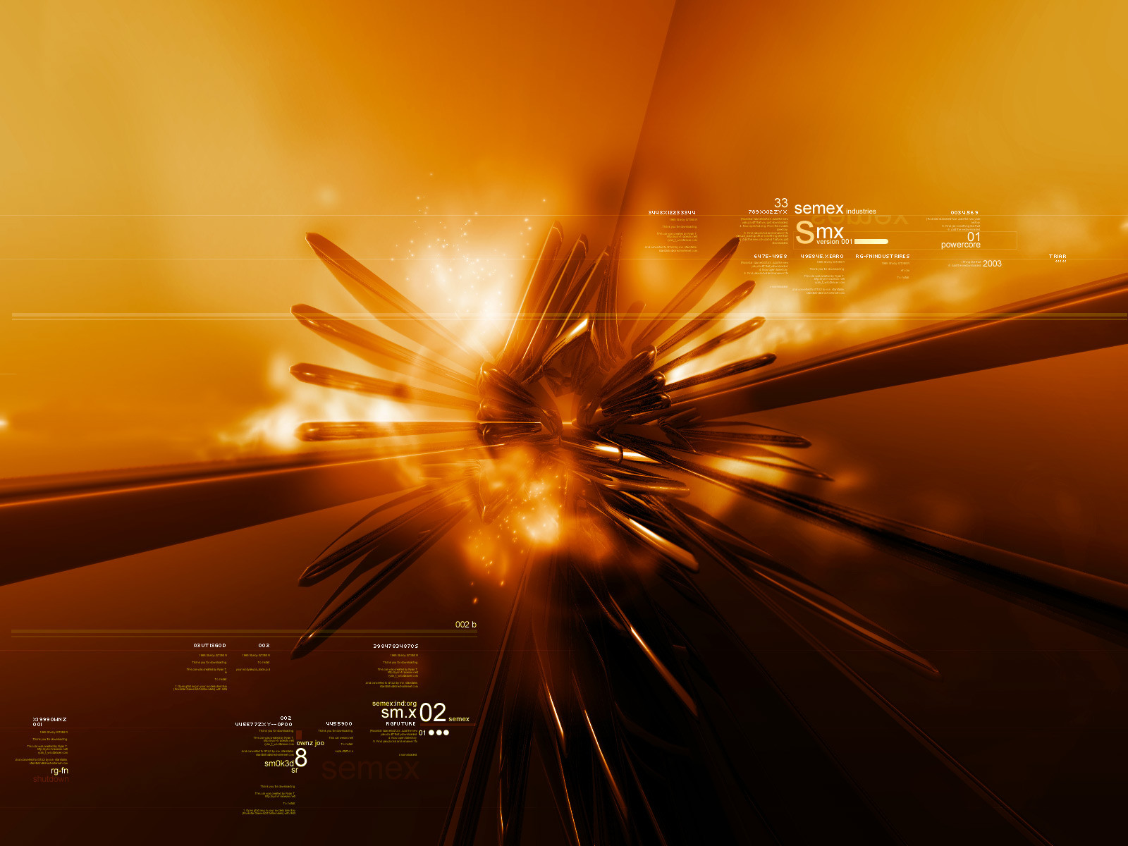
Tried some new things here, a little less transparency on the 2d and shit like that.Took me about 5 hours to complete. 3DSMax for the blue object, the rest is Photoshop. As always PLEASE leave me some comments.
Related content


Comments: 21

Nice Work!, I like that Blue flame Spitting logo!
👍: 0 ⏩: 0

Heh, I used this art as my win98 wallpaper about 5 years ago, when I didn't even though about CG  (Smile)")
")

👍: 0 ⏩: 0


blankey [2002-06-02 00:59:52 +0000 UTC]
way to keep up with the style.
-----
Peep the tightest new gfx site around (just up) [link]
👍: 0 ⏩: 0

very nice design.
oh and it's blue!
-----
.: :.
would you catch me if I fall?
👍: 0 ⏩: 0

niceee, did u make those brushes or did you download them sum where id really love some like that, if you did make them then plz upload them as brushes!
-----
dont think
👍: 0 ⏩: 0

not bad got a little bit of cubadust style 2 it , nice work
-----
Athemë
2MINDED.COM
👍: 0 ⏩: 0


that's not bad!
i like it.. maybe the background needs some more details.. but nice!
👍: 0 ⏩: 0

very nice...good job..love the render and details...airbrushing is great...fav. add-on
-----
[sig][link]
[Link] [link]
👍: 0 ⏩: 0

you are amazing. but PLEASE show the 1280x1024 people some love
i want to use these really bad, i love every wall you turn out
-----
_ _ ___delicious___[link] ___________ _ _ _
👍: 0 ⏩: 0

Very nice.. good use of text and the blue think is awesome!
👍: 0 ⏩: 0

the blue "thing" looks great, but i think the bright white text stands out to much
other than that, great work
hope to see more of your stuff soon
👍: 0 ⏩: 0

very cool man! i really like the typo you did, but i think it should be a little lighter but this is fav worhy +fav
-----
-
++ WastedYouth Programmer - [link] ++
++ deviantMAG Staff (Software Reviews) - [link] ++
👍: 0 ⏩: 0

I like the whispy lines on the 3d part...very nicely done
👍: 0 ⏩: 0

i like it!
-----
_/_/
live your life
so that the preacher
wont have to lie
at your funeral
_/_/
.:§ïlvêr Ðrågðñ:.
👍: 0 ⏩: 0

imo your fotn size a bit big and your lines could use a lower opacity would ehance more the imagry of the bottom right
👍: 0 ⏩: 0

omg i think this is your best WP to date VERY VERY VERY GJ +fav!
👍: 0 ⏩: 0

The less-transparency method works really well in this. I of course love the 3D you do, and the 2D and all is tight as hell! Spectacular lighting and the rest is all good!
-----
___________
+ + + + + www.njyn.tk
👍: 0 ⏩: 0