HOME | DD
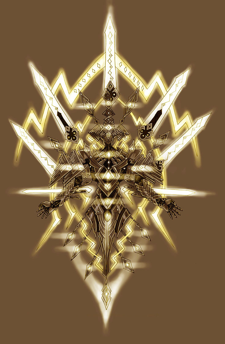
 Wen-M — Angels: Michael

Published: 2007-02-05 06:46:16 +0000 UTC; Views: 349450; Favourites: 9287; Downloads: 97339
Redirect to original
Description
Gold ink pen on black paper. took about 3 hours to draw.photoshop effects took 1 hour.
Related content


Comments: 1416

very well done your use of positive and negative space is great, especially in the contour lines of the figure, the figure is also balanced well with the sword, I would have preferred a either more geometric pattern on the ground or something the one you chose looks to passive in my opinion. Still the complexity of the lines in the body are well balanced by the sword and wings. In the end it is very “good”.
👍: 0 ⏩: 0

For some weird reason, this reminds me of Saint Seya (lol)... Maybe is the gold lineart of the armor, hehe
👍: 0 ⏩: 0

that is freakin amazing, i wish i could draw half as well as that
👍: 0 ⏩: 0

I went through your gallery again and I think this one is my favorite of everything you've done. I have no idea why.
👍: 0 ⏩: 0


You never cease to amaze me.
👍: 0 ⏩: 0

👍: 0 ⏩: 1
(raises both hands and feet)
👍: 0 ⏩: 0


D: give me some of your fucking awesome
👍: 0 ⏩: 0

Hm... it's amazing. I love the sword work, you come up with very original weapon designs. Have you ever considered teaming up with a manufacturer to produce some of your designs? I would buy them.
👍: 0 ⏩: 0

Oh my god, it's so beautiful!
Righteous!

👍: 0 ⏩: 0

wow....its amazing how good, no great, some ppl are at there crafts.
-__- if only i could become this good....@3@~
👍: 0 ⏩: 0

Holy crap that is sooo awesome!!!!! OMG
👍: 0 ⏩: 0

there's something about this one that just utterly captivates me. I lovt it.
👍: 0 ⏩: 0

Dang that is awesome. The lines just seem to glow as if they were lights. Good job.
👍: 0 ⏩: 0

yah, you've definetely been holding out on us. =/
👍: 0 ⏩: 0


")

In all honesty, I would have loved to see this before the photoshop work. I haven't yet looked in your scraps to see if maybe you posted it though. If you haven't, it would be very interesting to see just how much the photoshop did to the overall piece. I love the glow, but you are a talented individual sans technology. Wonderful work.
👍: 0 ⏩: 0

I think it came out absolutely amazing!
👍: 0 ⏩: 0

Three hours!?!? You little @(*$(&$#* Could you at least have the decency to add a zero to that. Just to make us mere mortals feel better?
Gorgeous work, Mr. -M! He looks so sad though.

👍: 0 ⏩: 1

youre not a mortal
youre a goddess.
:checks my book, oh yeah. you are.
👍: 0 ⏩: 1


that must be some fine-tipped pen ._.
now... when you scan, does it really appear that bright? or is that one of the effects?
and i must say, the silver and gold ink so far looks magnificent the way they were done, but i cant help but wonder what comes next?
👍: 0 ⏩: 0


Woah.... just.... woah... ....uhum... yeah... woah.
👍: 0 ⏩: 0


 (Smile)")


It's great. hey, can we see the original without photoshop effects?
👍: 0 ⏩: 0

I think it would look better if your lines were smoother. It is beautiful, but in my eyes, you could have spent a little more time on it
👍: 0 ⏩: 0


O_O *massive droolage* Stunning.
👍: 0 ⏩: 0


0.o wow. That is so amazing...so amazing. I really like how you did this!
👍: 0 ⏩: 0

are we talking archangel micheal? i was studying paintings of him today....... shiney michael is shiiiiiiiiiiiiiiiiiiney
👍: 0 ⏩: 0


'Tis quite shiny. *pets gently*
👍: 0 ⏩: 0

my favorite pic. congrats on putting a smile on my face.
👍: 0 ⏩: 0


That's so beautiful! You've totally captured the right look for the angel of fire!
👍: 0 ⏩: 0

Amazing. It looks as if it was drawn with pure light!
👍: 0 ⏩: 0
<= Prev | | Next =>