HOME | DD
 0meter — 080927 Wheeler
Published: 2008-09-27 04:27:35 +0000 UTC; Views: 2334; Favourites: 67; Downloads: 32
Redirect to original
Description
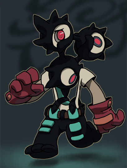
An edited version of something I submitted to a very small contest at school. I finished sketching, inking, and coloring in a little over two hours because I was really late. Haha. I never rushed on drawing like that before. What you see right now is just result of addition of second shading and a background. Everything else is as imperfect as the one I submitted; such as wobbly outline, incorrect perspective, etc.Hmm. I think they may cancel the contest haha. Way too little people entered submittion.
I wrote the description for him on the contest submittion but I do not feel like doing it here. Basically... his head spins. The end.
Bye.
[edit] oh crap. Why are ALL my characters facing LEFT? That's so stupid. I will watch out next time.
[edit] I was being unnecesarily pessimistic; of course contest is not canceled.
Related content


Comments: 23


HA I'M PRETTY SURE YOU TOUGHT I HAVE FORGOTTEN ABOUT THIS,HEHHHH? WELL HELL NO!
But...I only have one thing to say about this:
here chack it: [link]
👍: 0 ⏩: 1

I am having a hard time understanding the screenshot you sent me.
It says "No Toes"...but the character have three toes. Did you mean toenails? Sorry for this confusion!
👍: 0 ⏩: 0

I used to have a huge issue where all my character's faced left. But either way, I love the color scheme - it's a nice little break from your normal choices!
Hmm.... where is its brain? ")
Love the suttle lighting!
👍: 0 ⏩: 1
The character is designed to be a "game fighting character", so I have not quite considered anything about its detailed function. [also note that I had to finish this drawing in few hours haha] Now that the contest is over, maybe I can actually develope something out of him.
I thought about his brain just existing in a liquid form and flow in a rotating behavior inside his heads and necks. That way he can divide his "conciousness" into all three heads and be aware of his surroundings with 6 eyes. This is horribly illogical, sorry for babbling :b
Ah, did you notice the weak lighting on the underside as well? Heheh, thanks for the words K0r!
👍: 0 ⏩: 0

No matter how fast you do something. It still turns out cool.
It took me a second to notice he has a whole in his body. I feel dumb x:
👍: 0 ⏩: 1
Ah. Haha I think it was because the backround is mostly a solid color. That way it would be harder to distinguish which part is the character and which part is not.
Just to let you know, all the techniques I used in this image was chosen for speed :b Cell shading is a lot quicker for me to do. Also this was inked digitally so no clean up process was necessary. If I rushed using my normal techniques, I think it will actually look bad. But I am glad you liked it. Thanks a lot Nandi.
👍: 0 ⏩: 0


they're all facing left because you haven't been cheap like me and use the 'flip vertically' trick in photoshop
You did a description? Heck, if I did a contest, I'd just put down something lame like "It's your mom!" or "He's ridin' spinnaz!" like this:
[link] (warning, there's possibly loud music behind that link!)
Still, I second Lazymuffin... seems really bold. Is that a part of how fast it was? Actually, not so much 'bold' as just... you seem to have a lot more contrast... really dark blacks and nice bright highlights.
But yeah... funky!
")
👍: 0 ⏩: 1
[sorry for late response. This semester is a bit overwhelming]
MAN that music was loud! Thanks for the warning, but I guess I should have taken my ear phones off haha; I was too confident that it is going to be "alright".
Hmm. I just tried flipping the image. And I have to say...it looks like crap! Haha. I am noticing its imperfections even more clearly. Do your drawing still look okay when flipped? x:
I rushed on a lot of things for this drawing and one of it was color choices. Secondly, my laptop show everything in lower contrast than it is suppose to be. I viewed this image on a normal monitor and I think I now see what everyone is talking about.
I wish I could submit something I worked longer, but I am glad you liked this, and thanks for the comment!
👍: 0 ⏩: 1
flipping images is gruelling for me too... I get all nuts and fickle when I do it, and sometimes I won't even try just for the sake of not beating myself up too much about it.
Make sure to test your monitor every now and then... those settings are there for a reason D: and goodness knows I forget to check mine too.
👍: 0 ⏩: 0

You haven't colored something so boldly in a while.
It's usually much softer.
VERY COOL DESIGN.
👍: 0 ⏩: 1
this is the longest comment I have seen you write. [to me] :b
but thanks man
👍: 0 ⏩: 1

Oh hey, I haven't seen you submit something with this type of coloring in a while,
not that I'm saying your other stuff is bad, heck no, I love it all. o__o
Heh, this is like going back to your random creatures, which I still think are amazing,
since you draw such interesting bits, like how the suspenders are 'hanging' from the hole in his stomach.
And the head spinning! It took me a bit to understand what that ment
because I was looking at the individual heads instead of the whole thing.
But that's a pretty cool idea, though whouldn't that mean when his head is spinning
it'd look like his head isn't attached at all?
If you don't mind me asking, but what was the contest anyway? :0
👍: 0 ⏩: 1
thanks for the words, Z. It's been a while. I apologize for late response, [I know I say this EVERYTIME I reply] this semester is just...not great.
The only reason the coloring is this way is because I ran out of time; I had only 2 hours or so, but I must admit it was nice to try this technique again.
Haha, yes the head is not attached to anything. I was trying to figure out a way so that the character will feel more "physical" but there was not enough time. One of the prototype had his head located much lower, but I had to shrink his head; haha he looked too imbalanced.
The contest was nothing; it was for "designing a game fighting character". I won but...there were only 3 other entries :b
👍: 0 ⏩: 1
Hey it's alright, people are busy so take your time. ((have I said that before? *shrugs* ))
So if you had more time, what kind of coloring would you've done on this?
Line-less? Heh, but sometimes this kind of coloring has a better impact.
Specially for a contest like that.
Speaking of which, I know what it's like to win a contest like that though,
it's nice but then you find out there's little to no entries. xD;
It was like that in my old school.
👍: 0 ⏩: 0

The revolving head might be the catch with this character, but I think my favourite thing is that his suspenders don't go over his shoulders but rather the opening for his head. Hah.
This also reminds me of these really old action figures for Power Rangers in which there heads would switch flip in such a manner.
What sort of contest was this anyways?
This seems interesting. :b
👍: 0 ⏩: 1
Ah, thanks for noticing the suspenders although I was not thinking about them very much when I was drawing them haha. In fact...I did not even know they WERE called "suspenders"
I think I know what you mean by that action figure. I used to have those transforming robot figures. When they transform from a vihecle to a humanoid form, they had to "extend" their head out in a simliar rotational manner. Fun times!
The contest? It is so small, it is even worth mentioning but it was a "game fighter design" contest. There are only 4 submittions :b Prize is dumb.
👍: 0 ⏩: 0

Yayy nice subtle lighting on the bottom of the gloves there! I enjoy seeing your really cleaned up work like this (not that theres anything wrong with your sketchy stuff)
👍: 0 ⏩: 1
Wow I can't believe you noticed that lighting. I cannot see it very well on my laptop monitor. I kept telling myself that "HAHA NO ONE WILL BE ABLE TO SEE IT".
Glad you liked this drawing. It is true I do not do any full-inking very often. That is because other things I draw appear too "detailed" and intimidate me from inking. This character's features are all smooth, and have 0 wrinkles! This feels like cheating, heh.
thanks for the comment!
👍: 0 ⏩: 0

:0000 HOPE THEY DON'T CANCEL. Because I wanna see you wiiiin. 8D
WHOAA excellent HAHAHA I like the colors you chosen for this character. *u*
(AND ITS OKAY ;u; I never really noticed your characters all facing left before you have mentioned it. DAMMIT you could've gotten away with it HAHAHA)
👍: 0 ⏩: 1
It appears they did not cancel the "contest", but oh...COME ON...there are only 3 other people who submitted HAHAHAHA
Even if I win, I am not going to win anything significant. This was only for fun :b Oh and glad you like the colors. I am always big on colors when I decide to color anything. They are still very hard for me to control very well, and it means a lot for me to hear that someone likes the color. So thanks alot!
I could've gotten away with it? CRAP. it's almost as if I turned myself in :b
thanks for commenting.
👍: 0 ⏩: 0