HOME | DD
 19-10 — Aether

Published: 2005-01-24 21:46:21 +0000 UTC; Views: 1368; Favourites: 15; Downloads: 308
Redirect to original
Description
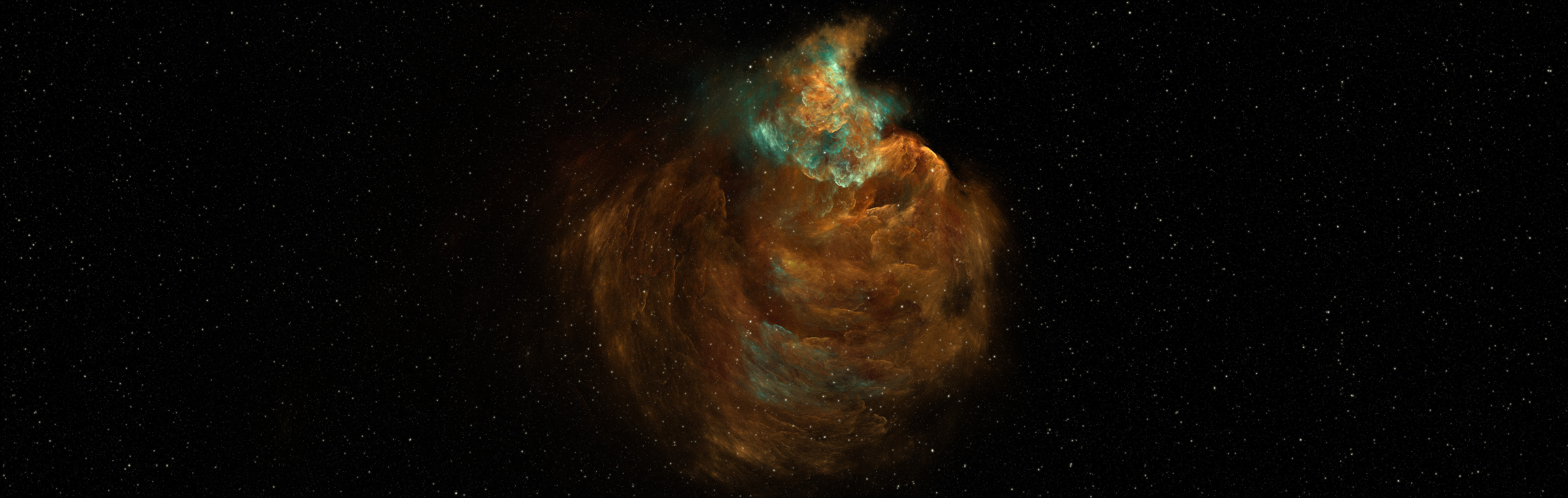
I've worked on this one for ages. I made endless modifications to get everything looking perfect") The original document was 2400x3100 at 300 DPI. I used textures by for the rest all is mine and made solely in PS. The title is Latin for heaven, heavenly or space or something like that.
The original document was 2400x3100 at 300 DPI. I used textures by for the rest all is mine and made solely in PS. The title is Latin for heaven, heavenly or space or something like that.  (Smile)")
I strongly recommend people with a fast connection to watch it at full size to get the full experience, lol. For full size, [link] .
Hope you like it ^^
Related content


Comments: 29

I've looked at the full size deviation of this. O_o wow...I must say it is quite big.
The planets are very lovely, but the space background seems fairly flat, not vast (and empty) like the real space.
👍: 0 ⏩: 1

Hmmm, yeah, come to think of it, I should take down the full size of the image now that I've got a print account....
You're right it's not that vast as it is supposed to be, but the vastness or realism wasn't what I was going for. Here the colors are what's most important. Thank you very much ^^
👍: 0 ⏩: 0

that is gorgeous! i love the color and the way the lighting works. all those sparklies!!
👍: 0 ⏩: 1

great piece dude!
i just looks great , even though the 2 little planets (in front of the big one at the right and the one left of biggy) are a bit flat, other that that, just great
👍: 0 ⏩: 1
Thanks a lot man. I just can't get my planets look right, most of em look flat -_-. Thanks again
👍: 0 ⏩: 0

i dont have much to add to the previous crits. i like this piece. the textures are nice, the planets are prety good. the lighting is mostly good. only the middle most left planet looks a bit wrong to me. a bit chopppy on the edge and lighting angle is a bit off. also, the stars are way to dence in my opinion. other than that, i really like this one. good job
👍: 0 ⏩: 1

nice colors and great detail, the only thing that bothers me is the text, rest looks very good

👍: 0 ⏩: 1
Dankjewel. Heb je ook full size gezien, want daar is de text iets anders.
👍: 0 ⏩: 1
 (Wink)")
oh ok, gelukkig. De font wast was echt een bitch, ik dacht dat he zo wel oke was :/
👍: 0 ⏩: 1
mwa tis ook niet zo erg, tis alleen beetje groot, je moet maar zien, zolang jij het mooi vind is het goed
👍: 0 ⏩: 1
o mooi zo. Heb je ook aula uur of pauze ofzo?
")
👍: 0 ⏩: 1
ahzo, dat heb ik volgende week pas. bah kutproefwerken.
👍: 0 ⏩: 1
ja idd, echt klote, maar gelukkig valt deze week wel mee bij mij, veel succes vogende week dan maar
👍: 0 ⏩: 1
Dankjewel, jij nu succes dan, maar moet weer naar de les. Ciao
👍: 0 ⏩: 0

I love the starfield ")
👍: 0 ⏩: 1

very nice piece, great detail and very good texturising. 2 things tho.
1. I think the piece is a little to filled, with this i mean that the nebula in the middle is the light source and everything around it is very light. some more contrast would have been nice. Like making it darker towards the outlines of the image.
2. I think the planets look a little flat, it is not bad but not optimal as well. With a better shadowside and little bit better atmosphere they could be very good.
As i said a very good piece and i hope to see more good work from you.
👍: 0 ⏩: 1
Great thanks. I'll take the critics in mind when I'll make a new one, I'm tired of working on this
👍: 0 ⏩: 0

Amazing, I'd hang this on my wall, or my ceiling, I love it. A new Fav!
👍: 0 ⏩: 1

dude, great planets here..
love the nebula too, and the colors on this are awesome.
i like the typo and the effect used on it
only thing i could complain is that the stars are a little too cluttered on it... maybe take the desnity of them down or something, or make them less uniform (some bigger, some smaller).
great job though, man. some of ur best stuff here.
mP
👍: 0 ⏩: 1
thanks a ton m8, I greatly appreciate it
👍: 0 ⏩: 0

awesome job m8,
I love the sharpness of the nebula..
lovin the planet textures and details..
great use of a wide variation in colours..
I really like the little planet in the center..
typo is well done.. fits well.
great work

👍: 0 ⏩: 1