HOME | DD
 1NNU3NDO — Superloop
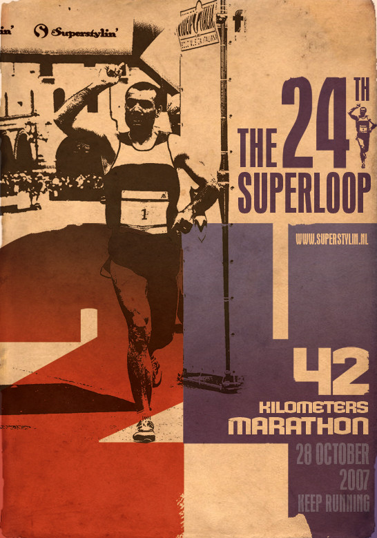
Published: 2007-05-21 16:37:19 +0000 UTC; Views: 8918; Favourites: 109; Downloads: 393
Redirect to original
Description
Marathon poster design initially for a client. Didn't make it past the studio so I "suped" it up a bit (Wink)")
Inspired by 70's typography based posters.
Related content


Comments: 38

I don't recall unfortunately. Did you try "whatthefont"?
👍: 0 ⏩: 1

Yes I did, unfortunately since the font is so big It was unable to recognize it as a font.
👍: 0 ⏩: 0

very interesting. i'd have tried lowering the tone of the background a bit.
👍: 0 ⏩: 0


oh maaaaaaaaaaaaaaaaaaaan
damn you shoulda seen my jaw drop when I saw this poster!
👍: 0 ⏩: 1
Haha, thanks dude. Everything back in place again?
👍: 0 ⏩: 1
Yeah, I guess. I'm still kinda woozy tho & my speech slurs.
👍: 0 ⏩: 0

very nice dude!
your stuff is always awsome.
I hope to be able to come up with things as creative.
what made you decide to go with the gradient on the Text? I do like it, but on the 4, it bothers me just a little bit. Its too hard of a contrast to my eye when the 2 is dark from top to bottom. It wouldnt bother so much if the heading was the same shade blue as the top of the 4.
keep up the awsomeness!
👍: 0 ⏩: 1

cool stuff. If the gradient shouldn't be a problem, if I were you I would put the same gradient as what you did as well.
I like this piece.
👍: 0 ⏩: 0

Very nice. The type is really powerful! A little too powerful, though...it's fighting with the figure for dominance.
👍: 0 ⏩: 1
I understand what you mean. Maybe it requires a bit of explanation. We initially wanted to focus a lot on the fact that it was the 24th edition of the run, it has been organized by our client for the past 24 years and this is a very important selling point for them. The (original) name of the event itself is so well known that the visual itself is not so very important anymore.
The sole concept was to build on typography as in typographic 70's posters. In the end this design was too retro-oriented, which is why it was scrapped as a proposition. But I still liked it for myself and as a style study, which is why I adapted it to Superstylin'.
Thanks for your input man ")
👍: 0 ⏩: 0


Youre gonna do another sweet typo poster?
👍: 0 ⏩: 1


i dunno, not really feeling this one... seen much better from u!
👍: 0 ⏩: 1
Thats ok man, thats actually quite a cool compliment in a way
👍: 0 ⏩: 0


Ah nice poster man! Love the way you putted your logo in the background

👍: 0 ⏩: 1

Awesome! I'm going to school for graphic design, and I specifically want to work on print ads and logo & font design. This is a very inspiring piece. Makes me want to keep at it...!
👍: 0 ⏩: 1
Do it, fonts are one of the things that drive my creativity. Along with music  (Smile)")
👍: 0 ⏩: 0