HOME | DD
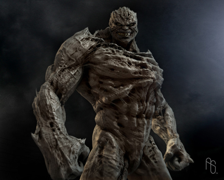
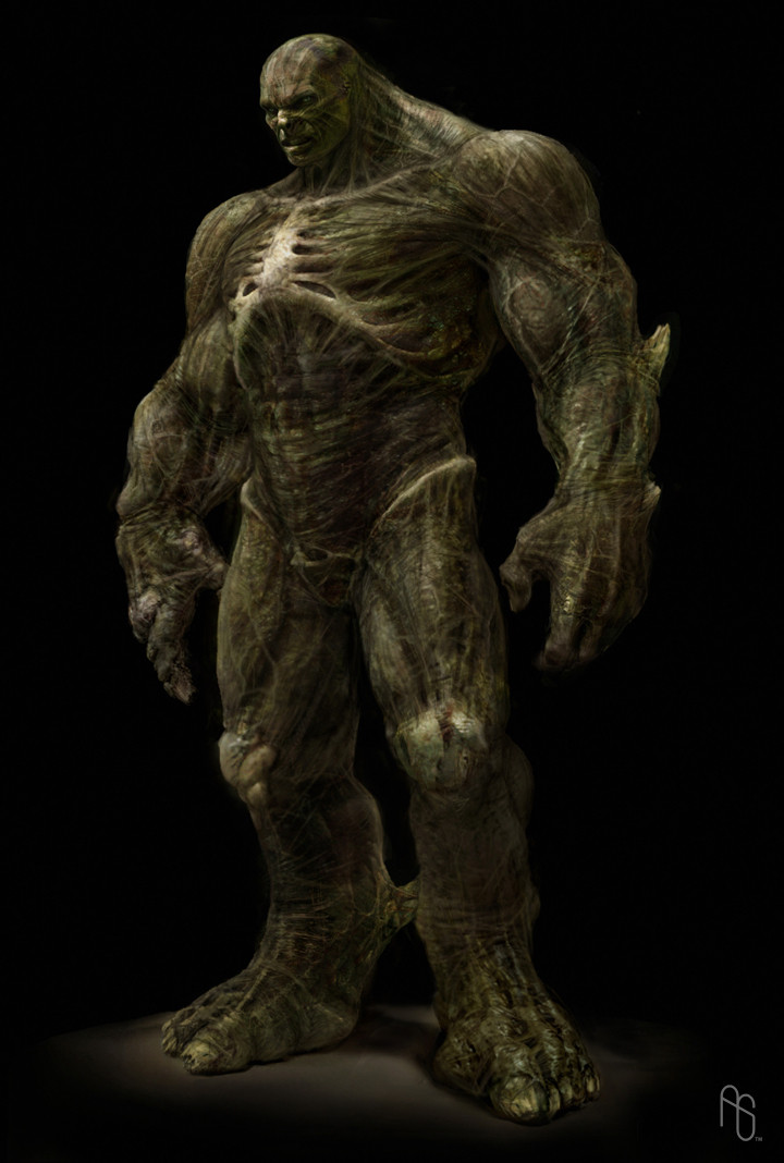
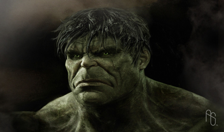
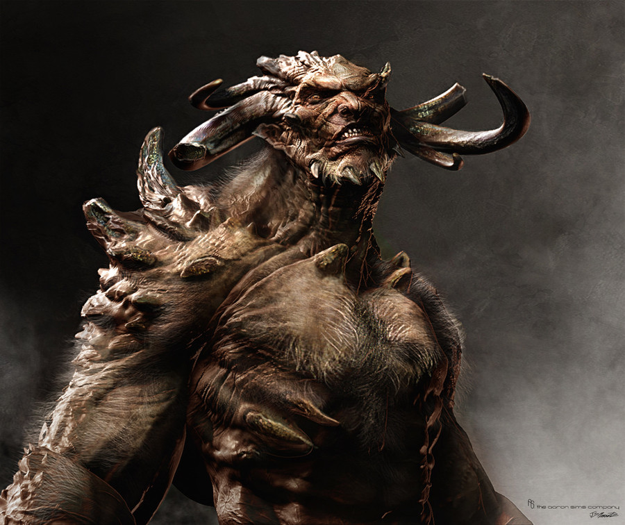
 aaronsimscompany — Early Abomination Concept 1
Published: 2008-06-24 03:08:01 +0000 UTC; Views: 41192; Favourites: 565; Downloads: 0
Redirect to original
Description
Early Abomination Concept 1, The Incredible HulkRelated content


Comments: 39

👍: 1 ⏩: 0

👍: 1 ⏩: 0


Well...still missing the fish-ear-things, but certainly better than it turned out in the movie.
👍: 0 ⏩: 0

I don't like his head its got like two open slots on it and its ruffed up like jagged that's kinda disgusting!
👍: 0 ⏩: 0


He looks like he's more suited to Resident Evil than anything else.
👍: 0 ⏩: 1
Looks much more like he belongs in Doom than Resident Evil.
👍: 0 ⏩: 0


damn! they should've used this version! awesome work!
👍: 0 ⏩: 0


While it did not look like the comic book counterpart, I would say the movie version of the Abomination worked out just fine-as silly a way as it is to describe, it looked realistic; like a deformed version of the Hulk, not some alien creature. But man, this concept would have been INSANE to see on screen!
👍: 0 ⏩: 0

he kinda looks like those things from gears of war a bit.good job on him
👍: 0 ⏩: 0

he looks like he just found a bottle of minty fresh tooth paste
👍: 0 ⏩: 1

you just made me spew soda. thanks.
👍: 0 ⏩: 1


Should have used this one, and should have written the story.
👍: 0 ⏩: 0


its awesome.
but reminds me of DC's Doomsday.
very cool tho.
👍: 0 ⏩: 0

The reason for that they use the other models was because Abomination must look like Tim Roth, and this one doe´snt look like him.
👍: 0 ⏩: 0


It looks like the Comic Abomination, very exellent job
👍: 0 ⏩: 0


Holy shit man! This is what they should have gone with! Incredible design. Love it!
👍: 0 ⏩: 0

I actually prefer this one, I think it seems to represent the comic character look that I'd seen a few time a little better than the approved one, but I'm just a little peon.
👍: 0 ⏩: 0


This work is incredible but the new one looks more realistic when human transformation to beast.
👍: 0 ⏩: 0


dude you have like the coolest job i can imagine...how do you get that job anyway? i'm in school for graphic design right now. i am so envious of you.
btw i used this pic as a base for a doomsday pic i did this week. would love to hear your thoughts.
[link]
👍: 0 ⏩: 0


damn what a departure from the comic as well as the movie version..
they should've used this version for the movie....
take care....drive safely
👍: 0 ⏩: 0