HOME | DD
 ado-mi — Apollo's harp
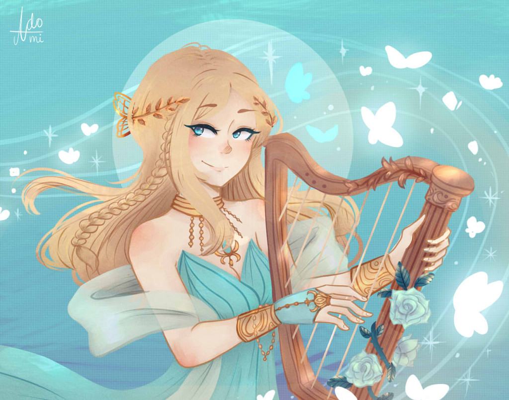
#butterflies #harp
Published: 2017-06-16 00:46:08 +0000 UTC; Views: 1409; Favourites: 201; Downloads: 0
Redirect to original
Description
Ah I've wanted to do something more.. technical then conceptual so this has a bit more details than what I usually do ;w; Also apparently my style looks slightly different here according to my sister...I used a reference for this ! Wanted to try out colouring metals and details ;w;
vignette3.wikia.nocookie.net/m…
"I'm open to any critique, comment or suggestion!!"
Related content


Comments: 111


She looks amazing
I adore the soft coloring its so pleasing to the eyes

👍: 0 ⏩: 1
You're welcome ^^ i love your works
Keep up a great job.
👍: 0 ⏩: 0

this is soooo lovely. nice, soft, angelic. really great work
👍: 0 ⏩: 1

Wow, thank you so much!!! >w<
👍: 0 ⏩: 0

Nice soft feel of the picture
and nice cool colors are really beautiful
thanks for sharing
👍: 0 ⏩: 1
Aww I'm glad you liked it  (Smile)")
👍: 0 ⏩: 1

Hi, im here from ProjectComment! ^^
First off, I think overall this piece is very lovely! I like the style of having thin lineart on the body, while the hair is mostly lineless! Very nice contrast! I also like the texture you put in the background, and it looks like there might be some on her dress too? it looks kind of like watercolour paper, and I think it's fitting.
However, there are a few little things I think could be improved! For one, I noticed some of the lines going down the inside of the harp are a bit wonky! The rest of your lines all look very nice though, so those few wonky lines on the harp stick out a bit and take away from the rest of the piece in my opinion. Also, most of the metal doesn't really look my metal to me! That may just be because I was expecting it to be very shiny and smooth metal, but if you were trying to draw more matte metal then you hit it pretty spot-on! Especially her butterfly hair clasp, and the leaves on her head. I think those metal pieces look the best! The ones that I think look the least realistic are her bracelets and necklace, they just look a bit flat. You can still tell that they are supposed to be metal tho and they fit with your overall soft, light, shading style, so it doesn't stick out too much!
Overall, great job! ^^
👍: 0 ⏩: 1
Ohh I see, thank you so much for your insight ! I'll keep it in mind
👍: 0 ⏩: 1
No problem at all, keep up the great work!
👍: 0 ⏩: 0


AAAH I INSTANTLY RECOGNISED HER FROMA 'More from DeviantArt' THUMB!! IT'S APOLLO'S HARP! You did a gorgeous work on her!!
👍: 0 ⏩: 1
Omg HAHAHAHA THANK YOU SO MUCH !!! <3
👍: 0 ⏩: 1

This is a gorgeous piece on ! Wow I love all the blue and golds! Those colors are just so good together in this piece and the details on the harp is breathtaking! The shading is gorgeous here and the mood is so calming and light! Beautiful work!
👍: 0 ⏩: 1
Thank you so much !!! >w< I'm glad it all worked out in the end to be able to get such praise from you !
👍: 0 ⏩: 0

Another beautiful piece in I really love the style you drew this in! I like that chalk type drawing style you draw in.
The girl looks very pretty and the anatomy is great!")
The detailed golden leaves in her hair, her necklace and bracelets and the white glowing butterflies finish the drawing completely!

👍: 0 ⏩: 1
Thank you so much !!! >w< I'm glad you think so and I hope I do !
👍: 0 ⏩: 1
XD You're most welcome haha! Of course you will! I am sure of it.
👍: 0 ⏩: 0

Aww thank you, I kinda do too !
👍: 0 ⏩: 0

Hi I`m from ProjectComment !
First I would like to comment about the background. The background has those little streaks of light blue in the top and has darker blue streaks in the bottom. I think it represents the ocean. I t also has that big pale blue circle which I think represents the sun, but because of the water.
I noticed those butterflies they seem to be a gush of wind but because I think this is the water I would have to think that this is a current of butterflies. Butterflies represent anxiety and a current is a force in the ocean so I think it represents a glowing turbulent mood. It also has those glowing lines, the butterflies can also represent notes. There are glowing white butterflies, 2 blue butterflies, sparkles, and random bits of light. It looks like a symphony.
Next I have to remark about the harp. The strings are too few and the strings don`t have varying thickness. The harp must have varying thickness so it can have varying sounds. It has a soft arch and pillar. I also noticed the roses. The roses are kind of light blue. The leaves are shiny and the thorns are there. I would have to say that the thorns must have varying thicknesses. I suppose that you add a bit of shine on the harp.
Now the dress it looks like it is semi-transparent and it is with soft texture. I think it is made of wool or cotton but most likely to be cotton. The dress it looks a bit stiffer and it has a darker shade of blue. It reminds me of a blue flower. The accessories of the girl is gold based. The necklace is with bands and those beads hanging about there. There is also that gold bug attached to the necklace. There is also a gold bracelet connected to the gloves as if they were intertwined. There is also the crown, it looks like a laurel with a butterfly added to it.
Now to remark of the girl herself. You have the girl with blonde hair and soft fair skin. It looks like she has freckles and she has an eyeliner. I don`t know why her eyebrows overlap her hair. I also noticed the braid in her hair and the laurel seems to be attaching itself to the hair. The hair also kind of looks flat like it lack depth. You properly drew the hair like it has many strands without overwhelming the picture.
I also want to observe this technically this time.
The lines suggest something. It is soft and curvy which indicate graceful movement and it also has a clear lines. The soft and curvy lines indicate te gracefulness of the work while the clear lines make it looks defined but it makes it look static.
I also noticed the use of blue and gold colors in the art. The background has blue hues and the signature if yours is also blue. They have light blue as adornments to the darker ones. The entire piece seems to have a lot of blue in it which means a lot of calm. It also has a lot of light blue in it so it means more calm. I also notice different shades of blue in the current of butterflies but sometimes I wonder, where is it coming from? Does it come from the girl or something else? Back to the topic, I see that you value light blue in your work here. For the gold colors, I think you transitioned gold and blue without the clash. It looks well transitioned especially in the flowers.
The lighting seems to come from the butterfly current. It looks realistically lighted except on the harp. There are some parts that lack light. Other than that it looks kind of good.
I also noticed the appearance of circles in your work. There is circle in the background and the clothes. There is circle in everything. It is most prominent in the harp but it is scattered nicely in the entire work.
I noticed the balance. The girl is leaning on the left while the harp is on the right. While everything is in symmetry with each other I have to comment about the proper balance of the girl. She is probably leaning on the left so she can support the harp which is on the right.
The gold and blue contrast each other yet they also work with each other. The gold color is normally located near the girl and on the girl. Gold is a warm color so I have to say it represents the heat on the drawing. There is also blue to signify the peace and tranquility of the work.
The movement of the work seems to be a bit static. Looking at it, it seems a bit flat. It lacks movement. Only the hair seems to be moving. The proportions also look well done.
It seems like the focus is in the eyes of the girl. All the lighting and the butterflies go in one direction, the left. It seems to attract attention to the eye.
It seems to have the theme of Greek mythology and also coveys the theme of gracefulness and divinity. It feels like the swaying of the music is real and you can sense the sense of tranquility.
I think the artist is trying to show the gracefulness of Greek mythology. It is a manifestation of Greek mythology and music. I think it is beautiful and graceful, because it has the soft touch to it.
I believe this work is successful because it conveys the brilliant use of shape and color to project gracefulness.
👍: 0 ⏩: 1
Wow thank you so much for this critique ! It's so long and detailed that I was quite overwhelmed but I'm glad you decided to comment on my work, I was able to notice a lot of stuff that I haven't seen before. I hope I'll keep all this is mind, especially your notes on composition and colour !
👍: 0 ⏩: 1
I was just trying my best. You are welcome.
👍: 0 ⏩: 0

This is very nice! A job well done on this indeed^^ Keep doing more marvelous work like this okay?
👍: 0 ⏩: 1
Haha hope I don't disappoint
👍: 0 ⏩: 1
You are most welcome and I truly hope you keep doing more stuff like that~
👍: 0 ⏩: 0

Hey there, I'm from ProjectComment!
Okay, first - the picture caught my eye as one of the most complete-looking among others. From the thumbnail it clearly has great color palette, detailed main character and balanced layout. With a quick view it's totally like a profeccional-looking piece of of art, that would make a fine postcard or notebook cover, or poster.
When I took a closer look, I found out that, though it appears great as a whole, it still has a few issues that might be improved to give it a more complete look. It's just a little polishing, maybe, but when the picture looks almost perfect from afar, it's a pity when some minor stuff catches viewer's eye during close inspection... This way, it still looks a bit sketchy.
Here's what caught my eye:
- fingers on her left hand are kinda thin and bend not quite naturally... Maybe, a hand ref, or even putting your own hand to look? (it's always easier with this one, unless you're a left-handed person yourself
- her hair on her forehead "sticks" to her skin with no clear border. If the colors were more different, it wouldn't be that distinct, but now it needs a clear contour...
- The hair and dress could use a bit more shading, to look more interesting. Also, some highlights on the jewelry (since the roses are more shiny than metal now)
- Maybe, it would look better to make lines thinner on small and delicate objects, like, again, jewelry.
- The face and hair placement on her head - I think there is too little hair on the left side of her head, it kinda lacks volume here (like it's "glued" to the skull with no volume of its own).
- the flowers' stems look a little roughly done, also the harp strings are too thick (and I think, there were supposed to be more of them?.. Not sure, maybe there are different types of these instruments)
And now, if I were to point out what makes it look so professional in my eye:
- I'm not a pro in this style (No, serious, I still don't know, how you people color works this way, that looks both simple and stylish... )
- Good composition, natural and graceful line flow
- Great colors - delicate and harmonic palette, everything goes well together. The cyan on the back is just so pure and clean, and all the color accents...
- Many, but not too many, details. Her accessories are thoughtfully drawn, hair and dress are accurate and detailed.
- Love the paper-like texture of the background and the way you put everything together - moon, sparks, butterflies - that they highlight the main character without pulling attention from her.
All in all, I hope you don't mind my digging for issues, because it honestly looks great (and that makes me want it to be perfect). I hope you will make more masterful pieces in the future!
👍: 0 ⏩: 1
Thank you so much for this critique ! (and I am indeed left handed which does make it hard for me to do left hand references sometimes blegh) I managed to notice a lot of things too that I should have fixed up haha but I'll keep them in mind next time !
👍: 0 ⏩: 1
Oh, that explains problems with left-hand reference model
You're welcome! Keep going and creating more beautiful pictures
👍: 0 ⏩: 1
Thank you so much ! I hope I do ;w;
👍: 0 ⏩: 0

You're welcome although i have to go to sleep now, its 9 and i need to wake up early for boring history and exciting art subjects at school.. Yep i love art subjectsss as much as i love lasagna with extra cheese yum hehe
")
👍: 0 ⏩: 1
Aw man, I got 2 weeks left to slack off then it's back to boring history again for me too haha
Omg you're making me hungry ;w; and I just had lunch haha
👍: 0 ⏩: 1
Lol enjoy it while it lastsss
👍: 0 ⏩: 1

Wow! This is so magical and pretty. I like the gold-looking head piece, it's very detailed and super pretty!! I like the style of the hair, it looks quite simple but effective. The anatomy is great apart from the right hand's fingers. The hand holding the harp. I feel like the fingers look a bit too thin and nails a bit strangely placed. However everything else is magnificent!
Great job!
👍: 0 ⏩: 1
Thank you so much !! I do think that the right hand looked quite... weird so I'm happy you pointed that out haha.
👍: 0 ⏩: 1
No problem!! I'm glad I kinda helped
👍: 0 ⏩: 0

The overall result is quite good and fresh.
👍: 0 ⏩: 1

Really nice artwork about characters and color !
Keep it going! : )
👍: 0 ⏩: 1
Thank you so much !!! I will hopefully haha
👍: 0 ⏩: 0

This is just spellbinding! I love you drew the butterflies coming from(?) the harp! Beautiful! Everything!
👍: 0 ⏩: 1
Thank you so much ;w; I'm glad you like it !!!
👍: 0 ⏩: 0
| Next =>