HOME | DD
 AikaXx — caution colo
Published: 2006-07-07 02:30:36 +0000 UTC; Views: 1129; Favourites: 25; Downloads: 71
Redirect to original
Description
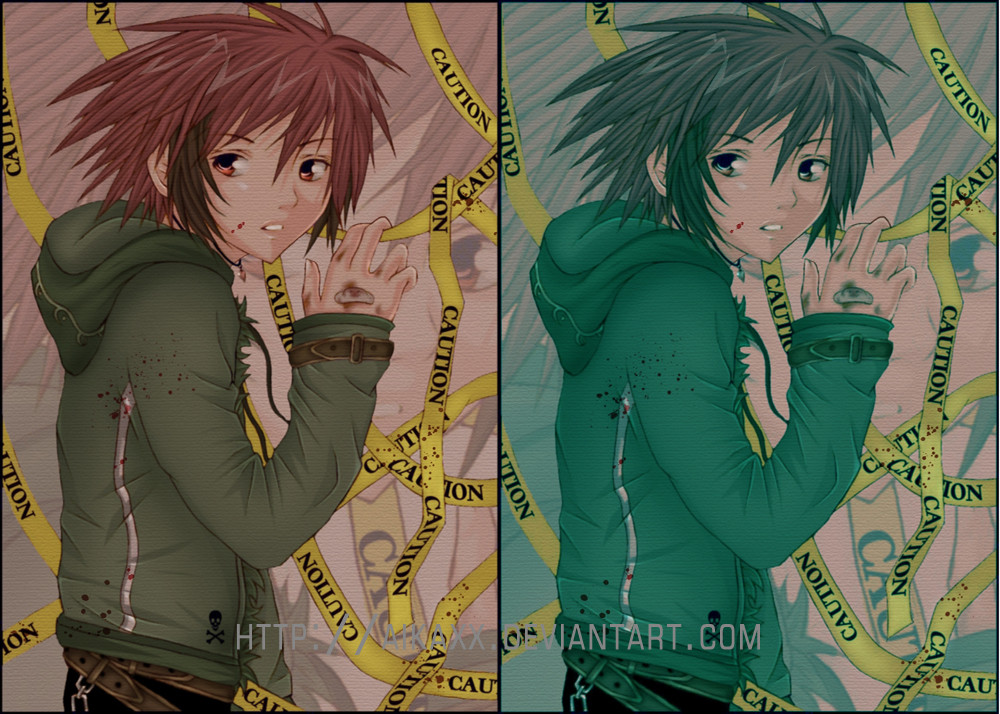
please full view ^^two colouring variants. which is better? I cannot decide
 (sorry for my bad english
 ") )
)
Related content


Comments: 17

Wow!! Their both soo cute, and nicely rendered. You did an amazing job! hmmmm...I think i like the red. Yeah, i like the red one.
👍: 0 ⏩: 0

It was a difficult choice between the two, but I like the one on the left best.
👍: 0 ⏩: 0

Actually both of them look great o_O I'm just about to say the red, but then the green captures me, so its really hard to choose xD
👍: 0 ⏩: 0

They both are amazing!! If I absolutely HAD to choose, I suppose the one on the left is better cuz then you can see the contrast of the hair, clothes, blood... And the nice details like the belt^^
👍: 0 ⏩: 0

I have to agree-- I like the one on the left. It was a tough decision, and one I'm still not entirely sure of it, but images with more vibrant and varying colors stand out more to me than images that seem to be different shades of one color. The one on the right seems a tad bit uniform, especially since the majority of the image has a "cool" color. I will say that the one on the right brings out darker colors better, though.
👍: 0 ⏩: 0


I can't decide which one looks better *_* It looks nice in either colour XD
Awesome drawing <33
👍: 0 ⏩: 0

aaaah .. don't make me choose! hmm .. i would have to say .. AAAAH .. i'll go with the left one because i just have a tendency to like anime guys with red hair :3
👍: 0 ⏩: 0

the second one appears to have the impresion of memories... iguess! i love it!
 (Smile)")
👍: 0 ⏩: 0

I like the reddish one to the left X3. But they both look nice

👍: 0 ⏩: 0

I say the left, because of the fact it complents the blood splatter. Plus it makes the Caution tape more vibrant and yellow-y :3
👍: 0 ⏩: 0


Hmm...I like the one on the left more if you want to know which color looks better and all. Really, I think it looks cool how it is right now with the two different colors next to each other and the artwork in general is awesome.
👍: 0 ⏩: 1


The coloring look very nice, both look good~
Personally, I like the one to the left.
👍: 0 ⏩: 1