HOME | DD
 alexdesigns — difference'
Published: 2008-11-03 14:07:35 +0000 UTC; Views: 9459; Favourites: 95; Downloads: 291
Redirect to original
Description
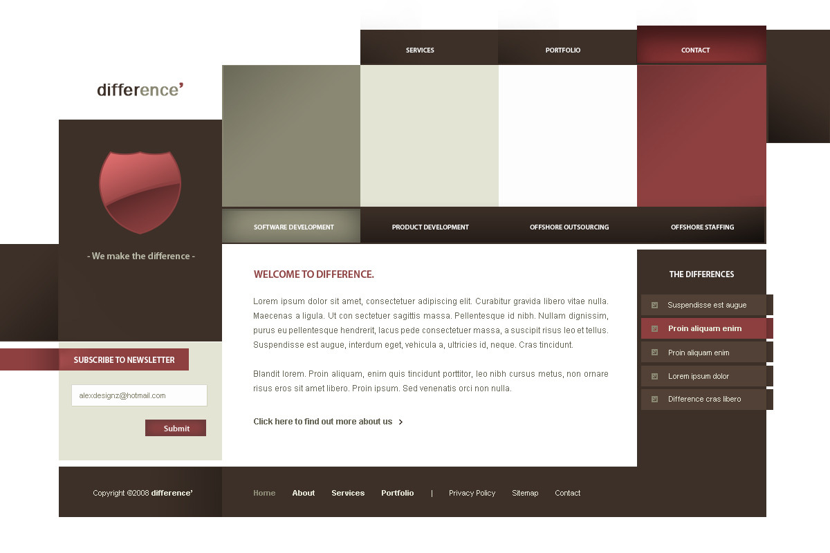
Something "difference" from my side. Comments and faves appreciated as always.[FOR SALE]
Related content


Comments: 71


Hi.
I am fron the Brazil and I found its deviation very good.
Congratulations!
Please, it forgives my English, I am using a translator on-line.
---
Olá.
Sou do Brasil e achei seu trabalho muito bom.
Parabéns!
👍: 0 ⏩: 0


love the colors and the design, very clean and harmonic
👍: 0 ⏩: 1
")

Nice concept, and nice color scheme well balanced. Definitely something new from you, though I like it, especially the nav.
👍: 0 ⏩: 1

its pretty unique. Not sure if I'm fond of the unlevel content boxes. But thats what makes the difference huh
👍: 0 ⏩: 1

 (Wink)")
👍: 0 ⏩: 0

It's not bad but I think it's totally confusing. Because the navigation is on too much locations.
👍: 0 ⏩: 1
It's a navigation and a sub navigation..
👍: 0 ⏩: 1
I know but the main navigation is also splitted into two parts, right?
👍: 0 ⏩: 1
The one at the top is the main navigation. The one lower down is a navigation that contains the main services. Not splitted.
👍: 0 ⏩: 1

great work man very nice, I could see this in flash, or maybe even ajax with all the individual areas opening up to reveal different things etc , but lol maybe give some respect for the box icon you used
👍: 0 ⏩: 2
Oh yeah, I always do that but just forgot to now. Let me try and find the ownet.
👍: 0 ⏩: 1
👍: 0 ⏩: 2
changed the box so deleted credits :>
👍: 0 ⏩: 1
Yeah lol, true, don't worry about it. I always credit them, just forgot to do so now. Well I edited it
👍: 0 ⏩: 0


I am still waiting to start up our idea. Come on man lets get it sorted.
👍: 0 ⏩: 1
we should..it's just that my motivation isn't great...and it needs to be. lol don't worry we will soon enough
👍: 0 ⏩: 0


Very nice mate, love the deep red colors - gives the design a real luxurious feel.
I suppose you could always stick a login form where that red box is, suppose that'd fill the space  (Smile)")
👍: 0 ⏩: 1
I think there should be some type of graphic in that space otherwise it'll be too much writing and that..
👍: 0 ⏩: 1
now that i look at it, yea a graphic would look better.
maybe a nice logo of a flame or something to go with the red?
👍: 0 ⏩: 1
probably yeah, will look into it
👍: 0 ⏩: 1
cool man, i look forward to seeing what you come up with
👍: 0 ⏩: 1
Changed. I think it looks better
👍: 0 ⏩: 1
Yeah man!
That looks way better ")
Nice job!
👍: 0 ⏩: 0

At first I wanted it to be gradientless, but that's not me, so I used some!
👍: 0 ⏩: 0
| Next =>