HOME | DD
 alivepixel — DaFont.com Business Cards

Published: 2009-06-21 21:20:52 +0000 UTC; Views: 49226; Favourites: 201; Downloads: 2917
Redirect to original
Description
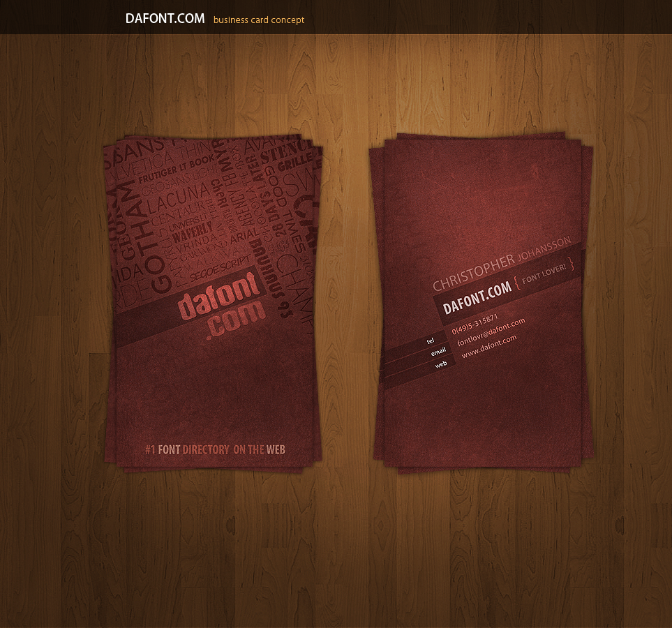
DaFont.com Business CardsI wanted to make a card filled with typography, and which site is better to make it for then daFont.com?


It's basically a grungy 2 sided business card filled with typography, I kinda like the outcome


I'm sry for the low quality on the text, I had to resize them.
Related content
Comments: 42

Free Business Cards, Renewed and Exclusive
View and Download Here::: www.PSDDaily.tk :::
👍: 0 ⏩: 0

wooow so cool ideas buddy thanks for sharing
visit here for some more !
👍: 0 ⏩: 0

awesome work man.. loved it.. do we get a psd or tutorial of it ? 
👍: 0 ⏩: 0

hi. really clean design you have come up with.
can i use it for my personal use??
👍: 0 ⏩: 0

Love them! and the text is fine when you zoom. Clear and beautiful and I love that website. I love typography!
👍: 0 ⏩: 0

Hey bro can you say me what font is the one that says dafont.com? In the left card?
👍: 0 ⏩: 0

amazing, just amazing.
i didn't notice all the text texture until i saw it in full size. wonderful piece of art.
👍: 0 ⏩: 0

This is gorgeous. Would the type on the front be done in a spot UV?
👍: 0 ⏩: 0

heya m8 superb work ,can u send me the bg pls of the card or a link /./thx man
👍: 0 ⏩: 0

i'm a fan of the website myself and this card is amazing! great work
👍: 0 ⏩: 0

Wow really nice. Maybe you should pitch it to them and maybe they'll dig your design
👍: 0 ⏩: 0

WOW, awesome cards man very nice work. Maybe a darker background behind the cards is better there is little contrast now. Nevertheless great work. and very nice look of the cards.
👍: 0 ⏩: 1

Glad u liked them! Yeah true, a darker bg might have been better, I guess this will do
👍: 0 ⏩: 0


