HOME | DD
 AlmightyRayzilla — Godzilla Fan-Fic sketch
Published: 2008-08-30 01:26:46 +0000 UTC; Views: 7100; Favourites: 56; Downloads: 1873
Redirect to original
Description
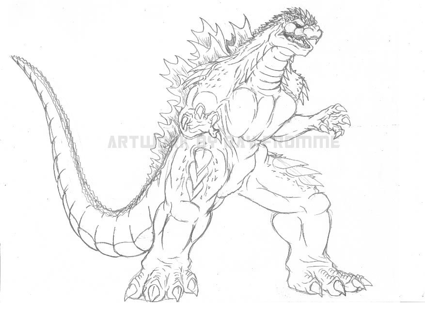
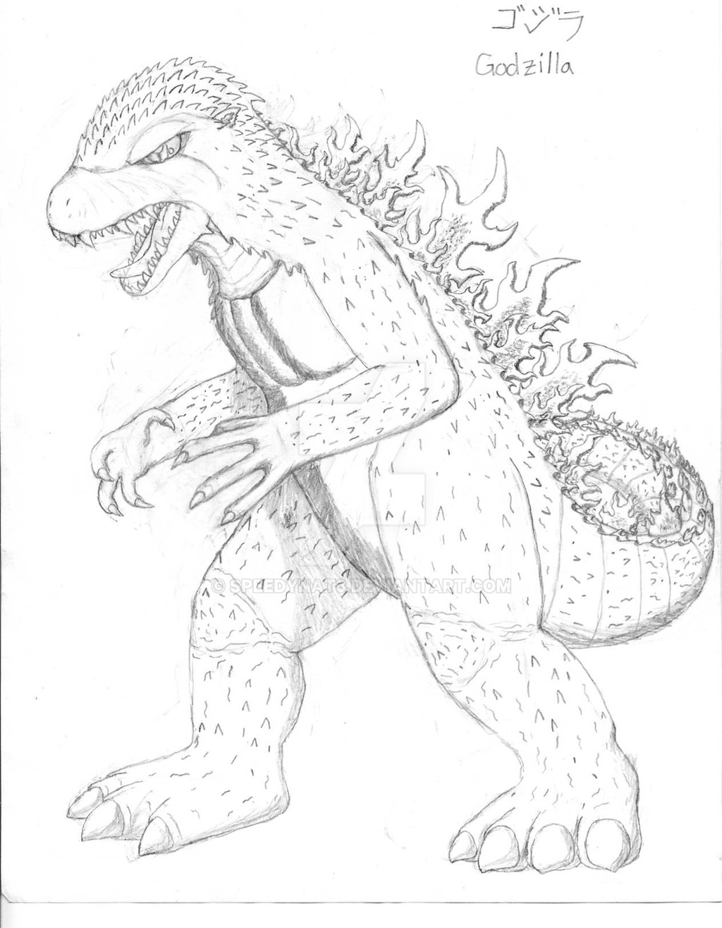
The latest sketch of Godzilla for my fan fiction [link] [link] as well as a more up-to-date version of a 2006 sketchy [link]To be honest, it was a Godzilla concept for Final Wars that inspired this design - the concept had a few spikes on him, and I figured it would be something different for Godzilla.
Godzilla (C) Toho Co. Ltd.
Related content


Comments: 8


I've seen this in real life! it's a very nice drawing and I'm insanely jealous.
-Lenora.
")
")
👍: 0 ⏩: 0


I think, looking at your old drawings, that your grasp of form has improved, I would l would like to see som line variation though.
👍: 0 ⏩: 1

Thank you.
But what do you mean by "line variation"?
👍: 0 ⏩: 1
thick to thin, broken line. Generally if the line is iin a darker(shaded) area it is thicker to indicate darknesss, and thinner to indicate lightness.
👍: 0 ⏩: 0