HOME | DD
 alphaleo14 — APU progress 6
Published: 2004-11-28 08:28:11 +0000 UTC; Views: 16519; Favourites: 216; Downloads: 4174
Redirect to original
Description
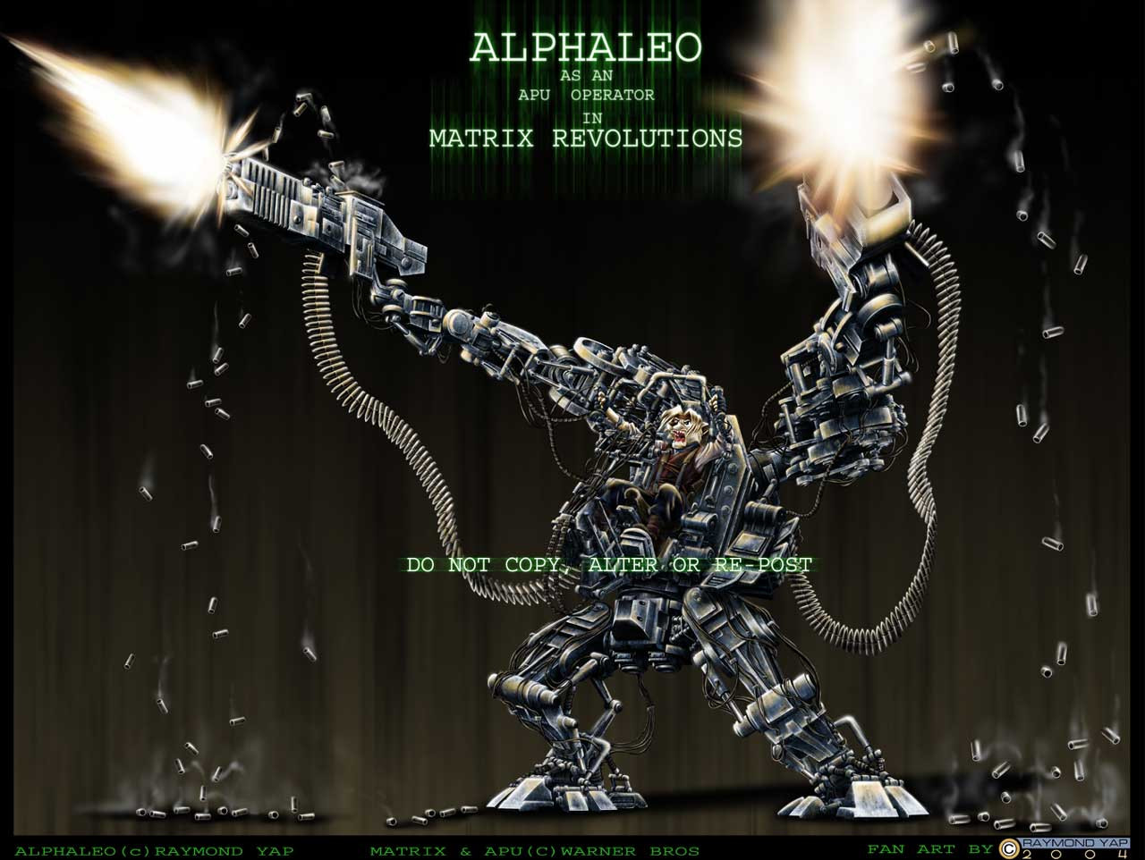
"IT FINALLY DONE" after '6 months' or toturing myself on it, i'm pretty happy how the APU turn out but as for the background i'm still working on it hoping i can do a better background than this one, for the moment please enjoy the main APU which i have work so hard on 'Enjoy'Related content


Comments: 277

thats just... awesome... i mean, how else am i supposed to describe it?
great job man!
👍: 0 ⏩: 1

thanks, i am still peparing to work on the back ground, which gonna be big(very big)
👍: 0 ⏩: 0

Wow....just wow.....@___@
It'd be awesome if you did a background for this as you said, or perhaps I ask for too much?
My fave part would have to be the shoulder/arm design of the mecha!
Okay, I'm just going to sit back and admire it now. :3
👍: 0 ⏩: 1
thanks, i'll keep up the good work until i have it finished
👍: 0 ⏩: 0

Thats fine peice of machinery there, but, why does he seems so angry?
👍: 0 ⏩: 1
u don't see people carrying a smilling face during battle.
👍: 0 ⏩: 0


that is totaly awsome. great work. the colors and shading are insane. he needs a runner to reload him soon though
")
👍: 0 ⏩: 2
not sure but hes going to run out
👍: 0 ⏩: 0
ha ha who will that be?
👍: 0 ⏩: 0

omg like its hawttt!!!
woot!now it just need is a huge swarm of sentinels at the BG to bring out the final effect of it blasting the swarm....right now, it seems that he is blasting into empty space...lol but very cool.
👍: 0 ⏩: 1

The outlines of the picture are much clear in the line version. When I look at this one alot of the part seem to have merged...... may be it's due to the coversion to jpg file.... lol... I've been butchy again XD
👍: 0 ⏩: 1
i do agree about that it was because of the jpg compression, most tiny detaill have been lost. the original size of the whole apu is actually alphaleo is exactly the full figure size on the monitor
👍: 0 ⏩: 1
^_^ any chance of you uploading the full size one?
👍: 0 ⏩: 0

OMAGAWD
-shakes you-
DANG HOW DID YOU DO THAT?
One of my most favorite pictures on Deviantart. O_O
-adds to favorites, and stalks you aswell- XD
👍: 0 ⏩: 1
sometimes i do question myself how on earth did i get myself into this mess. i mean good mess
👍: 0 ⏩: 0

That is absolutely incredible. The amount of commitment you put into this really shows. This is deffinately a +fav when it's done.
👍: 0 ⏩: 0

hey thats really cool. Hmm well i confident that matrix and your style really nice. Hope i will looking foward ur art XD
👍: 0 ⏩: 0

Well damn. Congrats.
Very, very nice work, and I am infinitely impressed with the time and effort you devoted to it. I know I questioned it before, but you've certainly proved yourself dedicated, and it certainly shows in the pic. Fantastic job. <3
👍: 0 ⏩: 0


worth the wait *_* even in a small size, this is AMAZING!
👍: 0 ⏩: 0


That is a way cool pic. 6 months? O_o. It's worth the wait definately! Keep the good works
")
👍: 0 ⏩: 0

wow...the textures the movement the meotion in his face realy make this sceen!!!
i am half expecting his squiddy buddy to popo up from the back...fantastic work!
👍: 0 ⏩: 0

Dude, Im not sure if i can say anything that hasnt been said, but this pic is definatly freaking awesome. I love your every attention to detail, and the patience and dedication you had to finishing it. As far as critiques, i really have none to be honest. The pic itself is truly amazing.
~keggy
👍: 0 ⏩: 0

Huuuooooooooooo!!!!!!!!!!!!!!!!
u drive me crazy...
of cos this is our top selling poster!
👍: 0 ⏩: 1

i work alone and not interest in joining anything, hahah!
jz kidding! of course i wanna join but how?
btw, cool work! dude! photoshop? looking forward to your background! and keep posting these killing art!
👍: 0 ⏩: 2
haha, its very nice!
u should try it!!!
the camouflage thing is very fun to play, the robot also nice. go buy it
👍: 0 ⏩: 0
ha ha, u think u are the sexy Raidan ah, by the way how is MG3
👍: 0 ⏩: 0

One word can only come out of me: Gasp! And that's not even a word! My god this is totally awesome!
👍: 0 ⏩: 0

absolutely amazing. 6 months... u have an incredible will!
👍: 0 ⏩: 0

*whistles* Wow. I've been following your APU progresses since the first one, and I must say, it keeps getting better and better. It's coming out excellently, truly the grueling work is paying off. It's pretty hard to truly comment somthing of this scale, but I will try to at least give you some specific details which I enjoyed, and possibly, some opinions.
First of all, I'm very happy for the fact that despite the titanic and immensely detailed APU, Alphaleo still shines through. For a while I was a bit worried that the complexity and sheer size of the machinery would overwhelm your character, hiding him, or even worse, shifting him from main star to a second role. Thankfully, I see you achieved keeping the small (relative ot the APU) 'Leo visible and noticeable. The reasons behind this, I think, were two. First of all, the explosion of emotion that Alphaleo is showing captures the eye over the cold, unfeeling machinery. His character, as a living, breathing, feeling anthro stands out from the metal, sort of like how in a city street your attention is always drawn to the flower growing in a crack in the pavement. Secondly, the colouring makes him stand out even more. Amidst the metallic grays you see the brown and white figure, and are instantly drawn to it, or in this case, him. The brown clothing really suits this pic. First of all, brown is a very good match for the white of Leo's fur, while at the same time, making it stand out. Secondly, the humble, earthy colours goes with the beat-up, almost rusty machinery. Nothing's new here, or shiny; everything is honest, practical and reliable.
Frankly, when it comes to the APU picture itself, I can't find anything to comment on in the area of constructive criticism. Pose, anatomy, expression, colour.. everything is just perfect.
On the background, I do have a few suggestions. Firstly, while a dark background really makes the APU and Alphaleo stand out, you're forced to sacrifice the realism that you so painstakingly try to show. Also, look at how the APU and 'Leo are shaded. The light is very strong, and there are no really dark shadows that would hint of being in a very poor-lit environment. The lighting on the character is more of a normally lit environment where it is possible to have more than one definite light source. So if anything, I would suggest something as realistic and lighted as the main character. To not lose him in the background, maybe use perspectives, different materials other than metal or just blurr it a bit (since when you're looking directly at something, the background is "fuzzied-up" by our peripheral vision).
One more thing about the background, and something that IMMEDIATELY caught my eye: don't give the impression of downwards falling. Look at the black background you have, and notice how the white lines move vertically, giving the impression of movement in that particular direction. This clashes, I believe, with the outwards-extending feel that Alphaleo in the APU gives. Look at the character you drew. Alphaleo is the center, and everything moves out from him, like light off a bulb or shapnel off an explosion. THIS kind of movement would be the best for the background, I think. An equally outwards-extending BG would not only compliment the main character, but would also draw more attention to the center: Alphaleo.
I hope my rant made some sense. In conclusion, this is an awe-inspiring, incredible picture, 'Leo. Congratulations on such marveouls work, and my admiration for your tenacity, skill and patience.
👍: 0 ⏩: 1
i must say thanks for the long reply, i'll take them into consideration and work it on the BG, u should already have seen the progrees 3 BG test, it should somehow layout like that, now the most challeging part is coloring them as well as will my computer cope up with the pace, i'm already planning to invest getting another bar of DDR 512 RAm to boast up my computer. thanks again bro for commenting and helping me out to improve.
👍: 0 ⏩: 2
Took a view at your Progress 3, and yeah, that background looks perfect for the character. If I can suggest anything, is to use colours other than steel gray for most of the BG, so you won't hide the APU and Alphaleo with it.
Can't wait to see your next progress.! ^-^
👍: 0 ⏩: 1
it's a killer, i really wonder now how on earth did i ever get myself into doing this insane work that will atleast took me another 6 months
👍: 0 ⏩: 1
If anyone can do it, it's you.
👍: 0 ⏩: 0
Took a view at your Progress 3, and yeah, that background looks perfect for the character. If I can suggest anything, is to use colours other than steel gray for most of the BG, so you won't hide the APU and Alphaleo with it.
Can't wait to see your next progress.! ^-^
👍: 0 ⏩: 0

hot damn, the coloring and detail on this is quite amazing... took a while to see teh end result, but i think it was worth it
👍: 0 ⏩: 0

This should become a print, definitely. You got mad talent. Like you said..i really only think the background needs work. everything else rocks.
-cow
👍: 0 ⏩: 1
i'll work on the background now, but for the moment, just feel free to enjoy the APU, thanks
👍: 0 ⏩: 0

The lighting and the colour on the armour is exquisite. You asked me for critique though .. XP ...
Well, one thing would be, the bullet chains are very light compared to the rest of the picture, which is really good because it helps them to stand out more, but perhaps they could use a little more shadowing at certain points, for instance when they cross behind the body of the APU? That way the main figure would be pushed into the foreground a little more as well.
I would say that the dark background works very well, keep it dark especially behind the main body of the figure and you can't go wrong. If you want to put some detail in I would again base it on the Matrix scenes, meaning perhaps debris, parts of sentinels, a few small explosions, rusted and old metal plates, doors, that kinda thing. Again, the background looks great dark behind the main figure, but more detail could be introduced further towards the outside... ?
I think this is awesome ^-^
👍: 0 ⏩: 2
yup! i have already work out a rought background on what u said here is it [link] a lot of the elements will need to be painted out later to give the full detail for now' it's only the rought ouline. but i do hope i can survive the final battel with the background. "FOR ZION"
👍: 0 ⏩: 1
The background looks amazing! (Just make sure the curve at the top doesn't detract from your APU's guns and it will be absolutely PERFECT.) This work is superb, I really cannot wait to see it finished. (eg. she wants it as her desktop background)

👍: 0 ⏩: 0
Also, perhaps a slightly smaller gap between 'APU' and 'Operator' in the text?
And one last thing....
It would look better without the copyright statement

👍: 0 ⏩: 2
Thanks
I love your sig ^^

👍: 0 ⏩: 0
i'm not worried about that, for the whole art work is still under-construction, for now every set up is only temporary and will be change for good to better, and thanks so much for the input, i'm improve with them. thanks again
👍: 0 ⏩: 0
| Next =>