HOME | DD
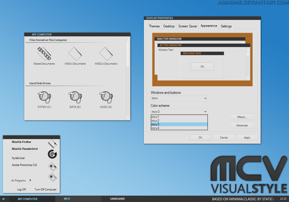
 aMADme — mood VisualStyle
Published: 2006-11-14 13:16:57 +0000 UTC; Views: 16269; Favourites: 38; Downloads: 2454
Redirect to original
Description
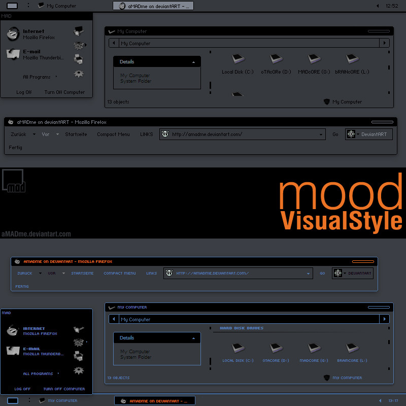
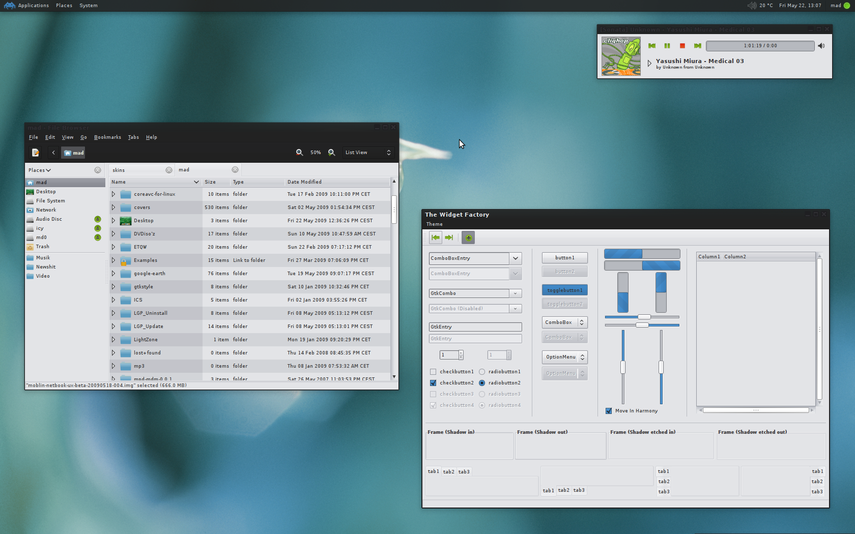
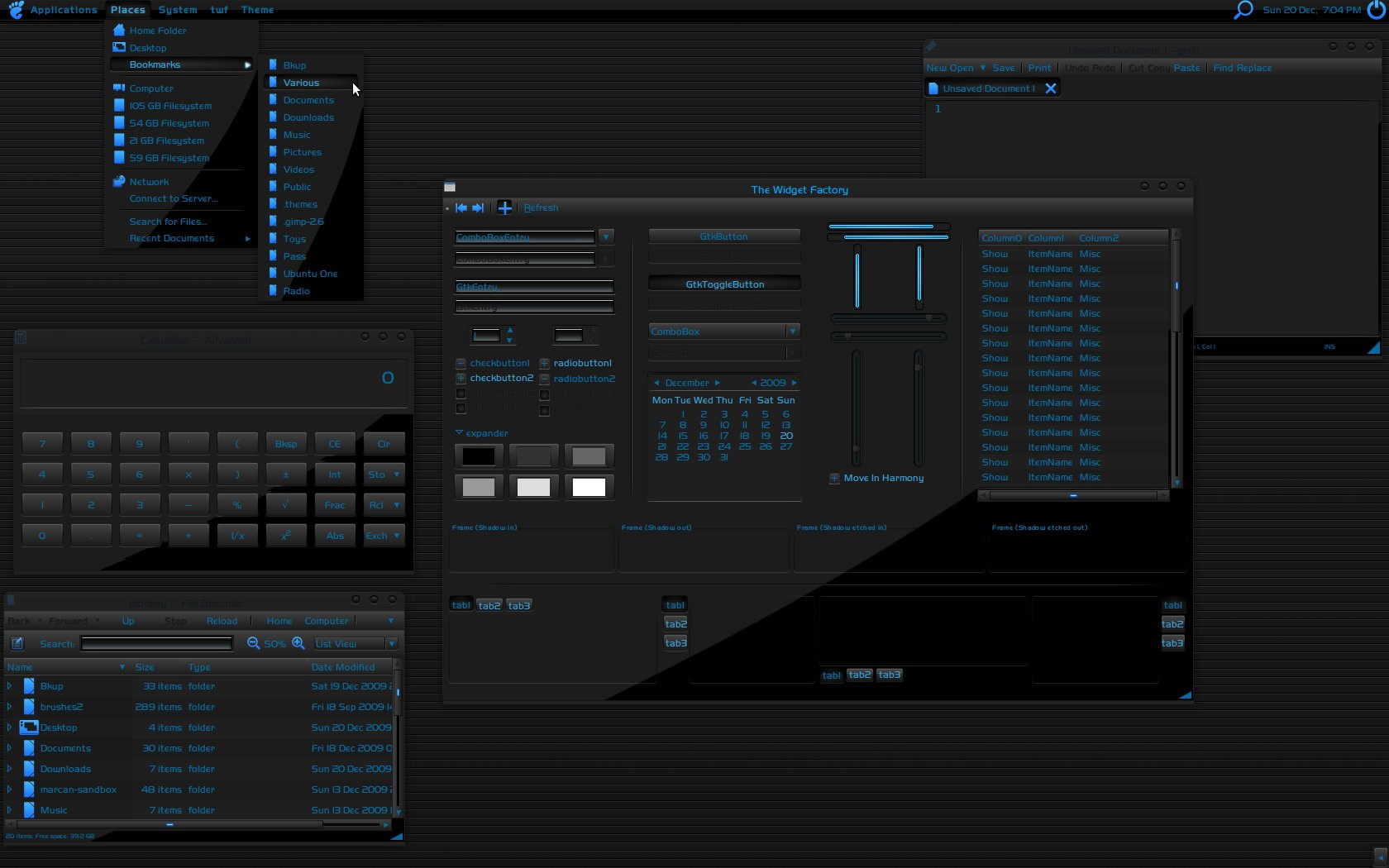
This is my first take on doing a VisualStyle ever.... I hope there's not too many bugs left, if you find one please report to me.I kind of got inspired by the design of my GFs new MP3player of the same name.
Stylertoolbars are included however only for Explorer, not for IE, cause I don't use it.
Install the fonts before using it.
---------------------------------------------------------------------------------------------------------
BIG THANKS goes out to akka and [link] for making Decadence OpenSource on which this vs is based on.
And of course since this is based on an OpenSource VS this can be modified and released as you please.
I don't care about credits if anyone does, but at least credit nuance.
Related content


Comments: 17

Very neat! Nice, simple, and dark! Dark is good! I really like the way you did the close buttons and the lines bordering the windows.
👍: 0 ⏩: 0


Ready to test another colors.
Very impressive work, simple and beautiful.
👍: 0 ⏩: 0

too dark? too flat? NAY! This VS is perfect .. well, almost. I love the colors and style and the scroll bar is small and compact. But the taskbar on the desktop is a bit big. That's my only complaint. I'm partial to thinbar themes, though. Still, this is a great VS.
👍: 0 ⏩: 1

I really appreciate that, even if I'm sonotsxe
btw I like your gallery

 (Wink)")
👍: 0 ⏩: 0

I like this very much, but in a minimalist style as this, two full colors are in my opinion too much. You could do a blue and orange because both look good, but not together though.
You could try different combinations (green-orange) or desaturate one of the colors.
👍: 0 ⏩: 0


great one! but i ll join the others thinking that s a bit too dark and the contrast with blue and black is not really a good choice for me...
but anyway, it is a pretty little thing when all the rest is awesome.
👍: 0 ⏩: 0

this theme is awesome! i pretty much love it. any possibilties of making a whit/grey/lighter version?
👍: 0 ⏩: 1
I wass thinking of more color versions for the next version, so yeah...
👍: 0 ⏩: 1

lol and i was thinking of my own color mods too
👍: 0 ⏩: 1

really digging those caption buttons, sexy. but yeah, bump up the contrast of the in the dark substyle and you'll be gold. good stuff man.
👍: 0 ⏩: 0


this is way too dark and flat for me, but it looks like you put a lot of effort into it. nice job  (Smile)")

👍: 0 ⏩: 0
