HOME | DD
 amandhingra — WebGraphix
by-nc-nd
amandhingra — WebGraphix
by-nc-nd
Published: 2007-07-02 11:36:15 +0000 UTC; Views: 20604; Favourites: 167; Downloads: 882
Redirect to original
Description
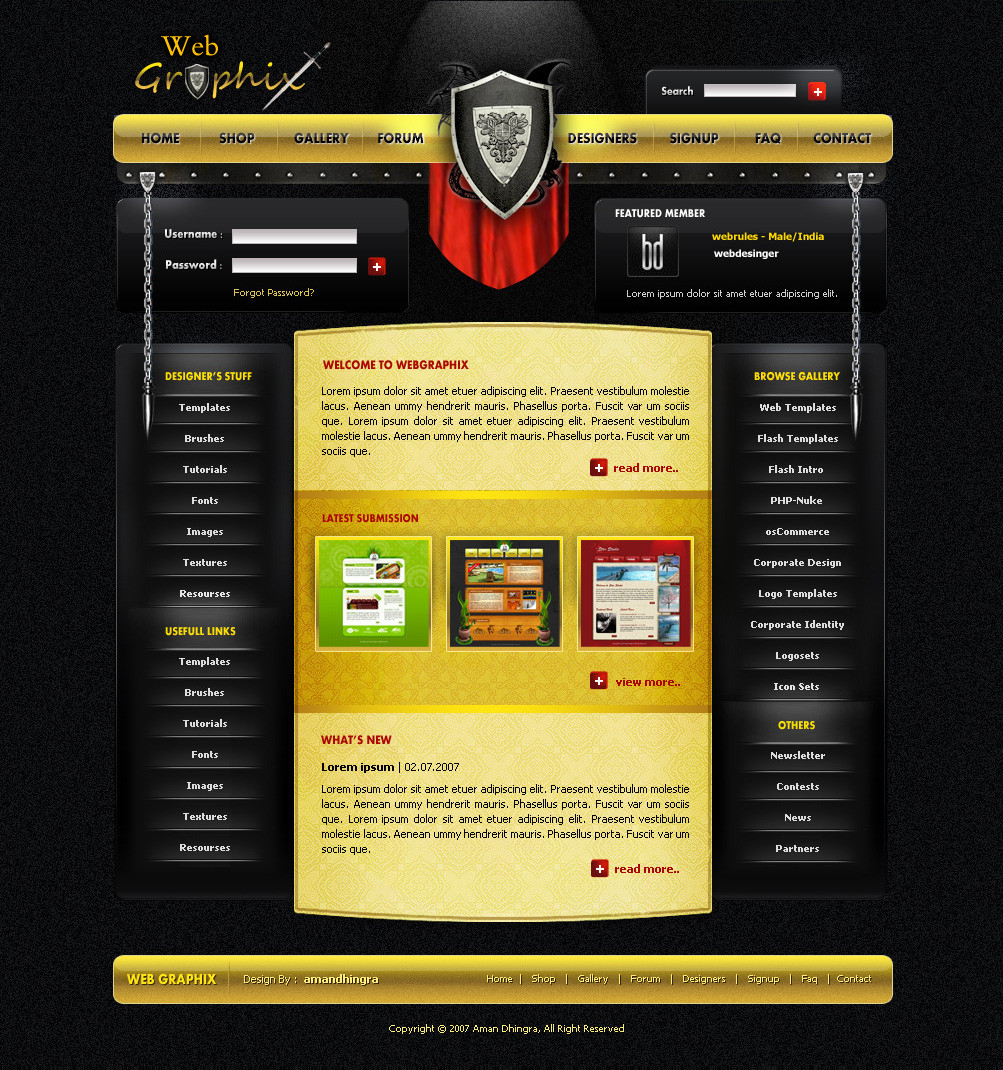
WebGraphix (Smile)")
This is for a new and fast growing community here on DA *webgraphix and i hope will rock in future.
and i think its one of the best template i hav design
")
Hope you like it and will be very glad if got some fav
Shield is not design by me. its an image. i got from google [link]
comments
 favs is always appreciated
edit: Remove that blue flame n some little changes
Related content


Comments: 128

awesome site, very smooth and nicely done, & added
👍: 0 ⏩: 0


Wow You are Really amazing ! it seems so effortless ..but once we start designing we know how hard we scratch our head!!!
👍: 0 ⏩: 0


Excellent work n Concept Aman. Keep it up bro.!!
👍: 0 ⏩: 0


i dunno why, but i really like this template...especially the layout.....surely a
👍: 0 ⏩: 1

THANKS BRO!!! i m glad u like this. but where is the fav bro
👍: 0 ⏩: 1
oops..almost forgot it..
now here's a real
also, i want to joinn your community WebGraphix...
you can check my artwork first....do respond.
👍: 0 ⏩: 1

this really rocks i wish you will give me the chance to use it for my site
[link]
👍: 0 ⏩: 0


 (Wink)")

")


Amazing~~~ I love the golden & black layout. The lighting effect from the top is also fabulous, can you kindly let me know how to do it? It makes me curious to death >_<
👍: 0 ⏩: 1


Too many designs on DA almost completely ignore the actual web component to the design process.
I think the noise "texture" used throughout is unnecessary and cheap looking. I would love to see the websites for groups like webgraphix and designersjunior step away from the cliche 2.0 style. By having the website for the group in a specific, overused style, you are making a statement about that group and it will turn away many potential members and viewers immediately.
The website for a group of webdesigners should be simple, clean, elegant, and free of any style association. (yes that means no shiny buttons or glowing links, how ever will we design without them??)
👍: 0 ⏩: 1
i understand bro what u r saying. and m totally agree wid you.. actully this layout is kinda boredm. so i hav made this. and try to use each n every tool of the photoshop for just practice lol.. anyways thanks for the comment mate
👍: 0 ⏩: 0


it was already mention it in the artist comment bro
👍: 0 ⏩: 0


i havnt said that i hav made this logo
👍: 0 ⏩: 0

Now this one's cool - I like medieval weaponry and all that...nicely done!
👍: 0 ⏩: 1
thanks . m glad that u like it
👍: 0 ⏩: 0


thanks mate. glad that u like it
👍: 0 ⏩: 0

| Next =>