HOME | DD
 amandhingra — WebGraphix
by-nc-nd
amandhingra — WebGraphix
by-nc-nd
Published: 2007-07-02 11:36:15 +0000 UTC; Views: 20604; Favourites: 167; Downloads: 882
Redirect to original
Description
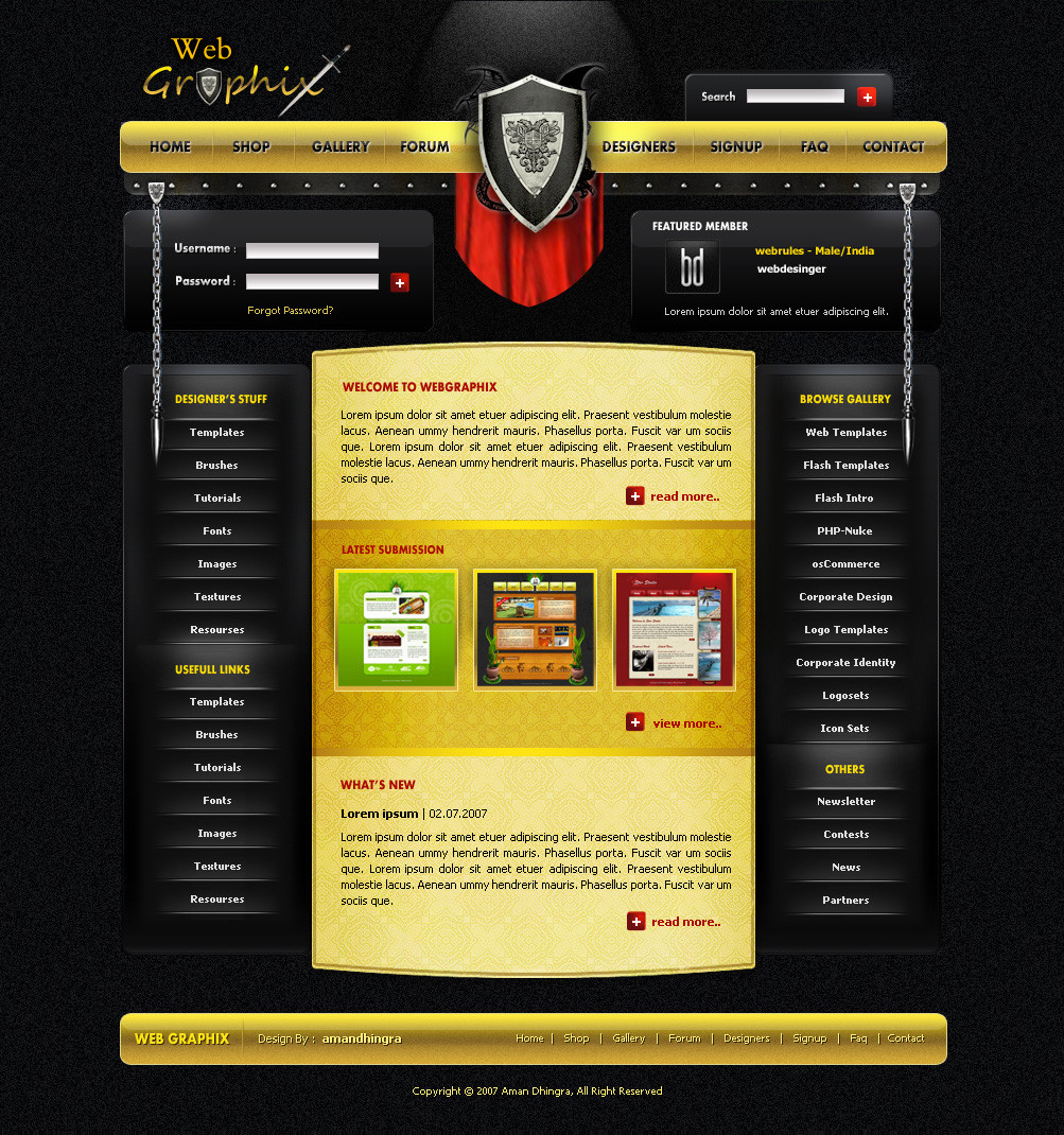
WebGraphix (Smile)")
This is for a new and fast growing community here on DA *webgraphix and i hope will rock in future.
and i think its one of the best template i hav design
")
Hope you like it and will be very glad if got some fav
Shield is not design by me. its an image. i got from google [link]
comments
 favs is always appreciated
edit: Remove that blue flame n some little changes
Related content


Comments: 128


o badhiya design hai bhai. you have some lovely designs. delhi mein kahaan?
👍: 0 ⏩: 1

dhanywaad apka. pad kar aacha laga ki aapko humare design pasand aaye ")
👍: 0 ⏩: 1
gr8 dude jayda dur nahi rahte aap .. u hav such a nice work in ur gallery
👍: 0 ⏩: 0

excellent layout! i'm a fan of centered layouts myself, and i really like the shield thing you've got going. love the colors, the lighting, and the button setup.
great work!
👍: 0 ⏩: 1
thanks. glad u like my work
👍: 0 ⏩: 0


To much noise in the background but other then that looks great!
👍: 0 ⏩: 0


Very nice. I don't much like the text for the header, but the rest of the awesomeness makes up for it.
👍: 0 ⏩: 1

thank dude. and thanks for the
👍: 0 ⏩: 0

great design and very practical, i think is gonna be very usefull
a small thing, ill delete the cross of the X under the sword, so the sword makes the cross to complete the X. just a suggestion
👍: 0 ⏩: 1
thanks dude... hehe i just forgot to erase that lol. thank for telling me
👍: 0 ⏩: 0

awesome !!! i love that but i don't like so much the noised background.
👍: 0 ⏩: 1

Very nice! and the logo is alsow hot!
👍: 0 ⏩: 1
 (Wink)")


Def better w/o the blue flame, I'd blur the Noisy light at the top.
👍: 0 ⏩: 0


thank u sooo much
👍: 0 ⏩: 0

welldone . great work improvments have been shown
👍: 0 ⏩: 1


looks very good man... many details..
👍: 0 ⏩: 1
and yaah i made this for just for fun. i dont know is that style will work or not? just trying to make my skill better nothing else
👍: 0 ⏩: 1

I didn't say i don't like it, i didn't say it is bad either, though i said it was really well done. check my comments again and u'll see there's nothin about me not liking this work. Just some issues i had bout that. And take it easy pal.
👍: 0 ⏩: 1
ok i m cool dude.. just tired nothing else ..edited
👍: 0 ⏩: 0
| Next =>