HOME | DD
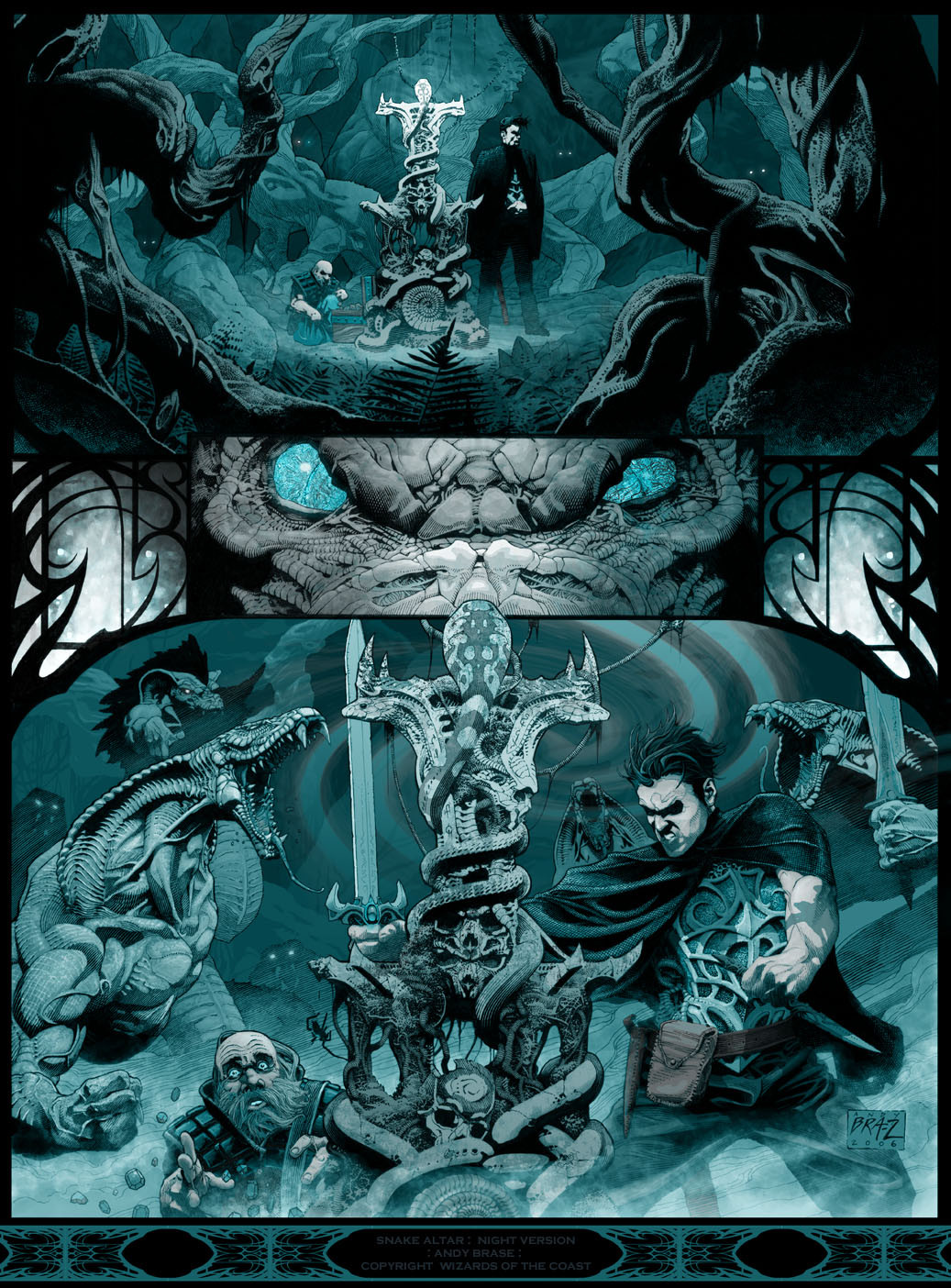
 andybrase — Snake Altar: Night version
Published: 2010-04-29 08:19:07 +0000 UTC; Views: 19460; Favourites: 491; Downloads: 0
Redirect to original
Description
Snake Altar: Night versionpencil, ink, and digital color
RPG art for Eberron (D&D)
This art was for a chapter header for an RPG book. Another one I colored myself over my line work.
The colors have been adjusted a bit from the original printed version.
copyright Wizards of the Coast
Blog/ Website
Related content


Comments: 40

 (Smile)")

This is beautiful and inspiring. Makes me want to drop everything and sketch.
👍: 0 ⏩: 0


how do you do the scrolling on the sides just heavy black pen. Our the bottom border just interested in learning some new cool techniques. Thanks
👍: 0 ⏩: 1

The design on the sides of the eyes in the center panel, was drawn in ink on the original drawing. The design at the bottom was added in PS... it's taken from some separate ink designs I created.
👍: 0 ⏩: 0


The time and care you must have taken to add all of these fine details is amazing! How long did this take?
👍: 0 ⏩: 0


Great job and i love the monochromatic choice
just amazing !
~ bets
👍: 0 ⏩: 0


yeah, it's a professional piece I did for Wizards of the Coast. thanx
👍: 0 ⏩: 0


This is magnificent, I mean bravo! The atmosphere really shines though and pulls you in.
👍: 0 ⏩: 0


Foreshortening on the rightmost arm looks a little bad ")
👍: 0 ⏩: 0


I love the contrast betweeen different blue. Very difficult to make this sort of cover. And the result comes from indicible...
Congratulations !
👍: 0 ⏩: 0


I don't like the way the one guy is holding his sword in the bottom panel, doesn't seem natural to a fighting stance, (he also kinda looks like Peter Patrelli from heroes, but I'm assuming he's not  (Wink)")


👍: 0 ⏩: 1
I've never seen Heroes, and didn't use any photo refs on this drawing.
I can't say I'm totally happy with his stance either... it is supposed to be an image caught in motion and not a static stance though. thanx for your thoughts!
👍: 0 ⏩: 1


you are a master. your art is definately one of my muses
👍: 0 ⏩: 0

")

Amazing 

👍: 0 ⏩: 0


Once again, great inkwork and texturing skills! *ScarletGothica has a good point! Can't resist faving your work!
👍: 0 ⏩: 0

oh wow, every piece you do it's simply amazing, I can't resist faving everything! 

👍: 0 ⏩: 0