HOME | DD
 antraxdk — Flatus - Version two - WIP
Published: 2004-02-28 10:59:54 +0000 UTC; Views: 1327; Favourites: 1; Downloads: 1520
Redirect to original
Description
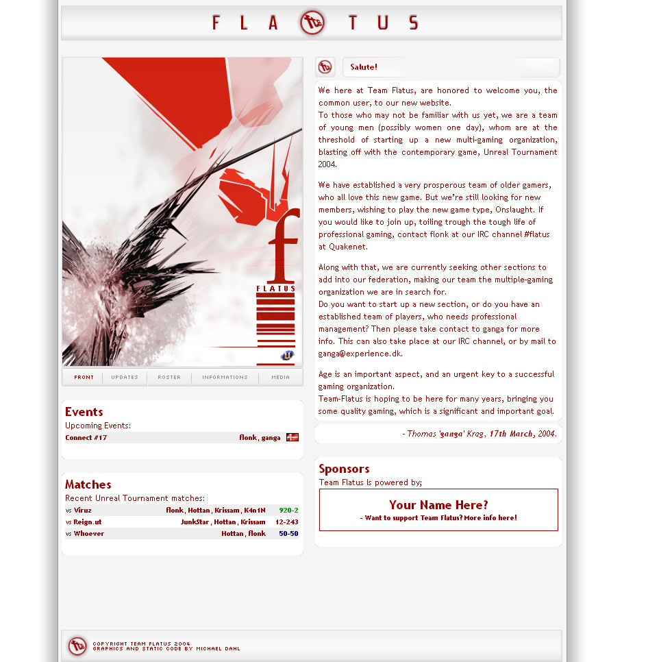
Update! Added a lot - Still wanting comments! (Smile)")
Browse-able version; [link]
Working on this. Both a personal and school project. Must be handed in by week 12, so every piece of feedback is gold.
Thanks in advance.
btw, please suggest changes.
Appriciate it,
Michael
Related content


Comments: 23


Nice design. Seems fairly simple but nice. Very clean, good work here bud
👍: 0 ⏩: 0


omg looks great man, i love the minimal feel of it all ( i <3 minimalistic designs) keep it up man!
👍: 0 ⏩: 0

may i suggest looking @ [link] - his work will inspire you soooooooo much. in fact he has recently done a site with the same style, sorta ")
[link]
👍: 0 ⏩: 0

this is really cool... kind of like the work 2advanced used to do. i like it alot (:
👍: 0 ⏩: 0

It looks pretty darn slick, that's for sure.
As others have mentioned, the placement of the navigation is a concern for obvious reasons.
I'm not really feeling the main image on the page, it doesn't really communicate anything about the clan ... or the fact that this an unreal clan website. It's got a nice "wow-factor" though, provided the person isn't growing tired of the 3d abstract craze (i am  (Wink)")
All the text is red. I reckon there should be a secondary text colour to help differenciate between headings and copy. IMHO, the copy should be a more readable black or dark grey.
Despite its flaws, this is already better than 95% of the clan websites that i've seen. I'll bet you'll do really well on this school assignment
👍: 0 ⏩: 1

Thing is, that Flatus eventually will evolve into a Multi Gaming site. On that expence I couldn't afford to make it to 'unrealish'.
That's simply why.
The font colors i'll look into, i'm lacking some header action at the minor sections anyway.
Thanks for your comment, It's well noted!
👍: 0 ⏩: 1
No worries
Good luck with the rest of the site
👍: 0 ⏩: 0

Nice. But why is your navigation below the picture? Will it be below a picture on every sub-page, or will it move? It does look neat having it where it is. But I've shot myself in the foot before by trying to have the navigation in a novel place.
👍: 0 ⏩: 1
Haven't thought of that, thanks for reminding me.
👍: 0 ⏩: 0


Lookin slick n clean..but i agree with the 2 comments...some of the aspects of that main picture doesnt fit in with each other...other then that its great
👍: 0 ⏩: 0

Good work but it seems like their is a lack of connection between a few pieces of your design. What goofy says is all really good. The large pink and black abstract 3D piece seems out of place with all of the red. If you make the pink red I'm sure that would clear things up. Other than that, I think you have more than enough comments from me and goofy.
SyCrOS
👍: 0 ⏩: 1
Forgot to say that the fta logo is great. I love it!
👍: 0 ⏩: 0


It looks nice
I like the most of it, but here is small list of the "bad" thing:
The U logo doesn't fit in (can't you make the red? I know it isn't that smart, but it might fit in a bit better).
I doesn't like the huge picture over the menu. I don't know why, but it's not me...
The boxes under the "menu hight" isn't to clear.
Overall: I like it a lot & the navagation system looks good (it's easy to figure out how it works)
")
👍: 0 ⏩: 1

You really have to keep the standards of gameicons. They make a little contrast which I think suits this site fine.
If you made it red, it would just fade in and the page would actually be quite boring.
But I'm lovin' it matie.
")
👍: 0 ⏩: 0

very cool
something new in the endless clanpage-country
👍: 0 ⏩: 0