HOME | DD
 Ariarin — #5
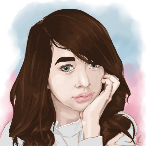
#deviantid #digital #painting #portrait
Published: 2016-08-08 10:32:18 +0000 UTC; Views: 147; Favourites: 2; Downloads: 0
Redirect to original
Description
I think I have finally improved, but I still have a long way to go before I'm as good as I want to be.I still hate painting hair. I can't get it right, it's getting really frustrating.
Related content


Comments: 6

Overall

Vision
Originality
Technique
Impact
I love it. This is really good. Well done, well done. Observe more, use more references.
For the hair you can start with darker colors and use larger strokes to lay down the proper lighting then smaller and smaller curves until you go into highlights because hair has bunch of tiny lines in there. XD SO tiny strokes for highlights which is detailing.
Only I can suggest is how you handle contrast. The artwork is already very good. The proportion is good, the impact specially the eyes are very attractive to look at. Be aware more of the contrast. Eventually you'll get there.
Very well done! Good luck in your future more works!
~BAYSHANI
👍: 0 ⏩: 1

Thank you for the much needed feedback and tips.
👍: 0 ⏩: 1
You are very welcome. Keep up the good work!
👍: 0 ⏩: 0

Overall
Vision
Originality
Technique
Impact
Positives:
- The proportions and tones are very good.
- The eyes are well drawn
- You have put the pink and blue together for the background and these are colours that compliment each other.
Things to possibly improve:
- "I still hate painting the hair": Here are some tips. The hair is very jagged around the outside, try to imagine you're drawing each hair from the scalp outwards instead of drawing the outline of the hair then colouring it out. You have the colouring and tones quite well done in the hair actually, it's just the textural quality especially around the outside. I can see some loose strands of hair but it doesn't look right because you've just sort of added them after doing the outline of the hair, it just looks all very jagged , especially around the bottom left where the hair basically is at a right angle, also when you are doing individual strands try using a much thinner brush and using several strokes (perhaps in different tones of brown or the chosen hair colour) rather than using a brush that size and just doing one stroke. The same principle can also be applied to the eyebrows.
Another tip for hair on digital media would be to set the wetness of the brush to very low, in traditional art this is how you would give textural quality to hair, especially when brushing off outwards on the tips of the hair. In traditional art it would also be in most cases more practical to use a comb brush to create the effect of hair as opposed to a round or flat brush (Which it looks like you're using).
Overall: A
The tones, colours, form and proportions are all correct and done to a high standard. Hopefully you can improve upon your works with the tips I've given you for the hair.
Anyone can message me if they have any questions or need any help. I hope to see you improve, good luck!
-C. Cryer - Poole
👍: 0 ⏩: 1
Hi! Thanks for the feedback. You made some good points, I didn't even notice the hair mess at the bottom left! I will fix some things with this painting soon.
👍: 0 ⏩: 1