HOME | DD
 arpad — Emprove identity
by-nc-nd

Published: 2008-06-13 22:01:26 +0000 UTC; Views: 36507; Favourites: 201; Downloads: 0
Redirect to original
Description
Recent work.
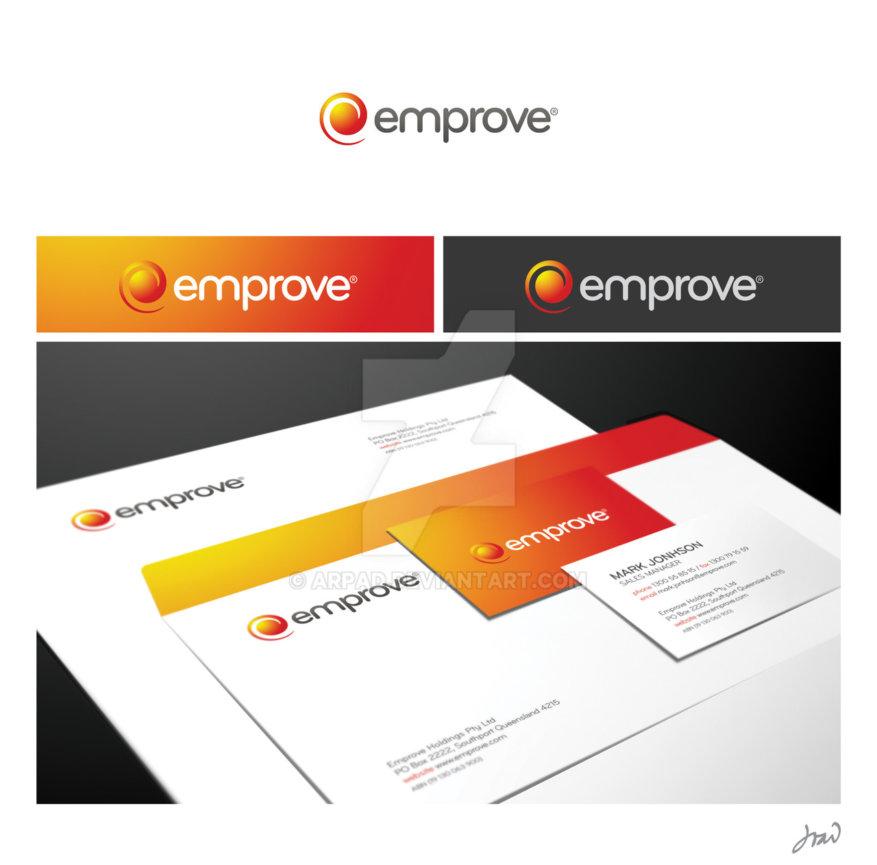
Australian HR company. The challenge was to create a very simple, versatile and yet memorable and corporate identity.
Concept: energy / birth / cycle / power.
Hope you like it,
João
Related content
Comments: 89

Hi Arpad,
Some great corporate works you've got here!
This is one of the greatest works in your gallery. The smooth font and graphic fit very well together.
What fascinates me the most is how beautifully the logo works on the business card. I'm used to putting a logo entirely white on a filled background. But the way that you drew the gradiënts resulted in a nice contrast, which definately works better then a plain white logo on a filled background.
Very nice!
👍: 0 ⏩: 0

Brilliant work u have done here! great design! keep up the hard work
👍: 0 ⏩: 0

nice one 
👍: 0 ⏩: 1

This font is a derivation from Bryant 
👍: 0 ⏩: 0

simply gorgeous work - so balanced and refined yet, the color is bold and creates an instant emotional connection. fantastic identity there
👍: 0 ⏩: 1

Thank you, I was aiming for that
👍: 0 ⏩: 0

Awesome 
👍: 0 ⏩: 0

Really soo Elegant and Pro work ,, Good work man
👍: 0 ⏩: 0

Hey, nice clean identity, Could you tell me the name of the font please
👍: 0 ⏩: 1

Bryant Pro. Thank you for your comment
👍: 0 ⏩: 0

its really amazing work..
can i know which programe you are using !
👍: 0 ⏩: 1

Identity work was done with CorelDraw, presentation is Photoshop.
Thanks for your comment.
👍: 0 ⏩: 1

i wish that i can work with corelDraw..i feel it lil bit difficult..
u have great work
👍: 0 ⏩: 0

No problem, great work! Are you moving with that project?
João
👍: 0 ⏩: 1

I like the text a lot, very simple and clean. I think the icon may lack a little depth though. It kinda drowns on the orange background. Just my opinion.
👍: 0 ⏩: 1

Thanks spud, I appreciate. I think so too, perhaps it could blend in some other way I guess
👍: 0 ⏩: 0

Everyone says its amazing bla bla bla!
Its not perfect!
The font on the text, its nice, clean simpel. The logo self where you made power birth energy and that stuff. It just dosent seems original! OFC its nice logo, good concept but a litle bit not original. Like that, i dont know how to describe it. Its just not original. Nice colors and all, really digg your style but the self logo with the round thing, dosent make it original!
Give it 8/10. Dont be mad at me only my perspective 
// edo
👍: 0 ⏩: 1

Thank you for your comments, of course I respect other's opinions. I myself think that a good logo doesn't need to be original, for that purpose we should define what it is to be original after all. This logo is very simple, and that was the goal. Plain and simple, soft and round font to kick it and vibrant colours to empower it. I did a couple of other concepts for this brand and the client chose this one exactly because of the arguments I just told you, it is effective and establishes a good vibe with the people, a good visual connection. I would give it 7/10, so that you know, I'm my own strongest critic.
Best,
João
👍: 0 ⏩: 1

Interesting comments. I've just gotten a copy of 'Los Logos 4', a brilliant compilation of thousands of logos organised by usage and style. It's amazing seeing the similarities of a lot of logos side by side, yet despite the similar components, each logo is executed in a unique way with its own style and personality.
Before I saw your comments about Energy/Power, etc, I was actually just thinking that would be a great identity for an Energy (Gas/Electricity) company! A lovely use of a simple palette.
👍: 0 ⏩: 0

Claro que podia ter feito mais, melhor, diferente, etc. O objectivo era claro e muito óbvio, criar uma marca distinta e simples, cuja identidade possa espelhar o espírito da empresa em toda a sua comunicação, tanto interna como externa. Agradeço as tuas críticas, ainda que mal fundamentadas.
Cumprimentos,
João
👍: 0 ⏩: 0

You could've done better, IMHO. The color selection for the spiral itself didn't caught me. The presentation of the letterpaper, envealope etc. is not fine also.
👍: 0 ⏩: 0
| Next =>


