HOME | DD
 arpad — Emprove identity
by-nc-nd
arpad — Emprove identity
by-nc-nd
Published: 2008-06-13 22:01:26 +0000 UTC; Views: 36508; Favourites: 201; Downloads: 0
Redirect to original
Description
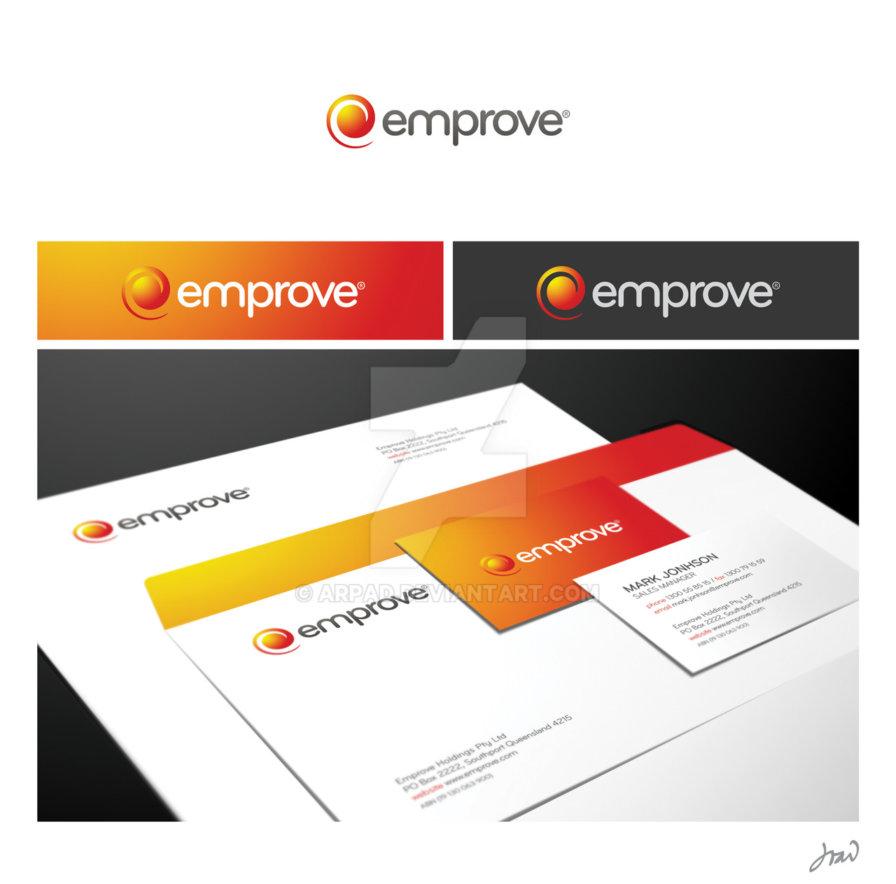
Recent work.
Australian HR company. The challenge was to create a very simple, versatile and yet memorable and corporate identity.
Concept: energy / birth / cycle / power.
Hope you like it,
João
Related content


Comments: 89

Very clean and corporate.
I wonder how much the client must have paid for this.
You a great designer man.
👍: 0 ⏩: 1


just say this will put to my fav
no comment..this was totally nice work
👍: 0 ⏩: 1


Its clean fresh , conceptual and its awesome. I love how the type is evenly spaced and can stand on its own.
👍: 0 ⏩: 1

Thanks my friend, I'm glad you pointed that out, I had a lot of work with the kerning. You know when we move the head back and forth to see how it looks? Or zoom in/out all the time? I had to print this in small sizes to see where the gaps were! God bless printers heheh
👍: 0 ⏩: 1
Yea when im working with kerning i always fire up my printer! considering most fonts are made for print not display.
👍: 0 ⏩: 0

amazing work. Always loved your work! How do you add depth of field to make it look quite real?
👍: 0 ⏩: 1
Thank you! It's just free transform + blur + burn/dodge tool from ps!
👍: 0 ⏩: 0

Enérgico, quente, e ao mesmo tempo amigável.
Muito bom!
👍: 0 ⏩: 1

Someday I will  (Smile)")
👍: 0 ⏩: 0

Thanks for the religious comment hehe
👍: 0 ⏩: 1

Aww... jpeg artefacts
Aweseme as always.
")
👍: 0 ⏩: 1
Thank you for your comment. What do you mean by jpeg artefacts?
João
👍: 0 ⏩: 1
Espcially visible in the orange part, there is a distortion around the white letters. This is a side effect from saving as .jpg. I don't know if the highest jpeg save settings evade this, but .png certainly does.
Skunk
👍: 0 ⏩: 1

Yes...Highest JPG settings certainly evade this.
BTW mate, great logo! It represents every word in the concept pretty well. Well done!
👍: 0 ⏩: 0


 (Wink)")
You're too kind, nothing amazing really, imho, just effective I guess

👍: 0 ⏩: 1

nah your being modest dude, that is soo original. Really great job. You are really a great inspiration. ")

👍: 0 ⏩: 1

Simple, clean, and has some great colors. Nice Job.
👍: 0 ⏩: 1
Thank you visualizer, I'm glad you think that way
👍: 0 ⏩: 0