HOME | DD
 Art-of-Eric-Wayne — Insect Angle
Published: 2012-02-29 15:26:45 +0000 UTC; Views: 2177; Favourites: 38; Downloads: 0
Redirect to original
Description
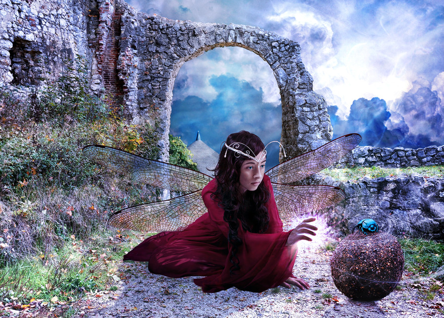
the Insect Angel cares for all insects, even the most lowly.This started as an experiment (actually it's a parody) but I got obsessed with it.
Note: element of ironic remove and the specific nature of the beetle's burden.
Stock used:
Ruine Kaltenburg18: [link]
castle in moutains: [link]
I just used the tip of the castle.
dragonfly wings: [link]
Check out how I put a sheen on those wings.
clouds: [link]
Girl: [link]
I ditched the arm and waist bands, and I put antennae on her head, uh, thingy.
YOU MIGHT ALSO LIKE:
Related content


Comments: 48

Overall


Technique
Impact
I like the concept. It's magical and fantasy. The color is also nicely matched. The fact that this is an experimental piece makes it better because usually beginner photomanip artists have trouble in matching colors.
But there are two things that decrease the believable factor:
1. The girl is much too big compared to the arch behind her. If she stands, how tall will she be? It gets worse because the subject is fairy and fairies are supposed to be tiny. Human perception will immediately tells it's fake.
2. The shadow is not dark enough. It seems the girl is floating or pasted.
Yet, compared to other beginner photomanipulations, this art is much better. As I said, I really like the color matching. Good job e.deviantart.net/emoticons/s/s… " width="15" height="15" alt="
 (Smile)")
👍: 0 ⏩: 1

Right, she IS too big. I hadn't even noticed that. For some reason it didn't seem like an issue. I made her bigger so viewers could see here. I'm not concerned about her being tiny or not, I supposed fantastical characters can come in various sizes, but not TOO big! She could be more of an "angel" than a "faerie," and that's as easy as changing the title. The dung beetle is also about 10X his normal size (which was deliberate)!! This piece has a definitely element of tongue in cheek about it.
The problem with the shadow isn't that it's too light, because it's on it's own layer and I can easily adjust it darker. It's something else that I can't quite figure out. The shadow has a gradation from dark, closest to her, to lighter further away, and it also blurs as it goes away.
I'm actually revising it right now, and just check DA and saw your critique. I might try making the faerie a little smaller, and of course I'm going to switch to calling her an "angel" which is what I originally called her anyway.
It's Photoshop, so the flaws you see can be fixed, if I can figure out how to do it. Then I think the strengths will also be magnified.
Finally, thanks so much for pointing out those flaws, especially the scale thing, which I'd completely missed. Bizarre.
👍: 0 ⏩: 0

WHat a gorgeous piece. I love the concept; lovely magical feeling here
👍: 0 ⏩: 1
Thanks a lot. It does have a bit of magic about it!
👍: 0 ⏩: 1
You are very welcome!
👍: 0 ⏩: 0


Love the story you are trying to create. It still looks a bit photoshopped like she doesnt belong. I would lighten the character and add lightning effects to both the background and then the character.
👍: 0 ⏩: 0


This one was declined by a lot of fantasy manipulation sites. Don't know why.
👍: 0 ⏩: 0

Nicely manipularted, Chairman Kuns! The 30kg ball of dung is a particularly nice feature. Should be a DD. BTW the scategory's all messed up, where's the fan art division for the Lord of the Wrongs?! lol XD
👍: 0 ⏩: 0

nice compose although the character shadow on the ground looks a bit plain, but that just my 2 cents
")
👍: 0 ⏩: 1
Thanks! not sure what you're saying about the shadow, or how to improve it. I even researched how to do shadows while working on this, to add to my own technique. A shadow fades out and gets blurry as it gets further from the object that casts the shadow. You are the second person to say something about the shadow, but I don't really see what the problem is. Oh well. Glad you like it anyway.
👍: 0 ⏩: 1
oh, haha, sorry for my english, hmmm how to say this, about that shadow, you see, the character shadow and the bottom part of the character is not blend together. I think that the problem with the shadow.
👍: 0 ⏩: 1
I'll fix it later, when I can figure out what's not quite right and also the best way to correct it. Right now I'm just not sure.
👍: 0 ⏩: 0

Thanks Zicsi, and thanks for adding it to your favs!
👍: 0 ⏩: 0

Ohhhh this is becoming great .....the sky and the work of light and shadow on the dress and I love the color of the bug....awesome!.....
👍: 0 ⏩: 1
Thanks for noticing the differences since the prior version!
👍: 0 ⏩: 1
it's getting really good....
👍: 0 ⏩: 0

Dude i was looking at my old stuff on deviant and found this [link] hahaha dragonfly boy
👍: 0 ⏩: 1
I think yours might have fly wings, because it only has one set. Keep him away from my dragonfly girl! She's not for spawning. Ha, ha. It looks like he's looking for her, too.
I'ts cool and I also like the semi-transparent wings. I spent a lot of time figuring out how to put a metallic sheen on mine that wasn't a part of the wings or the background.
OH, wait, that's you in the photo. YOU stay away from my angel, here me? Ha, ha, ha.
Thanks for sharing that piece! We must live in the same mental universe.
👍: 0 ⏩: 0

Very beautiful. You put this very well together~ Great work!
👍: 0 ⏩: 1
So glad you like this one.
👍: 0 ⏩: 0

awesome composition, love how you mix all the photos, lovely colorization, congrtas an amazing final result!!
____________________________________________________
hey will you help me with a contest??
[link] [link] [link] [link]
i really appreciated

👍: 0 ⏩: 1
Oh, thanks for "getting it" on all those levels, even the composition.
👍: 0 ⏩: 1


I love this one. Simply stunning. So much work but worth the effort.
👍: 0 ⏩: 1
 (Wink)")

I guess the idea was originally a joke, then this turned into an experiment, then I got obsessed, and it ended up being pretty serious. Glad you like it. Wish the was an Insect Angel, and one for me too.
👍: 0 ⏩: 0

Thanks. I've revised it, and think it's finally finished (for the time being, since I ALWAYS go back and revise, even years later).
👍: 0 ⏩: 0


Thanks! Glad you like this one.
👍: 0 ⏩: 0
Oh my fairy of the artists!!! hahahaha........ You did an extraordinary job at this image! ............love it....the dragonfly wings are great.....What do you want to add or change(?)......
👍: 0 ⏩: 1
So glad you like it. It seems to be getting a bit of a cool reception (as in, "not warm") so far. A few "photo manipulation" groups rejected it.
I just want to clean up some of the little details and improve the special effects. Little things like adding reflections in her hair. Some dodging and burning. I'm not quite satisfied with the faerie dust. Want to do some more cloning over of any distracting leaves or spots in the background. Maybe add some reflections on her clothes.
All that stuff gets quite technical and it's a bit tricky pulling it off. But most people won't notice the differences once I make them unless they put the "before" and "after" images, side by side.
I'm hoping I haven't created one of the least popular faeries on DA. Time will tell.
👍: 0 ⏩: 1
the whole image is good....is that good work with the layers you do ...amazing!...
👍: 0 ⏩: 1
I'm all about the layers. It has 48 layers at the moment.
👍: 0 ⏩: 1
ohh..... many layers a little tired ... or not?...the most I've done is 25 or 27....
👍: 0 ⏩: 0

Thanks. It's not my normal style at all. I don't do photomanipulations. It was kind of an experiment. I also don't do faaries.
👍: 0 ⏩: 1