HOME | DD
 AtixVector — MY deviantART LOGOTYPE
Published: 2008-10-04 02:03:03 +0000 UTC; Views: 36584; Favourites: 440; Downloads: 2778
Redirect to original
Description
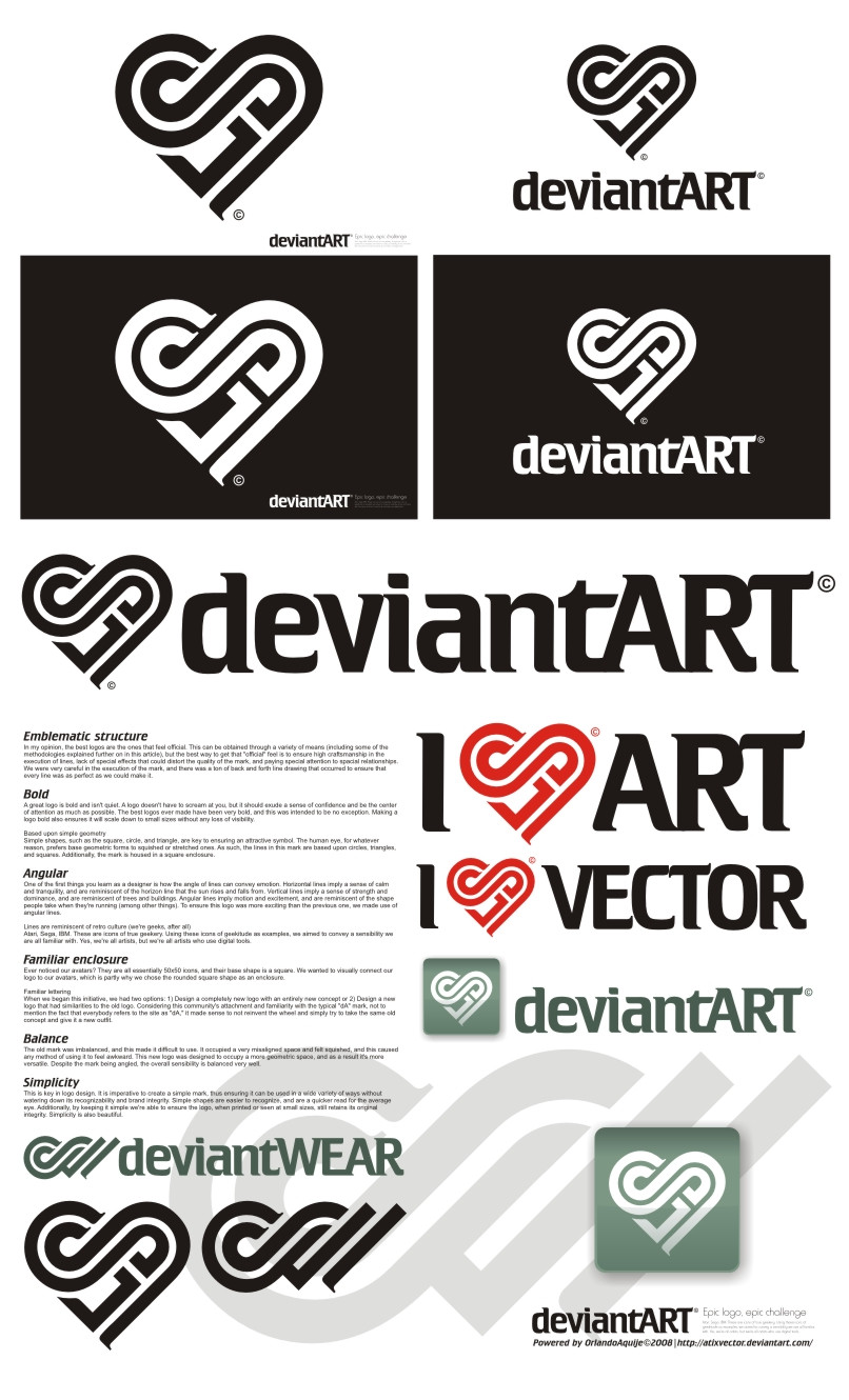
I LOVE DA V1.0::::::::::A C T U A L I Z A C I O N:::::::::
Si quieren ver cómo quedaría este logotipo en el header de DA, veanlo en este video, cortesía de `Norke [link]
I LOVE DA V 2.0 [link]
My deviantART Logotype III [link]
Related content


Comments: 359

Could you release the button version as PNG please. (The one with a rounded square box around it) I would very much want to use it on my sites and vids to link to my account!
👍: 0 ⏩: 0


Me gusta!!! POr qu no lo cambian por tu logotipo?? Jejeje
👍: 0 ⏩: 0

oye este es el logotipo para deviantARTque mas me gusta te quedó my padre saludos!
👍: 0 ⏩: 0


Most wars in the entire world happen in islam countries, somehow, there's also a gradual severe female discrimination nuisance. I'm of the opinion that they should civilized their mind and act form not doing bull-sh*t stuffs anymore.
👍: 0 ⏩: 0

o.o are you trying to offend islam ?
👍: 0 ⏩: 0

What? How does a heart look like a crescent? And why would that be a bad thing? :s
👍: 0 ⏩: 0

y quien ganó? bueno en lo personal este es m favorito ;D
👍: 0 ⏩: 1

Gracias! Pero creo que nadie ganó.
👍: 0 ⏩: 1
nadie ganó? xD como puede ser eso posible? xD hahahaha se escucha gracioso. Pues yo digo que el tuyo la neta ;D ._. los otros estan asi normales solo le cambian el tipo de letra y ya y el tuyo esta asi todo  (Smile)")
👍: 0 ⏩: 1
Pos la neta es que estos weyes se reservaban el derecho de no elegir a ningún ganador y declarar el concurso desierto. Así que finalmente no es tan raro como suena. Pinches c~#€... xD
Gracias por tus palabras de todas formas. Voy a seguir probando suerte en otros concursos.
Saludos!
👍: 0 ⏩: 1
estan bien tontos me cae D: xD hahahaha
saludos

👍: 0 ⏩: 0

Dios si hubieran elegido uno
tenia que haber sido este
me parecio que este fue el mejor de la competencia<3
quedo muy muy bien hecho
👍: 0 ⏩: 1
Gracias, Anna... aunque creo que no elegirán ninguno.
👍: 0 ⏩: 0

Oh wow! Awesome logo!
The first thing I noticed was how the D and A can look like infinity sign (you know the curve?).
Its really interesting!
")
👍: 0 ⏩: 0


Waau increible es super original la idea desde luego ^^
👍: 0 ⏩: 0


This Epic Logo is just the best, in my opinion.
👍: 0 ⏩: 0


yeh very clever, although the little serif notch things at the end of the logo coupled with the hard bold confident lines and corners makes the logo a bit too corporate i think.
👍: 0 ⏩: 0

")

Man I took forever to find the "d" but this is really well done.
👍: 0 ⏩: 0

Honestly, its a great idea and all, very clever, but I didn't get it at first glance. Like, AT ALL. I think it would be too insignificant as a logo...
👍: 0 ⏩: 0

damn that's good design.
I approve of this hearty logo
👍: 0 ⏩: 0


My favourite of the logo design comp so far for sure and a deserving 

Well done indeed
👍: 0 ⏩: 1

This concept is absolutely incredible, i will be VERY surprised if this entry does not win
👍: 0 ⏩: 1

wow estaba viendo este logo y pensando q bueno es... y cuando subo la pagina y veo el perrito...
de pana q te la traes con los logos.. excelente viejo.. XD
deberias hacer algun tutorial
👍: 0 ⏩: 1
Gracias, pero no creo que sepa tanto como para hacer un tutorial! Lo que haré má adelante será uno sobre cómo dibujé el cabello de El Joker...
👍: 0 ⏩: 1
| Next =>