HOME | DD

atobgraphics โ€” Logotypes V.1

Published: 2005-11-14 11:55:01 +0000 UTC; Views: 7077; Favourites: 54; Downloads: 910
Redirect to original
Description 
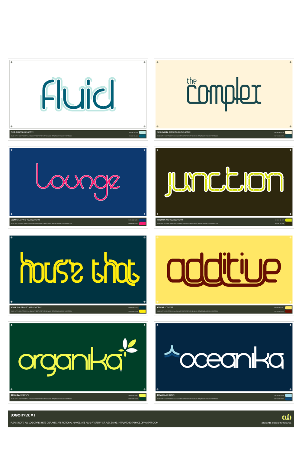
Selection of recently produced logotypes, all fictional based but soon to be used in various formats as promotional work for myself.
The colours arent all that important just thought they'd be possible combinations that suited each purpose.

All fonts seen produced by myself in Illustrator CS.

Let me know what you think
Related content
Comments: 93

atobgraphics In reply to ??? [2005-11-15 10:41:47 +0000 UTC]

Made myself, not available for download, sorry

๐Ÿ‘: 0 โฉ: 1

bozor In reply to atobgraphics [2005-11-15 13:17:02 +0000 UTC]

aww, well let me know if it changes - hell i could even be up for paying for them

๐Ÿ‘: 0 โฉ: 0

AHalo [2005-11-14 19:58:28 +0000 UTC]

very nice!

๐Ÿ‘: 0 โฉ: 0

acronym16 In reply to ??? [2005-11-14 18:44:39 +0000 UTC]

the bottom two logo's would make excellent modern corporate type faces, very nice work.

๐Ÿ‘: 0 โฉ: 0

MiG-Quadra [2005-11-14 18:41:55 +0000 UTC]

last two are pretty ^^

๐Ÿ‘: 0 โฉ: 0

misscam-ftw [2005-11-14 18:03:34 +0000 UTC]

Great, I love the fluid one

๐Ÿ‘: 0 โฉ: 0

paperairplane [2005-11-14 17:55:37 +0000 UTC]

I love the two bottom fonts and all of the typography.
How did you make the fluid one with only a stroke on part of the letters?
The little TM under the a's in the last ones are also really hot.
Great job man.

๐Ÿ‘: 0 โฉ: 1

atobgraphics In reply to paperairplane [2005-11-14 18:59:13 +0000 UTC]

It was constructed on a grid using the pen tool. Hard to explain, but looks kinda cool

๐Ÿ‘: 0 โฉ: 0

Ariel-G [2005-11-14 17:36:32 +0000 UTC]

all cool

๐Ÿ‘: 0 โฉ: 0

serendipityguy [2005-11-14 16:52:45 +0000 UTC]

these are just great, THis what I struggle with & I which I could create one for my web site [link]

๐Ÿ‘: 0 โฉ: 1

atobgraphics In reply to serendipityguy [2005-11-14 16:57:38 +0000 UTC]

Thanks, i could design one if required, for small cost. cant do it for free.

๐Ÿ‘: 0 โฉ: 1

serendipityguy In reply to atobgraphics [2005-11-14 16:59:43 +0000 UTC]

send me a note with the details...

๐Ÿ‘: 0 โฉ: 0

Sebasti4n [2005-11-14 16:16:32 +0000 UTC]

Organika and oceanika are the best!

๐Ÿ‘: 0 โฉ: 0

skm-industries [2005-11-14 15:46:27 +0000 UTC]

Love that 'Organika' font, would love to use it.... *wink*

๐Ÿ‘: 0 โฉ: 0

spritek [2005-11-14 15:27:05 +0000 UTC]

typo great logotypes!

๐Ÿ‘: 0 โฉ: 0

eightball In reply to ??? [2005-11-14 15:01:19 +0000 UTC]

Love em all, organika and oceanika are my favs.. nice!

๐Ÿ‘: 0 โฉ: 0

kscness [2005-11-14 14:45:36 +0000 UTC]

i love additive and organika!
but they're all good styles!

๐Ÿ‘: 0 โฉ: 0

Fufina [2005-11-14 14:21:22 +0000 UTC]

ยท fluid + organika ยท

๐Ÿ‘: 0 โฉ: 0

CaperisM In reply to ??? [2005-11-14 13:58:28 +0000 UTC]

I love organika and oceanika.
Rest are average.

๐Ÿ‘: 0 โฉ: 0

Jo248 In reply to ??? [2005-11-14 13:52:36 +0000 UTC]

Brilliant! My favourite is the oceanika one, its really cool!

๐Ÿ‘: 0 โฉ: 0

99thbone In reply to ??? [2005-11-14 13:51:42 +0000 UTC]

1st row -- left
last row -- both

interesting fonts style used -- the first one is my favourite -- like the concepts -- later days

๐Ÿ‘: 0 โฉ: 0

kwedo In reply to ??? [2005-11-14 13:49:43 +0000 UTC]

๐Ÿ‘: 0 โฉ: 0

artikboy [2005-11-14 13:41:04 +0000 UTC]

very cool ones! i think i liked them all

๐Ÿ‘: 0 โฉ: 0

Mooseh [2005-11-14 13:36:27 +0000 UTC]

I like fluid. House that is really clever Though the word Organika just wins out in my opinion

๐Ÿ‘: 0 โฉ: 0

Eliasklingen [2005-11-14 13:18:29 +0000 UTC]

wow, great job my favourite is the house font

๐Ÿ‘: 0 โฉ: 0

googleplex [2005-11-14 13:15:09 +0000 UTC]

love the last one...

๐Ÿ‘: 0 โฉ: 0

biosoup [2005-11-14 13:12:10 +0000 UTC]

they are great!! I most like the last one!! will you can one for me if I ask you?? (for non-commercional purposes)

๐Ÿ‘: 0 โฉ: 1

CardinalCDXX In reply to biosoup [2005-11-23 02:19:26 +0000 UTC]

I think you mean, and to help you out.
"These/they are great! I like the last one the most! Will you make one for me if I ask you? (for non-commercial purposes)

๐Ÿ‘: 0 โฉ: 0

Shikaz [2005-11-14 13:04:05 +0000 UTC]

i like them all
all of them are amazing i just dont like junction but its matter of taste and i think many likes it
but cant understand on what these will be used please ?

๐Ÿ‘: 0 โฉ: 1

atobgraphics In reply to Shikaz [2005-11-14 14:03:08 +0000 UTC]

Im not keen on junction either. the've been created just as logo designs for portfolio, not really for any set purpose yet.

๐Ÿ‘: 0 โฉ: 0

rson890100 In reply to ??? [2005-11-14 12:54:42 +0000 UTC]

I like da fluid one da most.

๐Ÿ‘: 0 โฉ: 0

rantic In reply to ??? [2005-11-14 12:51:34 +0000 UTC]

organika looks hot.

๐Ÿ‘: 0 โฉ: 0

VEXTA In reply to ??? [2005-11-14 12:33:21 +0000 UTC]

wow ausome dude i love it.

id use al dem fonts cause they just lok so ausome

๐Ÿ‘: 0 โฉ: 0

atmosphair3 [2005-11-14 12:22:07 +0000 UTC]

organica - oceanika

๐Ÿ‘: 0 โฉ: 0

Shokubo [2005-11-14 12:19:52 +0000 UTC]

nice all of them

๐Ÿ‘: 0 โฉ: 0

Scazza [2005-11-14 12:15:06 +0000 UTC]

the bottom 2 rock my socks LoL

nice job buddy

๐Ÿ‘: 0 โฉ: 0

mikeskid [2005-11-14 12:08:31 +0000 UTC]

cool

๐Ÿ‘: 0 โฉ: 0

ThaUrbanLegend [2005-11-14 12:07:02 +0000 UTC]

I like Organika and Fluid.

๐Ÿ‘: 0 โฉ: 0

PrimaryVIVID In reply to ??? [2005-11-14 12:03:40 +0000 UTC]

Beautiful typography. Really brilliant stuff here, a fav for sure.

๐Ÿ‘: 0 โฉ: 0

Zhaana In reply to ??? [2005-11-14 12:03:09 +0000 UTC]

SO nice !! I love the fonts additive" and "house that" ! Great job ^_^

๐Ÿ‘: 0 โฉ: 1

atobgraphics In reply to Zhaana [2005-11-14 12:05:25 +0000 UTC]

'house that' will be seen soon, just mocking up some vinyl record covers using that.

๐Ÿ‘: 0 โฉ: 1

Zhaana In reply to atobgraphics [2005-11-14 14:02:37 +0000 UTC]

Ohh kewl i'm looking forward so

๐Ÿ‘: 0 โฉ: 0


<= Prev |