HOME | DD
 atobgraphics — Logotypes V.1
Published: 2005-11-14 11:55:01 +0000 UTC; Views: 7077; Favourites: 54; Downloads: 910
Redirect to original
Description
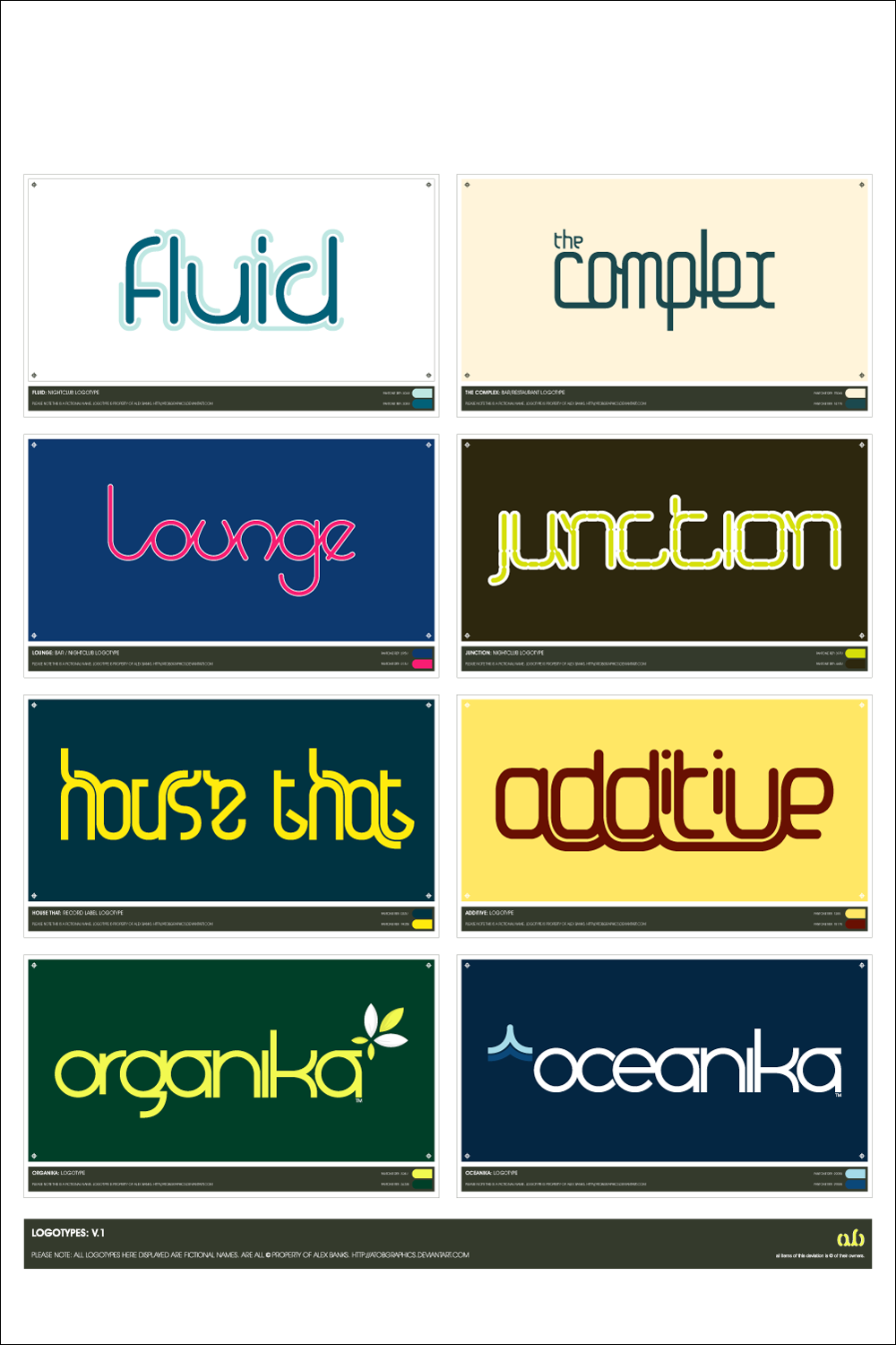
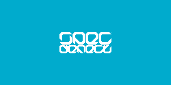
Selection of recently produced logotypes, all fictional based but soon to be used in various formats as promotional work for myself.The colours arent all that important just thought they'd be possible combinations that suited each purpose.
All fonts seen produced by myself in Illustrator CS.
Let me know what you think
 (Smile)")
Related content


Comments: 93


by the way xD i love the loungue typo too! 

👍: 0 ⏩: 0

Cool logos. I like "The Complex" best
And god I want the bottom font please please share it!
")
👍: 0 ⏩: 0


i luv 'fluid' n 'the complex'
so simple
can i get the fonts?
👍: 0 ⏩: 0

organika is a skateboard company that uses that uses a similar font to that.
👍: 0 ⏩: 0

")

You cant. Their typefaces ive created for my own use. sorry
👍: 0 ⏩: 1

Sorry about my english
")
👍: 0 ⏩: 0

I very much like these fonts, they are very detailed - which perhaps makes them somewhat inpractical for everyday use, but who cares - love how the lines seem to resemble what they stand for. The laid back lines in Lounge are perhaps a good example.
👍: 0 ⏩: 0


some very nice fonts, definetley inspirational, if you've not heard of it before I suggest you check out a book called dos logos, really worth the buy if you're doing logo design and love them like I do, you won't regret it.
👍: 0 ⏩: 1
Yeah i already have 'Los Logos', a must have book for any designer. Great inspiration material, especially for typography.
👍: 0 ⏩: 0

They're all great looking (really great), but they're very dense, which substracts from their usability. I'd like to see some more logotypes from you.
👍: 0 ⏩: 0
thanks mate, in the process of making some t-shirt designs utilising that font at the minute.
hope for them to be available after xmas. (too busy woith work to get them done before)
👍: 0 ⏩: 1

hehei, niiice
btw, is there any chance u have a 3-lined font?
👍: 0 ⏩: 1
erm, not sure mate. generally i make them if i cant find them
👍: 0 ⏩: 1

Well, my comment will get lost in the positive praise, but this is looking good, very professional. They are all awesome except 2nd row I think, which is far less appealing than the others...Bottom row might be the best...I'm keeping an eye on you.
👍: 0 ⏩: 0

I like the "the complex" on the best personally, they are all good tho
👍: 0 ⏩: 0

will you be releasing any fonts??...didnt you start a font concept based on heat coils before...youv'e got a hand for it...i'd really like to use something like that in a few of my designs (please dont judge my capabilities by my deviations...i did them in short time using shitty software 
👍: 0 ⏩: 0


Now, are these auactual typefaces, or just vector bits?
Also, I'm looking to get into typography, and I'd like to know if there are any starting points or tutorials or software you reccomend.
Oh, and on junction: change the yellow to more of an olive green color. The brown background and whole stencil look of the type reminded me of something military, and the olive drab would complete that, or at least complement it.
👍: 0 ⏩: 1
The typography was created in vector form by myself to my own design.
At the moment they are simply shown as logotypes but hope to develop them into working fonts.
You'll be pushed to find any tutorials on typography, best bet is to buy some typographic books.
Software, you'll need a program like Fontographer to make them into fonts like you can download, but create them in Illustrator or any vector based software.
👍: 0 ⏩: 1
That's... somewhat of a relief. At least I know I still know how to search for things... all this time I thought it was my fault.
What about Fontlab? Is that any good?
👍: 0 ⏩: 1
Ive never used it, but heard about it, they generally all do the same thing anyway.
👍: 0 ⏩: 1

the most i like is "organika" and "oceanika" the other ones are difficult to read and maybe understand.
great!
👍: 0 ⏩: 0


the organika & oceanika are my FAV's so smooth and pronounce.
👍: 0 ⏩: 0


these are some awsome fonts!
are they only personal or can they be downloaded?
👍: 0 ⏩: 1
They are just the logotype, the whole alphabet hasn't been created yet.
Dont think they will be available for download when fully created.
👍: 0 ⏩: 1
aww, thats too bad.
great work still!
👍: 0 ⏩: 0
not available for download, sorry
👍: 0 ⏩: 1

aw. too bad. oh well.
👍: 0 ⏩: 0

wow. some of the best typefaces ive seen there! well done matey. is it easy to make ur own fonts in illu? i mean so tehy are universal across ur system. cheers ad well done!
👍: 0 ⏩: 1
Thanks, Its pretty easy to make your own, you just use the grid structure and away you go
👍: 0 ⏩: 1
yeah but can u export em as a font or jsut use em in illu
👍: 0 ⏩: 1
evntually going to put them into fontographer for creation as a useable font, just havent got the time to sit down and do it
👍: 0 ⏩: 0

good job..
I am more fond with the 2 logos at bottom.. I think that Most of type provided here has a fixed x-hight, which looks to me like Egyptnized fonts,ofcours without using the serif. such fonts are good for titles and advertising but not very nice in reading, I am telling you that to be aware of their look in small sizes, like what if you make the length of every logo 1.5 cm, and print it? will it be clear? The illustration with yellow organika has no gemotric relation with your font. while it has nice relation in oceanika. more?
👍: 0 ⏩: 0


loving the fonts, did you make them yourself or can you buy/dl them?
👍: 0 ⏩: 1
| Next =>