HOME | DD
 atobgraphics — _Logotypes.Volume.Two
Published: 2006-09-17 11:12:28 +0000 UTC; Views: 3711; Favourites: 33; Downloads: 20
Redirect to original
Description
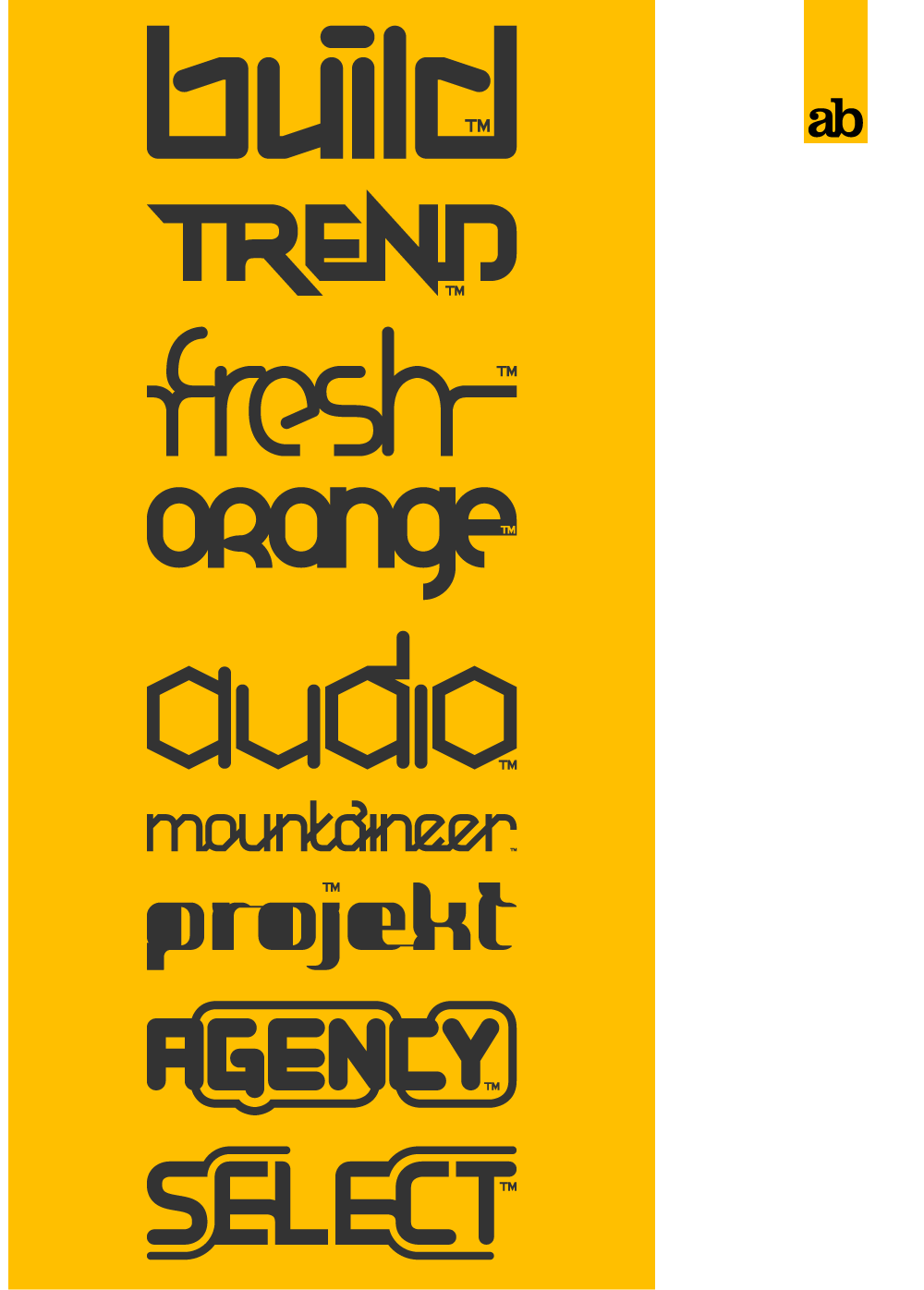
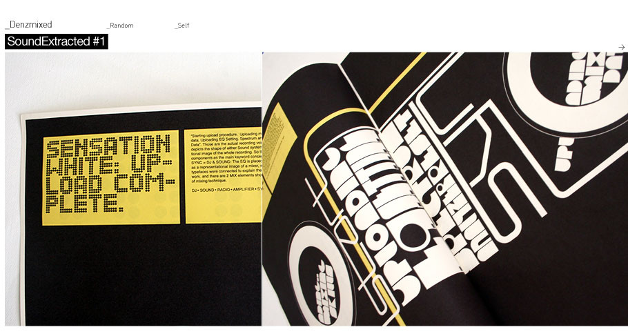
Selection of recently produced logotypes all fictional based just as bit of fun.All fonts seen produced by myself in Illustrator CS2.
Let me know which you like.
Thank You

Related content


Comments: 58


")


Its a self-created font ive produced
 (Smile)")
👍: 0 ⏩: 2

Ohh i really like it, yeah i was just looking at fonts/ typography online for my Graphic Design class and i ran into yours.
👍: 0 ⏩: 0
Ohh i really like it, yeah i was just looking at fonts/ typography online for my Graphic Design class and i ran into yours.
👍: 0 ⏩: 0


I love select orange and fresh! but they're all cool!
👍: 0 ⏩: 0

great fonts and logos, my favorite are audio, agency, and select
👍: 0 ⏩: 0


orange looks pretty fresh. and the other one..is it "mountaineer"??
very cool fonts man. where can I get them?
👍: 0 ⏩: 1
Unfortunatly they are just logotypes for now, but if i ever get chance i will produce them as full working fonts
👍: 0 ⏩: 0

"Select" and "Fresh" ... they're both exactly what they say they are.
My faves without doubt. Nice.
👍: 0 ⏩: 0

Why do some of the letters in alot of the fonts have rounded edges and then others dont? It kind of bothers me.
I love the fonts "Trend" and "Orange" though.
")
👍: 0 ⏩: 1
I'm not sure if I'm seeing what you mean... Looks to me like all the fonts that have the odd sharp edge are meant to visually 'join"(?) with another letter... Like the 'e' and 's' in fresh.
2 pence.
Peace.
👍: 0 ⏩: 1
I ment how the B in the Build font has sharp edges at the top of the shaft but the bottom of the shaft in the I doesnt.
👍: 0 ⏩: 1
You know what, I cant believe I missed that. You're right, they are a little incongruent (?)... But I think it adds interest.
👍: 0 ⏩: 1
It does make it more interesting in a way but it also kind of bugs me at the same time.
I still really like all of them though.
👍: 0 ⏩: 0


some cool stuff man, I might put some of mine up here
👍: 0 ⏩: 0

fresh and project are my favs, but i really like the boardery bits on select too. veeeeery nice!
👍: 0 ⏩: 0


I like orange, audio and trend, especially the font in the orange logo is awesome, great work
👍: 0 ⏩: 0

maintaineer and audio seem like they would be a bit diffucult to read, but i like them all, expecially the uniqueuse of lines in agency and select, but i like them all really. : D
👍: 0 ⏩: 0


"fresh", "orange", "mounkahneer" I liked most!
 (Wink)")
👍: 0 ⏩: 0

the seventh logo there got to my attention...is it a font...?!if it is whats it called...?!heh
👍: 0 ⏩: 1
It not got a name. Its one of my own produced fonts
👍: 0 ⏩: 1
oh nice job on it....
is it up for sale or not...?!
👍: 0 ⏩: 0


Great layout, I really like how you have worked with the ™ in each logo, it's an interesting thing that brings them together in one piece.
👍: 0 ⏩: 0


| Next =>