HOME | DD
 atobgraphics — Pure
Published: 2006-02-20 09:42:37 +0000 UTC; Views: 2530; Favourites: 20; Downloads: 553
Redirect to original
Description
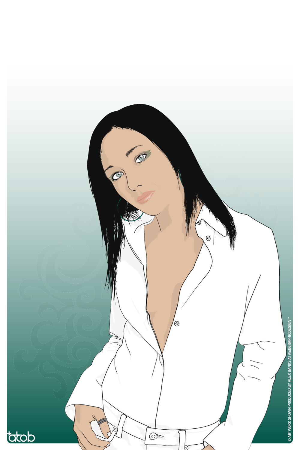
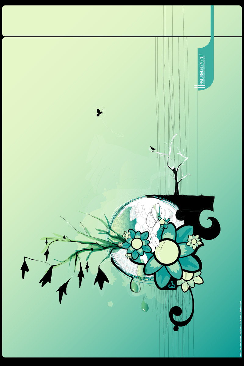
Decided to try something a little different stylewise inspired by the work of *j3concepts and ^EinionGot fed up producing full realistic vectors so wanted to try a new painted almost cartoon stylied design.
Its not perfect but I like it.
My plan is to use this figure on various media and also add the background elements too it also.
Time: 8hrs
Program : Adobe Illustrator CS
Stock: Skins.be
Artwork shown is copywriten by Alex Banks @ AtoB Graphic Design.
Related content


Comments: 35


I love the little details in the hair and whatnot...ahhhh! 
")

👍: 0 ⏩: 0


I like it dude. Only thing would be to add some highlights and shadow into the hair. Make it stand out just a little more than one solid color
👍: 0 ⏩: 0

A nicely defined outlines there, very clean looking. The parts I like the most about this are the slightly smaller details that you have included on the lips and the sparkle in her eyes. For me, I think the shadows on the chest could look a little bit more subtle.
Overall nicely done
👍: 0 ⏩: 0


This is some of the finest vetor art I have ever looked at. Superb! An INstant 


👍: 0 ⏩: 1

You are welcome, my friend.

👍: 0 ⏩: 0

hum, thats funny. Im doing an independent study on vectors and I tried to describe to my art teacher what vectoring is about, and mentioned making my own lineart, and she pointed me to alot of past and present japanese art...They're really all up with line drawings. In some old jap. art, there basically is no shadowing to speak of, its all basically shapes, alot like vectors.
When I think of what I imagine this style to be, I'm thinking you still have very many 'realistic' vector techniques in place, especially on the face. The jacket, I like a lot, or at least, I think it fits my view of the style I'm imagining. Of course, this is all in my head, so I could be completely wrong. How well do you think you achieved the look you were going for?
?eace
👍: 0 ⏩: 0


Todays features are shining a spotlight on the wonderful vector artists here on dA.
For more info or to view other featured artists, please visit the link below  (Smile)")
[link]
👍: 0 ⏩: 1


love the detail, i think she could use maybe a little blush/color on the cheeks and i don't know about outlineing the fingernails. But it is your work i'm just a novice at this stuff., but very sweet background is cool too.
👍: 0 ⏩: 0


")

Awesome. Its a nice change to your normal stuff. A piece with some of these and ond person in your full vectoring would look cool Especially with those awesome, yet simple backgrounds you make
👍: 0 ⏩: 0


i like it - i think you should emphasise the curve of her breast slightly. and that's not just because i'm pervacious.

👍: 0 ⏩: 1

I'll have to agree with =expansiondesign on this one. The clean style is cool, but it just doesn't match with the more complex aspects of the piece.
👍: 0 ⏩: 0

nice to see new style.. think it needs a bit more detail... that doesnt mean that it needs to be more realistic... jsut more little details to add to the whole thing.. spec in the jacket..
👍: 0 ⏩: 0

Beautiful ! I immediately thought of Einion's work when I saw the thumbnail ! Awesome work, I love it
👍: 0 ⏩: 1

Thanks you
Einion's work is truely inspiring
👍: 0 ⏩: 0


The deign itself is very nice, but you made the same mistake as in the previous one - when you use black shapes to achieve darker skin tones, the person looks like dirty.
Overall, I like the composition and the subtle background
👍: 0 ⏩: 0


this might sound wierd but i really like the background
👍: 0 ⏩: 0

