HOME | DD
 aureath — Monster's Ball - 2006
Published: 2006-10-05 22:17:58 +0000 UTC; Views: 2918; Favourites: 42; Downloads: 18
Redirect to original
Description
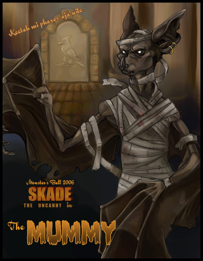
Awggh, this is far from perfect, but I'm sick of working on it, so! Every year, Zeriara holds a contest/game/mass orgy called the Monster's Ball, wherein you choose a monster from pop culture and dress one of your personal characters up as them. This year, I went with a more classic monster and chose The Mummy. Leaning towards Karloff's version, but with some of the newer movie's influence as well.I kind of designed this to look like a movie poster. My original idea was to replicate the old Mummy poster exactly (only with... Skade as the Mummy, clearly), layout and text-wise, but I went a slightly different route with it. I played around with the contrast and sketchiness to get it looking more like one of those older movie posters. So yes. I dunno. I may upload the textless, lower-contrast version to scraps later or something, as I think it's more flattering to the image, but less fitting with my idea.
And just for LOLs, here are my entries from years past:
[link] - 2005
[link] - 2004
[link] - 2003
Related content


Comments: 13

And speaking of Halloween.... badass bat costumes! [link]
👍: 0 ⏩: 1

Oh yes, aren't those awesome? 8DD Someone showed those to me a while ago, I forget who. I loves them so! *goes to click around the gallery again*
👍: 0 ⏩: 1
Yeah, they are... I wish I had money. Well, I wish I had *that* much money. ;..;
👍: 0 ⏩: 0


I LIKE!
It has such a fine atmosphere to it, with the dark colors and sketchy line art. Oh, and the eyes are just brilliant.
👍: 0 ⏩: 0


I think you nailed the physical appearance of the Mummy pretty damn well in this picture (well, as a bat I mean) as you did very well on the thin shape and shrunken texture of her body. The wrinkles from said shrinking really enhance the look of a dried corpse, particularly on her lips and shoulders, while the tones of her skin seem accurate for a long dead, preserved Skade (I noted her tones here being a bit darker and duller than her normal, living self and thought that was a nice touch). Additionally, I felt you also did well on the coloring and texture of the aged bandages as well.
Overall, I think you set up the movie poster look quite nicely with a fitting background and a seriously creepy looking Skade mummy to top it all off (The eyes being especially creepy). Very well done on this.
👍: 0 ⏩: 0

That looks real bad ass! Especially the background! Kuddos on that! Yea you got the poster look down good, as for the mummy look is bang on! that and the coloring is superb! 8D good luck in de contest! but I wonder....who was the winners last year?
👍: 0 ⏩: 0


Bandages! Everytime I see a bandaged mummy I want to tug bandages ;__;
👍: 0 ⏩: 0

It's pretty pathetic that I instantly recognized the line of diagonal text up there. The more recent version of that movie was my favourite movie for yeeears. This is really awesome!
👍: 0 ⏩: 0

Oooh! Awesome work on this!
That is 1337. XD
")
👍: 0 ⏩: 0