HOME | DD
 Autaux — 12Feb2006MegadethContest2

Published: 2006-02-12 12:01:26 +0000 UTC; Views: 7202; Favourites: 49; Downloads: 709
Redirect to original
Description
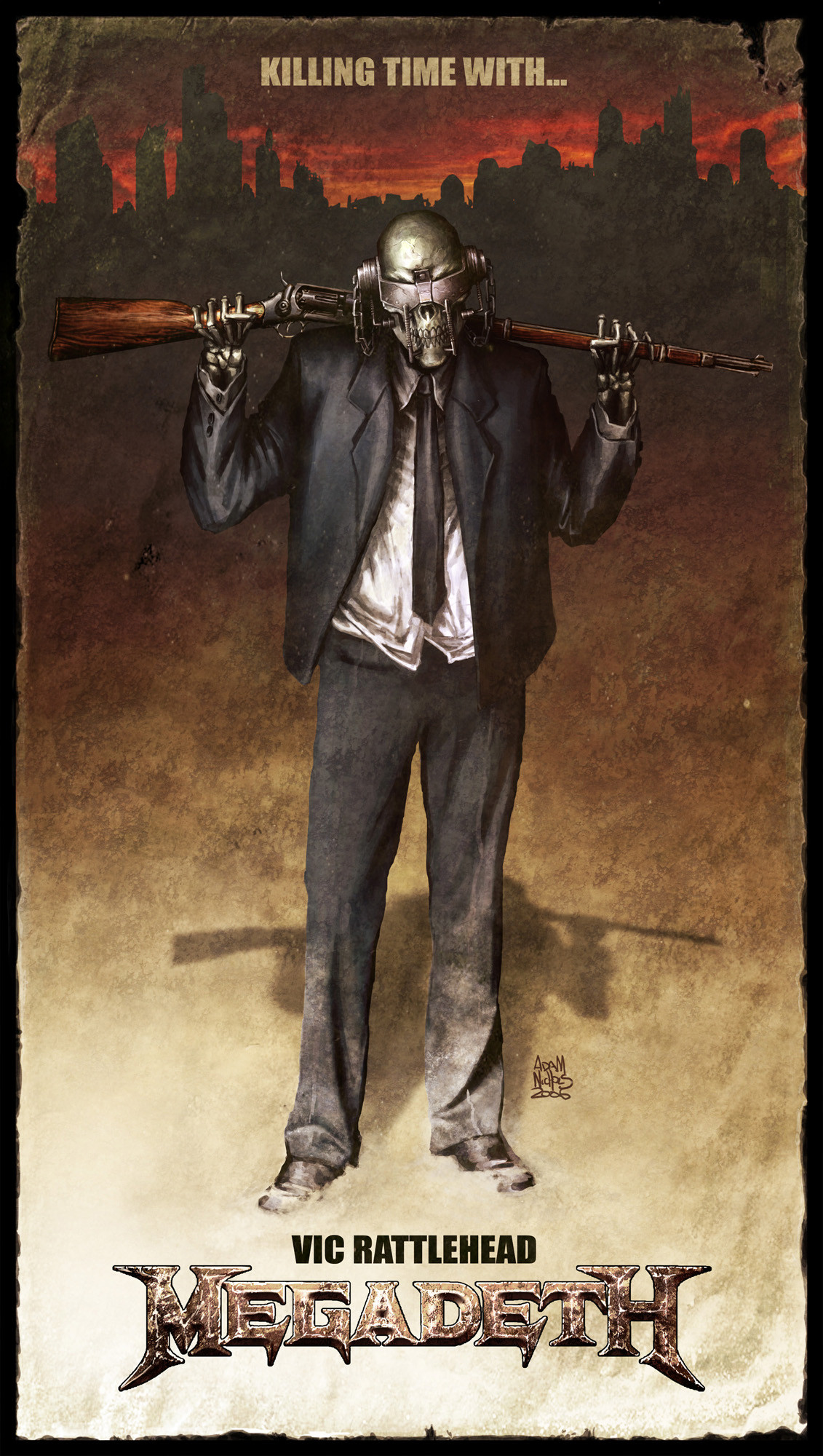
By Adam NicholsHeres my second entry into the Megadeth Vic Rattlehead Redesign contest, second of three entries I intend on submitting by the closing date on tuesday.
About the 3 images:
As a longtime fan of Megadeth I instantly felt compelled to enter this contest not only for the prizes but just for the honor of redesigning an icon I grew up with (I started listening to Megadeth at about age 8 influenced by my elder brothers) and have loved the iconology of Vic and Megadeth. Naturally Ive chosen to stick as closely to Daves long running image for Megadeth with its strong political views and visuals. I noticed 99% of the entries so far were just logo designs collating photos so I decided to go one further designing a poster or potential promotional artwork for my entry. The aim was to redesign the character but I decided there were some elements of the original where were crucial to the concept and to the band too. I decided to keep the blue suit and skeleton skull and to redesign his head predominantly to make him less 1980 and more current and modern by streamlining the features and angles. The pose roughtly suggests the cross with the rifle over the shoulders and usual megadeth one liner "Killing time with... Vic Rattlehead" in similar vein to their previous albums and lryics. The concept of "clean dirt" also throwing in a political twist to the image as well within the mock up torn and tattered "poster". I felt a certain erge to stick close to the original ideas of Megadeth as I knew the fans (being one too) would protest to any radical changes to Vic and hoped i could still keep the new Vic as bold and iconic as the original.
Good luck to the other entries and I cant wait to see which ones Dave goes with ;D
cheers,
adam nichols aka autaux
entry 1: vic verticle poster
[link]
entry 2: vic widescreen poster
[link]
entry 3: megadeth vic logo
[link]
Related content


Comments: 9

Very true to the Megadeth roots...I really like this...I really wish I had more time to work on this but I will at least keep all Megadeth fans posted on my progress in the Megadeth forums as well as here. This is a definate choice to hit Dave's eye...I am almost certain of it...the new feel with that flair of old school Vic jumps out right away...Excellent choice as far as background and logo btw...Best of luck to you...
👍: 0 ⏩: 1

really appreciated, yeah i tried to stay true, i read somewhere a fake post about dave wanting something entirely new but it turned out to be a fabrication and to tell you the truth did scare me alot hehe thanx for the support! ;D
👍: 0 ⏩: 0

dude this rocks, great work, i hope all the time effort and thought u put into this pay off!
")
👍: 0 ⏩: 1
thank you, me too, id be a dream come true ;D
👍: 0 ⏩: 1

This would have to be one of the best entries i`ve seen so far.
I say that not only because of the way it looks, but the thought and meaning you have put behind it. You`ve not only held true to the ideals behind this icon, you`ve also breathed new life into something that was looking a little dated, but haven`t alterted him too much.
All in all you`ve done a sweet job in showing Vic the modern age.
👍: 0 ⏩: 1
thats exactly what i wanted to hear *phew* i didnt want to see vic as some techno half cyborg or machanical animal... hes still gotta be "vic" so i tried hard to stay true... im glad someone else sees it too, thanx! ;D i hope dave likes it too for what it is
👍: 0 ⏩: 0

 (Smile)")
 (Wink)")
thanx one more logo entry on the way tonight, just hope i get it done...
👍: 0 ⏩: 0