HOME | DD
 Azn-Chipmunk — Critique plz
Published: 2012-07-12 04:31:04 +0000 UTC; Views: 2307; Favourites: 28; Downloads: 4
Redirect to original
Description
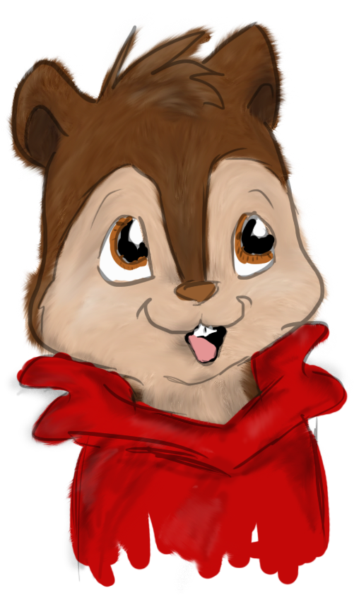
Testing out this fur technique i found so i can do it for detailed drawings. So this isnt a great drawing xD just a speed art thing just testing the fur.I know the line art is messed up - ill fix that ( i need moar practice)
I just need help with the shading stuff D:
and is the fur going in the right direction?
and do you guys like this style (adding the fur xD)? Does it look better? or more creepier? :3 i wanna know xD cause i dont wanna do this for commissions or my arts if it doesn't look good
")
PLEASE CRITIQUE. or give me your thoughts!
(just critique the fur xD i know everything else really sucks, especially the eyes)
Related content


Comments: 14


Well I could try to critique
Honestly, I think the fur looks pretty good already. If I were you, I'd add a little bit different brown colors, preferably darker, to Alvin's brown fur.
I mean, your picture looks pretty nice already, though you may want to shade under the hair on top his head :3

👍: 0 ⏩: 1

yay :3 Thank you so much for the critique
👍: 0 ⏩: 1

I WUV IT I WUV ALVIN WALVIN HE IS SOOOOO CUTE!!! AND FUNNY

👍: 0 ⏩: 0

This is excellent work! Your should be very proud of yourself! Wonderful! Neat with the shading and the fur!
👍: 0 ⏩: 1
aw haha :3 thank you! that means a lot
 (Smile)")
👍: 0 ⏩: 1

yaaay <3 thanks!
👍: 0 ⏩: 1

I don't know about fur direction for chipmunks, but if you look at photos of chipmunks, you could probably see which direction the fur should be going.
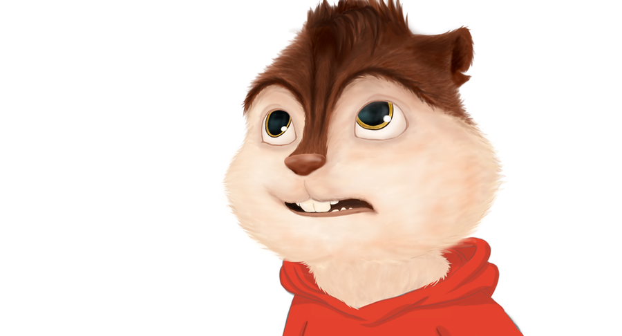
Both styles are good, it depends on what you want. This one shows fur texture, makes things look softer (the hoodie too), and is more realistic while the other is more cartoony and bright. For commissions, you could probably just give them an option between the two styles if you want/can do it. XD
As for the shading, I think if you emphasized it a bit more it'd look better. Like, shade more in the neck area, under the cheeks, right under the mouth's "w" shape, etc. Right now, the shading isn't too noticeable except in the ears and right above the nose.
👍: 0 ⏩: 1
aaah
you're so awesome at critiquing xD
👍: 0 ⏩: 1
You're welcome. :3
And aw, thanks.
👍: 0 ⏩: 0