HOME | DD
 BeckyKidus — Short guide on values and hues
#colors #contrast #drawing #howto #hue #tips #drawingtips #value #beckykidus #drawingtutorial #tutorial
Published: 2019-04-06 20:58:42 +0000 UTC; Views: 2710; Favourites: 163; Downloads: 8
Redirect to original
Description
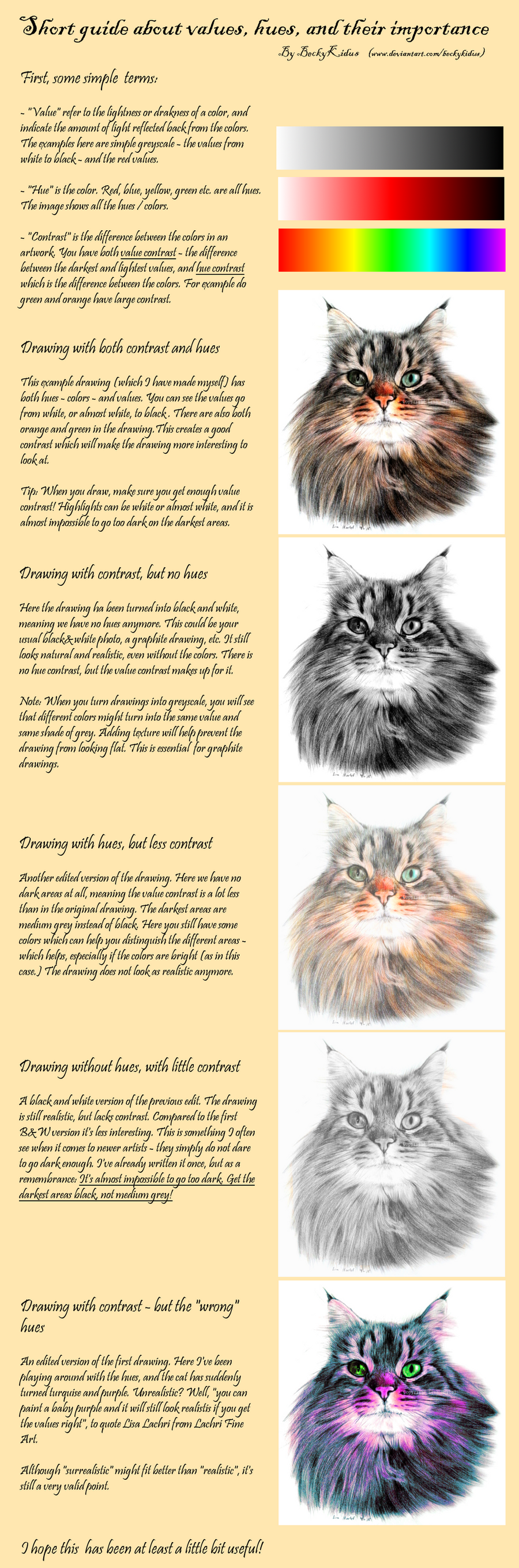
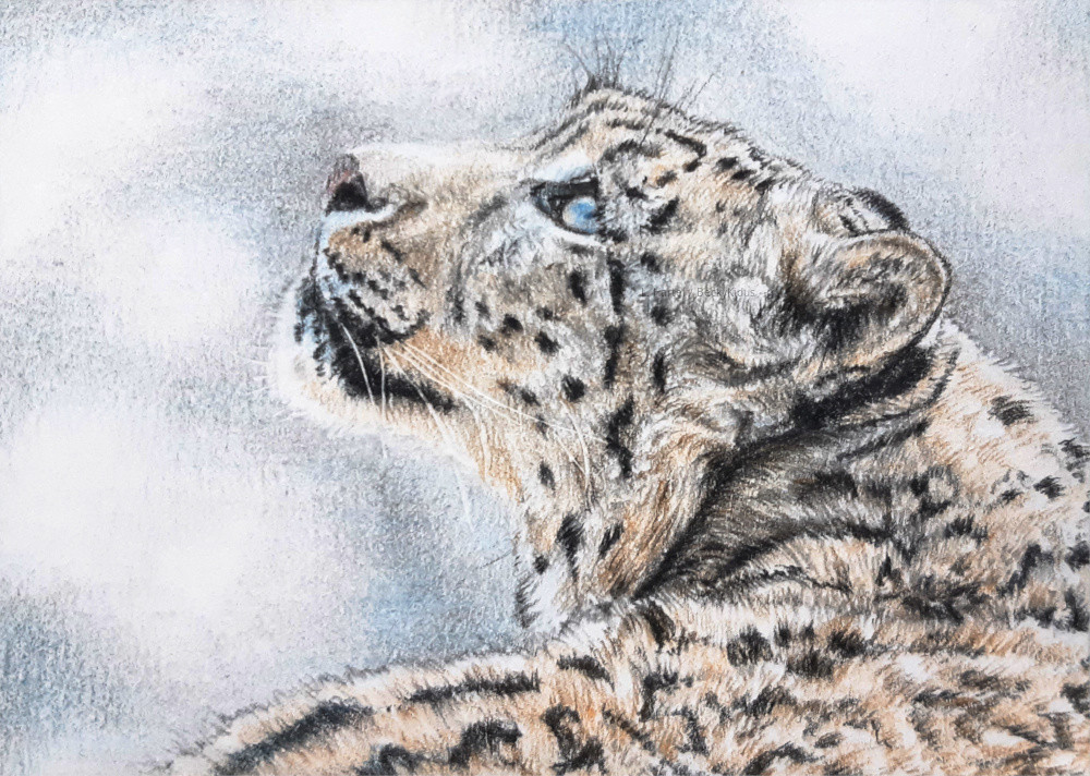
Just a quick guide which I hope will be useful for at least some of you people out there (Smile)") I'm on a trip to now, so I've not been able to do much art, but here you get something anyway. I hope to start doing my second part about drawing fur soon, about actually drawing traditional fur
I'm on a trip to now, so I've not been able to do much art, but here you get something anyway. I hope to start doing my second part about drawing fur soon, about actually drawing traditional fur  Although don't get your hopes up too much, procrastination might get in the way
Else - title talks for itself.
Drawing by myself, found here: The undisputable king of FLOOF
You can post this on other sites, but no commercial use and credit me (if possible).
Related content


Comments: 42

👍: 0 ⏩: 1

👍: 0 ⏩: 0

Overall

Originality

Technique
Impact
Very well done. e.deviantart.net/emoticons/s/s… " width="15" height="15" alt="
But for me, your examples read, as if „Value“ and „Contrast“ are switched.
Contrast itself only defines how strong a difference is.
While the Contrast you describe here only counts towards the difference in Value.
Even 2 colors of the same value can have more or less contrast.
For example, blue and yellow, which are opposites, produce a strong contrast, while blue and violet are closer and produce a weaker contrast.
You describe in your second example. When turning a image into grayscale, that different parts of the image can blend together.
This happens, because the contrast that was there, was only generated by hue.
In your last example, the difference in hue between the eye and the fur creates a much stronger contrast, then the Brown and green in your first picture.
I Hope, this is a somewhat helpful critique.
Sincerely
DoodlingTurtle
👍: 0 ⏩: 0

👍: 0 ⏩: 1

👍: 0 ⏩: 1


Interesting point, and well explained. What you say about the drawings lacking contrast is what you often see in graphite and sometimes color pencil artists too, when they lack experience. It may be shyness, but it may be lack of knowledge, too. Some artists don't realize the importance of value contrast, others simply don't know how to achieve that in graphite. That takes quality soft pencils, ones that are designed for graphic drawing specifically. Then later it is a matter of style, I guess.
Speaking of contrast, I'd like to add there are different kinds of contrast. I used the term "value contrast" specifically to differentiate that from color contrast, which is the contrast between hues that exists even at the same values. Blue and red are always in contrast, no matter their value. That's how one can use either value or hue contrast to give depth to an artwork. Of course, preferably both.
👍: 0 ⏩: 2

You're right about inexperienced artists and lack of contrast in graphite drawings. Being one such artist, I am shy about putting too much carbon on the paper, but once I see it on my computer I realize how little my shadows show up!
👍: 0 ⏩: 1
It depends on many things. Like I said, softer pencils are, in my opinion, a must. Even if you draw boldly, the harder graphite can never reach the same degree of darkness and solidity of shadows and when you draw shadows with a hard pencil it just shows no matter how you do it. Then there's also the scanning mastery. I never want my works scanned by somebody else anymore because I am very picky with settings and I always optimize manually. Even so post-processing of the scan to enhance contrast is absolutely mandatory simply because a scanned image is never as contrast-rich as the original drawing and technically it never can be. That is something you ought to replicate as well as possible on Ps later.
👍: 0 ⏩: 0
👍: 0 ⏩: 0

👍: 0 ⏩: 1
👍: 1 ⏩: 0

Was really good! I did have some trouble reading the text on mobile, even landscape orientation. It was a little small and the script, while interesting, was challenging.
👍: 0 ⏩: 1
👍: 0 ⏩: 0

This is very helpful. I thank you for sharing this.
👍: 0 ⏩: 1
👍: 0 ⏩: 0

Have you missed a bit of text on the last paragraph? Otherwise great and helpful guide with a beautiful cat
👍: 0 ⏩: 1
👍: 0 ⏩: 0

Ohh, I think I have been in all of these stages (Wink)")
👍: 0 ⏩: 1
👍: 0 ⏩: 1
And they are just as beautiful as your animals
👍: 0 ⏩: 1
👍: 0 ⏩: 1
But you have those beautiful griffins on your page ")
👍: 0 ⏩: 1
👍: 0 ⏩: 1
Oh sorry then but who is it then you talk about if I may ask?
👍: 0 ⏩: 1
👍: 0 ⏩: 1
I need to draw that creature it sounds awesome, a wolf with blue antlers and feet like a birds
👍: 0 ⏩: 0

👍: 0 ⏩: 0

This is really really helpful. ^^
Thank you so much for making it. >u<
👍: 0 ⏩: 1
👍: 0 ⏩: 1

this tutorial makes me think of the many different projects we have been doing in art class. Charcoal shading, color wheel, etc.
👍: 0 ⏩: 1
👍: 0 ⏩: 1
👍: 0 ⏩: 0

Nice tutorial.
The purple cat seems so magical and cute.
👍: 0 ⏩: 1
👍: 0 ⏩: 1

I think you lost that last sentence there. "Although 'surrealistic' might fit better than 'realistic', it's..." and that's where it ends.
👍: 0 ⏩: 1
👍: 0 ⏩: 0