HOME | DD
 billiambabble — Monsters Shopping mk2
Published: 2007-10-15 01:05:37 +0000 UTC; Views: 392; Favourites: 0; Downloads: 7
Redirect to original
Description
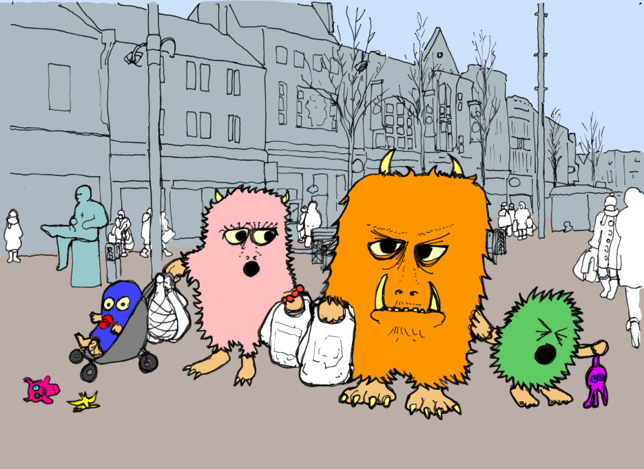
This is a reworking of deviation:[link]
The final piece is intended for a local-themed calendar. The picture has been adapted to represent shopping in Winter, be it Christmas shopping or January Sales. (i.e. I put scarfs and hats on people in the background!).
It's a bit different, but sort of clean, I think I like it. It looks less cheap somehow.
 (Wink)")
Special thanks to the models (monsters), who appear to be invisible to everyone else.
Method and tools:
Black ink pen and tracing paper over composite photo-picture.
Tracing paper! I tell you, I mean I haven't used tracing paper in YEARS!
")
Scanned and colour filled in PSP8.
Related content


Comments: 14

")


 (Smile)")


Oh! I see what you mean about the fur now!
I do prefer the original (sorry about that) but tracing paper's pretty awesome
👍: 0 ⏩: 1

I think I should just improve the way I do fur.
👍: 0 ⏩: 0

All East Midlands city and town centres share naffness and have the occasional monstrous family (if you look carefully)
👍: 0 ⏩: 0

Great work as usual BB
I think the monsters fit better with background in this pic than they did in the original...
👍: 0 ⏩: 1
Yes, I think stylistically it works a little better than the other one, although it's a bit too graphic designny is some ways. Thanks.
👍: 0 ⏩: 0
