HOME | DD
 BioArtHub — 1/100 - Introduction
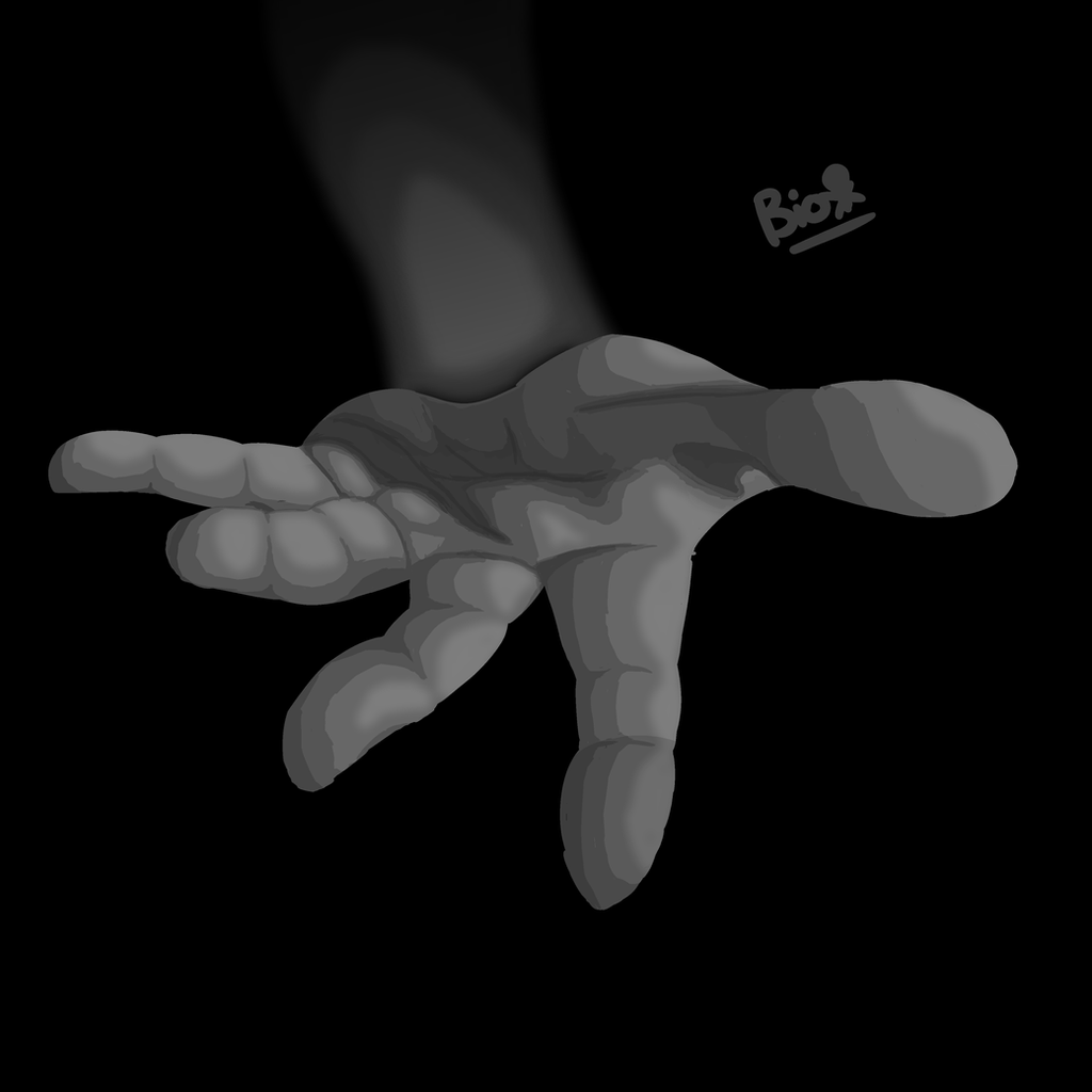
#blackandwhitedrawing #blackandwhite #conceptart #conceptual #eerie #greyscale #hand #introduction
Published: 2017-11-21 20:19:57 +0000 UTC; Views: 258; Favourites: 23; Downloads: 0
Redirect to original
Description
And so our long, long journey begins. Come with me, take my hand, and let us begin the first chapter~Time Taken: Roughly 3 1/2 - 4 hours.
Took me a while to properly do such an unusual perspective, but I'm happy with it! (Though I may have failed just a bit.)
Please don't steal my art, and thanks for stopping by my gallery!
Related content


Comments: 18

Hi, there, I am from .
Nice hand drawing. I noticed on the description that you challenged yourself to draw realistic five fingered hand and I gotta say, that's pretty impressive. This piece for some reason is kind of reminded me of some front cover of the novel or poster for the film or maybe billboard that you seen a lot on the highway while you driving a car.
I gonna reviewed this piece shall we but remembered I am not good at reviewing stuff. The color of the hand that you choose are very good and there is nothing wrong with that. I also love how you put the line on the fingers you know to give more details and realistic look. Truth is, I can't drew realistic hands but I can't only drew cartoony hands. I tried to draw realistic hand on Photoshop before but it didn't worked up for me. The shading on the hand looks very nice and look so detail which is nothing wrong with that. The background looks good and it's a good color choice for this piece. The background are my favourited part on this piece actually.
I noticed that the third finger also known as the ring finger looks kind of weird compare to the other fingers. The third finger looks kind of fat or something but it's still looks all right nonetheless. If you want to know the name of each fingers on human hands, here the link of the charts that will help you know the name of your fingers on your hands. This is not a spam by the way so please don't be scared. 1.bp.blogspot.com/_xCW4Jfa-SWE…
Overall, you did great job drawing this hand. Not only that you probably spend a lot of time to finished this which is very impressive so keep the good work. And now I am going to add this to my favourites folder.
👍: 0 ⏩: 1

ah, I noticed that too. it was a problem with the perspective. the ring finger was supposed to be stretching directly forward (which would make it look fat and short form that perspective) but in sketching a moved it around a bit. Actually, it was one of the things i didn't really like about this. I also didn't like how i shaded it, which made it look fat, unlike the others.
also, how is the background your favorite part? It's just black XD
also, thank you so much for the compliments and the criticism!
👍: 0 ⏩: 1
Your welcome. I also have problem drawing five fingers too. You did great by the way.
👍: 0 ⏩: 0


The perspective is great, the grayscale as well, especially with the arm fading into the background.
since you're asking for critique (in the critique-boutique), I might mention, that the creases which
separate the phalanges of the hand are a bit flat on index, middle and annular finger. Caused by the perspective
the phalanges are cylinders which we perceive from their top, which would result in very round creases. (I hope I got the point across)
Apart from that I was just wondering, why the brightest grey spotts blend, while the others have a clear edge.
But I do really enjoy the composition and overall result!
Keep up the great work
👍: 0 ⏩: 1
1. THANK YOU SO MUCH!!
2. Okay, i'll keep that in mind
3. I debated blurring or not blurring the highlighted, and i even tried blurring the rest of the shades, but i found that i didn't like the look of it at all. so i decided to blur the highlight just because it looked somewhat better
👍: 0 ⏩: 2
Don't worry about the third point, I was just wondering, if it works, it works^^
have a nice day!
👍: 0 ⏩: 0
it took me a minute to actually understand and comprehend what you were critiquing. i get it now. the creases are flat, and they need to be more circular, as to match how i've drawn the hand. i'll definitely keep that in mind when i do a similar drawing again.
👍: 0 ⏩: 0


Oh very detailed, must've been a challenge for you to draw, but I must say, your effort is appreciated in my my eyes, this is very eye pleasing the shading is evenly balanced, wonderful job
👍: 0 ⏩: 1

That's an impressive hand you made!
Are you doing the 100 theme challenge?
👍: 0 ⏩: 1

Beautiful lineless hand drawing! It's amazing! I could never draw something technically as good as that. And have lines insinuated! Good job!
👍: 0 ⏩: 1
thank you so much!
the lines were mostly insinuated by stark contrasts when shades and highlights meet (because shades and highlights do not carry over a different adjacent object). oh, and a lot of layers.
👍: 0 ⏩: 0