HOME | DD
 bliz — samulinivala.com Layout
Published: 2007-07-24 08:53:10 +0000 UTC; Views: 2314; Favourites: 16; Downloads: 65
Redirect to original
Description
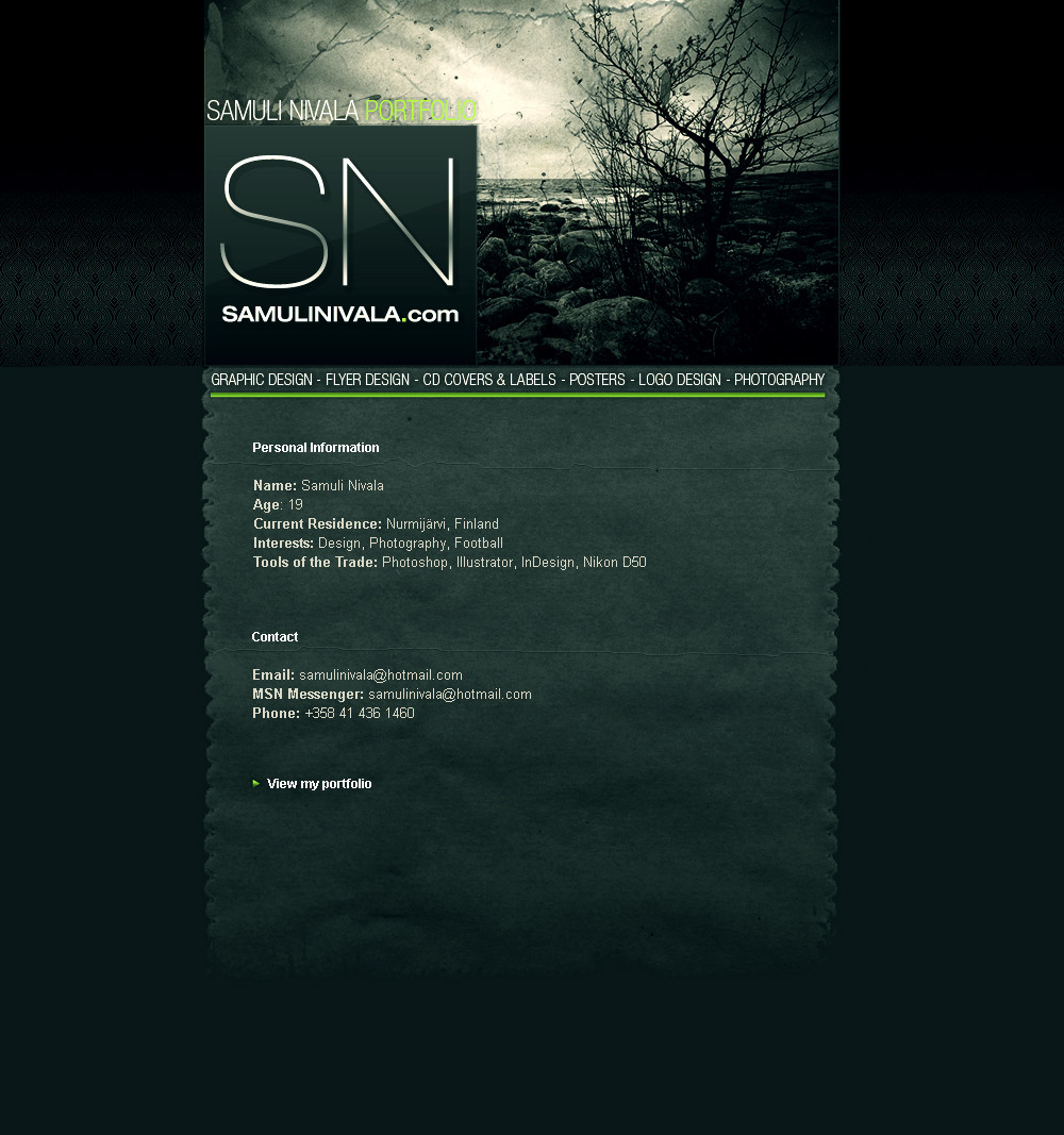
I am alive, besides, I made something")
Portfolio that I made for my website. I bought the domain so the website will be online as soon as possible. The photo at header is taken by me.
Feedback appreciated!
 (Smile)")
Related content


Comments: 21


Great concept and beautiful colour-scheme. I like the photo you used for the header and the delicate but complicated pattern in the header background.
I'm just thinking that the light green elements could be a little bit darker.
👍: 0 ⏩: 0

cools man. mine's up but the layout is tooo basic : [link]
mind designin for me?
👍: 0 ⏩: 1


Love it man... Nice concept.
I just wondered something, what happen if the page content is too short or too long?
👍: 0 ⏩: 1

thanks! I'll keep the content in a compact package, so there's no need for stretching the content element. Portfolio section will work by a popup.
👍: 0 ⏩: 1
I see. Nice one on the pop-up.
Truthfully, 3 thumbs up bro on you layout, but I still have a bad feeling about popup. Ever heard of popup blocker?
I do think it work much better with the contents inside div with style overflow = auto. although it would just defeat the purpose of the whole concept.
Just my 2 cent suggestions.
👍: 0 ⏩: 0


i like it. looks good.
btw welcome back, very glad u are alive
 (Wink)")
👍: 0 ⏩: 1


"portfolio" is a bit difficult to read in the header & i agree with RengisedesigneR that it's dark, but i think it works well like that.
The colours are well chosen & i like the layout & header photo
Cant wait to see it online!
👍: 0 ⏩: 0

