HOME | DD
 blotchy-the-squid — decay
Published: 2004-04-27 01:05:44 +0000 UTC; Views: 15844; Favourites: 479; Downloads: 8148
Redirect to original
Description
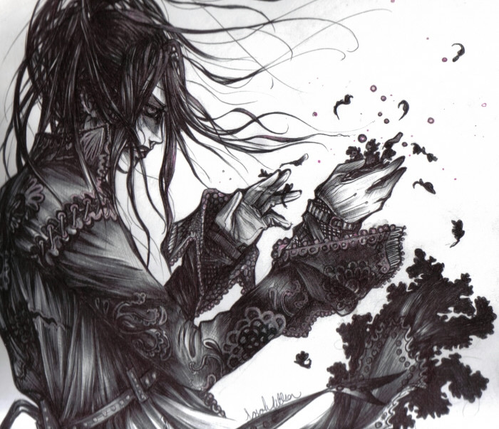
....this has to be the worst scan ever....damn poopy scanner! Why can't I use the good scanner? i'm the only one who uses it! I think it's all just a plot to make me angryyy.The sketch of this was one of the probable sketches for commission. Isn't anymore......still, such a bad, bad scan.
-ballpoint+gelpen-
Related content


Comments: 251


I bought a print of this at Otafest one year... still love it. You KNOW how badly you need to sew/design and sell clothing, right?
👍: 0 ⏩: 1

aw, you were at otafest!?!?!?!?!?!? fond meories, very fond memories! I considered fashion design for a time...maybe I will still get into it, who knows!
👍: 0 ⏩: 1
Yeah, Otafest is good times. I didn't get to go this year, though.
👍: 0 ⏩: 0

I love it, it's the best picture in your gallery! I like esspecially her hair, but the dress id also very nice  (Smile)")
👍: 0 ⏩: 0

------
wells if joor scanner is truly so poopy i coulds not tell i likes it much
i like joor style of drawing, it remiands me of wolf's rain
------
eternial friend nick

👍: 0 ⏩: 0

i love the details you put there!soo...so detailed! the color you used for rendering your work work well with the concept you wanted to imply.you're good! i am not sure though if i like the face...but i like the hair huh!it's good. your shade and shadow is good as well as the lights. nice body posture yopu made there unlike other works i've seen.. bacause i think some people tend to make their characters look a bit stiff. well anyways hope you can read this bacause of the sooo many comments posted here.well.. SAYONARA!CIAO!
👍: 0 ⏩: 0

the style is incredible. sorta reminds me of amano's work. and the fact that it's traditional art work makes it even more appealing to me.
👍: 0 ⏩: 0


It may be a bad scan, but it still shows what impressives skills you have with ballpoint pen. The cloth and hair textures are well executed. Great one.
👍: 0 ⏩: 0

wow, that's pretty crazy. Haha! I like it!

👍: 0 ⏩: 0


Amen, you're awesome >"< Great details T_T Your skill is excellent, I wish I could do like you T_T
How can I miss you before ? *________* So amazing, have to watch you now ^^
Great job !
👍: 0 ⏩: 0

wow... beautiful artwork.. so eye-catching.. one of he best i've ssen yet... I'm still a newbie here in DA and then i saw yours and wow...!! ^^d keep it up!
👍: 0 ⏩: 0

i just wanted to say i LOVE your name! oh, and the pictures really cool too.
👍: 0 ⏩: 1

excellent picture, a little bigger and sharper would be nice, but still awesome work.
👍: 0 ⏩: 0


This has awesome detail on it......the shading is perfect....
👍: 0 ⏩: 0


;__; ive never seen such beautiful work in biro.
(what else is there to say other than omigosh and i love biros >_> maybe its becuase they're cheap and..nice)
👍: 0 ⏩: 0


this is absolutely breathtaking, and an amazing display of talent.
brraaaaaaaaaaaaaaaaavo.
-condescending puff of cigarette-
👍: 0 ⏩: 0


Crazy detail, that must have took you a long time.

👍: 0 ⏩: 0

that's so beautiful.. the way everything falls apart.. decays.. amazing work..
👍: 0 ⏩: 0


Whatever you say I like it. It is technically really well done. the texture of the gloves is perfect. I just think the cloth swept up seems a little exagerated, IMHO it distracts more than it helps. The embroidery on the sleeves is really well done and suits the whole mood.
👍: 0 ⏩: 0

This is just so awesome work!!! I like really much!
👍: 0 ⏩: 0

Wow, ballpoint and gel-ink? ")
👍: 0 ⏩: 0

i have a question.....
did u sketch that out in pencil first???
👍: 0 ⏩: 1
i outlined it in pencil first of course. It's pretty rare that something i go straight to pen in turns out half decent.
👍: 0 ⏩: 1
I have tried working in pen, but with a fountain pen... It seems to blotch a lot, and cross hatching is difficult. Is that why you use ball point? I ask these questions just because your style is incredible!
👍: 0 ⏩: 0

cries* its so beautiful!!! *bows down and praizes the artist!!!*
👍: 0 ⏩: 0

Wow this is so far out of my league!
What I really like about this piece other than its mood is the patterns on the characters trenchcoat. They are so very intricate and in depth. I especially like the insides of the sleeves. I could almost feel the smooth fabric! Also the slight touching of color adds even more to the picture while still retaining that black gothic appearacne.
I noticed the heavy detail on the characters face and it is very nice. However, the hands seem not to reflect the detail. They're more cartoonish than the face.
I also read some of the other reviews.
I think Squaresoft is really overrated. I could not imagine good talent going to waste to create pup-fiction anime they don't even write themselves. Don't feel all doomy over not working for a group like that, blaze your own path. Overall it is worth being posted in my favorites. One question though, how did you use a BALL-POINT PEN to make the hair strands so thin and uniform!!! I've been working with bics forever and they are so crude and cumbersome! I am shocked as to how you accomplished this! Did you pencil it first? How did you shade is so perfectly?
👍: 0 ⏩: 1
thank you ^^ muahahaha, as for the ballpoint pen, it's completely about the pressure! I find they are BY FAR easier to use than regular inks or even special inking pens ( unless of course you're just going for the flat black and not using them to shade of ). I roughly sketch out almost everything beforehand in pencil of course, but i don't usually create patterns until i'm using the pen.
As for the Square dissing....i"ll just smile and thank you for commenting ^o^
👍: 0 ⏩: 1
Heee....
Ignore the dissing, it is my way of complementing you work. Just one peice of advice I'm looking for, what brand of pens did you use? I use cheap bics from the conveinence store.

👍: 0 ⏩: 1
XD ahaha.
weelll. I also use bics. The black crystal ones. y'know, those ones everyone gets for school to write notes with , i can never find packs of JUST blacks! it's always a pak of a bazillion blue, a couple of blacks and two reds.
I love love love those ones in particular because they are soo dark, have a decent flow and are sort of red/prurple tint and not blue! I hate the ones with blue tint! die blue tint, DIE!
..sorry, i'm getting carried away... o.O
👍: 0 ⏩: 0

Oh this is such a great picture! The shading and detail is amazing, bad scan or not it's wonderful!
👍: 0 ⏩: 0


Amazing. Reminds me of a song bye "the uninvited." You have impecable talent. It's hard not just to stare at it and thick of things. That is why people see FF in your art. Working for Square has always been one of my dreams, but no major talents and little money for a gaming college. Anyways thank you for allowing such beauty to enter the world.
👍: 0 ⏩: 1
thank you very much. yeah, i wish i could work for them * tear* i don't think i have the money for training either. I am desperately looking into scholarships. oh well, a kid can dream.
👍: 0 ⏩: 1
Yeah dream and dream. I know the feeling
👍: 0 ⏩: 0

👍: 0 ⏩: 0


Sucky scanner regardless.....your art still managed to throw my jaw to the floor ")
👍: 0 ⏩: 0

I love this image, so much so i've made a wallpaper of it, hope thats ok? thanks a bunch: [link]

👍: 0 ⏩: 1
WOW!!! that is SO COOL! I love it!
👍: 0 ⏩: 0
| Next =>