HOME | DD
 bluefeathers — So Like a Rose

Published: 2007-07-12 19:11:24 +0000 UTC; Views: 4976; Favourites: 249; Downloads: 99
Redirect to original
Description
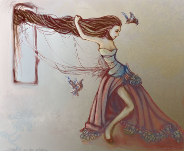
EDIT: I won 2nd place!!! Woohooo!!!! XD XD XDDrawn for 's contest! He just extended the deadline to August 25. So much for me hoping to win 3rd place by default LOL XD;;
I had a lot of trouble colouring this one. I'd really like to hear what you think, especially of the colours, such as what you liked and didn't like, what you would've done differently, etc...
Credits:
victorian silk pattern in the background and marble pattern on the leaves from Mayang, butterfly paper-cutting from China.
Gloves - pattern from , rose brush from [link]
Inspiration: the song "So Like a Rose" by Garbage
Baby thinks he´s dying
Lost inside his bedroom
Mommy won´t stop crying
And daddy´s always working
There´s no going back
There´s no going back
There´s no going back
On this one
Baby wakes up with the sun
While everyone is sleeping
He thinks he´s going crazy
This could be the big one
There´s no going back
There´s no going back
There´s no going back
Sleeping with ghosts
It´s such a lonely experience
The stars are out tonight
Only they can hear you breathing
You´re so like a rose
You´re so like a rose
You´re so like a rose
I wish you could stay here
(I actually misheard the last line, ahahaha


 ;; )
;; )
Related content
Comments: 44

When I saw the title I thought right away to the Garbage song. It was one of my favorites a few years back.
The sadness in her eyes fits the song. I like the colours of this piece. There is warmth from the reds and pinks of the roses, and the blues of the dress and leafy wings. The arms... how long the they are from the elbow to the wrist.. It takes away from it a bit. It somewhat seems like the style though and balances with the large hair. Sense this piece is really old and you've improved sense - I'd love to see a redo of this with quiet a bit more sadness and blues.
👍: 0 ⏩: 1

Thank you for your thoughtful comment!
👍: 0 ⏩: 1


👍: 0 ⏩: 0

Wow very creative!! This is really beautiful!! you are like my new favorite artist on dev!!
👍: 0 ⏩: 0

This seems to be a very unique take on fairies...Very beautiful, I love the soft colors...
👍: 0 ⏩: 1

Garbage is awesome. This is more awesome. I adore it.
👍: 0 ⏩: 1

oouu thankyou! x3
👍: 0 ⏩: 0

I dont really know why but I think this is my favorite of the pictures in your gallery. ^^ The design and concept is so gorgeous. She totally blows my rose fae out of the water. Gorgeous work
👍: 0 ⏩: 1

Awww thankyou!!! You're so sweet~!!! *o* <333
👍: 0 ⏩: 0

The Colors, The look , The everything is just soooooooooooo Fantastic *Thumps Up*
I love it ^^
👍: 0 ⏩: 0

so amazing..! i love the colors.. and her hair X)
👍: 0 ⏩: 1

This is so strangely beautiful... She really does look like a rose and her hair is amazing.
👍: 0 ⏩: 1

I love this one, especially the details, like the crown. It's beautiful
👍: 0 ⏩: 0

That's the song I thought of when I read the title, and it actually was Garbage! One of my favorite songs of theirs, too. :3
Her hair is definitely the best part. I love how it wraps around the crown, and how it...is drawn, I suppose. [laughs] And as always you've used such pretty, soft colors, and soft brushes.
I like the concept, and it's a really cute pose!
👍: 0 ⏩: 1

Awww thank you!!! XD XD XD Yay Garbage fans!!!
👍: 0 ⏩: 0

It's very pretty but I just wish the leaves (wings as I see them) were a bit higher but that's just me. Good luck on the contest!
👍: 0 ⏩: 1

Thank you very much for the suggestion!!!! ^O^
👍: 0 ⏩: 0

this is fantastic!! I love it. It's featured in my journal
👍: 0 ⏩: 0

The colours work quite beautifully in this piece. I think you did an awesome job with it.
👍: 0 ⏩: 1

Wow really good i think you could set higher than 3rd place im going to start watching you when my comp. gets fixed lol well tell your friends of my contest good luck
👍: 0 ⏩: 1

Thankyou!!! XD XD XD
👍: 0 ⏩: 1

Aside from the pic. of Puissante, this is my FAVORITE of your gallery!
👍: 0 ⏩: 1

OMG!!!! So beautiful !! I love her hair!! O___O The color are so wonderful!!
👍: 0 ⏩: 1

This is gorgeous. I think I'm going to have to watch you. xD
The colouring is lovely. The colour choices all work really well together, and you've incorporated patterns subtly, so that they don't overpower the image! I'd like to see a little more consistency in the "blurriness" of the image-- the top of the hair and the roses are quite smudgy, while the dress and leaves are quite sharp. If it wasn't like the top is smudgy and the bottom is sharp, but rather bits of the image are sharp and bits are smudgy, I think that would push this onto another level! I think that balance is actually one of the most difficult things to do (personally). I also think, in terms of composition, that the words could be better incorporated, rather than just floating there. What I like to do is to make big, scripty letters that are very light (perhaps set on colour burn or screen) and then layer much smaller, capital letters with serifs over that are substantially darker. Hopefully that makes sense. xDDD
I LOVE the texture and I think you have just the right amount of background to really make the character pop, which is also a really difficult thing to do. Kudos!
👍: 0 ⏩: 1

Thank you very much for your comment!!!! ^O^ Yes I agree with the sharp/blurry thing!
👍: 0 ⏩: 0

Quite beautiful. You should set your sights higher than third place by default!
👍: 0 ⏩: 1


